Dimitar Rashkov
You must be logged in to post a comment. Login here.
R
Roberts Wrong
Report Abuse
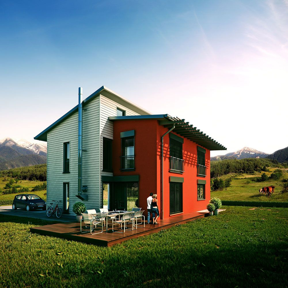
really quite fantastic imo. Considering the fact that its a typical housing typology, I think they're fantastically done. Loving the heavy saturations and colours.
love the horses in the background.

Andy Pennington
Report Abuse
Its probably worth pointing out (I made the mistake in my own post as well I believe), that this is not image of the week, its visualization pro of the week. To be fair, as Justin says I think Redvertex is certainly worthy of the 'pro of the week' title this week.

Justin Hunt
Report Abuse
Whilst not one of Red vertex's best images it is the best image submitted for the week. Its one of the stregths and weakness that any image of the week selection processes have. If there are poor images submitted that week well then it stands to reason that that weeks "image of the week" will be poor too. At the same time if there are alot of fantastic images submitted then of course the "image of the week" will be truely great.
So it is really up to us to push ourselves and submit fantastic images. I for one havn't gotten anything suitable yet, but I am trying.
What I like about this image (dispite its faults) is that they have tried to do something different with really ugly architecture.
jhv

Sketchrender Ltd
Report Abuse
well you know what they say.
Opinions are like as* holes everybodys got one.
Excuse me Jeff for the bad language, but some people make me laugh.
M
Marko Paajanen
Report Abuse
I had an experience at an advertising agency where I used to work with a nice group of people who's actual job it was to pick apart images (CG and photography). I came into work with a CG image and a photo. It wasn't long before I had a little horde of them tearing apart the photo for having a variety of unrealistic qualities. They assumed both images were CG because I was the CG artist. The floodgates are open to what is wrong when we know (or think we know) an image is CG beforehand. They needlessly all looked like fools. No danger of that happening to anyone here I suppose?
I agree the sun is a little out of place and the scale of the grass is off, but the other arguments are a little weak in my opinion.
Great job.

Jeff Mottle
Report Abuse
If you don't like the images being selected then submit some images for consideration!
S
Scott Smith
Report Abuse
In addition to the other comments, the house and deck don't show a foundation or skirting. In real life, decks don't sit directly on the ground like that (at least to my knowledge). Makes it look unrealistic, artificial and photoshopped in.
B
Barry Lothian
Report Abuse
In addition to what others have said:
I think the people are slightly too small and could do with being scaled up a little (if your window head is 2.1m above floor level then they look roughly 1.6m which is pretty small)
The shadow from the roof above the red wall suggests the sun is quite high yet the background image is much lower.
Again congrats on being chosen
Andy Pennington
Report Abuse
I have good points and bad points. In some way its technically good: nice contrast, your people are lit correctly, the modelling is decent and the materials are pretty good. In a number of ways though its technically not good:
Compositionally its not strong
The camera is too high
The background perspective feels wrong
Your reflections are too bright
The foreground grass and leaves scale is wrong
My own personal gripes are:
Your people are placed uncomfortably and their direction of travel doesnt make sense to me.
Foreground shadow lessens the overall sunny atmosphere and makes it cold.
Lose the horses. Really.
Congrats on image of the week though.

Shane Gee
Report Abuse
RedVertex may well deserve to be selected for Pro of the week or even month, but definitely not with this image. Does not show their skill level. Not even worth listing problems in this image.
Nic H
Report Abuse
pretty weird composition and not feeling the strange different green little plants and hedge.
i have seen much much better work from redvertex tbh.

Damian Wiech
Report Abuse
I dont see any + to put this image "pro of the week" :(
70% - photoshop and photos
30% - max :(

neil poppleton
Report Abuse
The scale of the foreground grass is too big..