Fred Baldez (July 15, 2010)
You must be logged in to post a comment. Login here.
T
Toh
Report Abuse
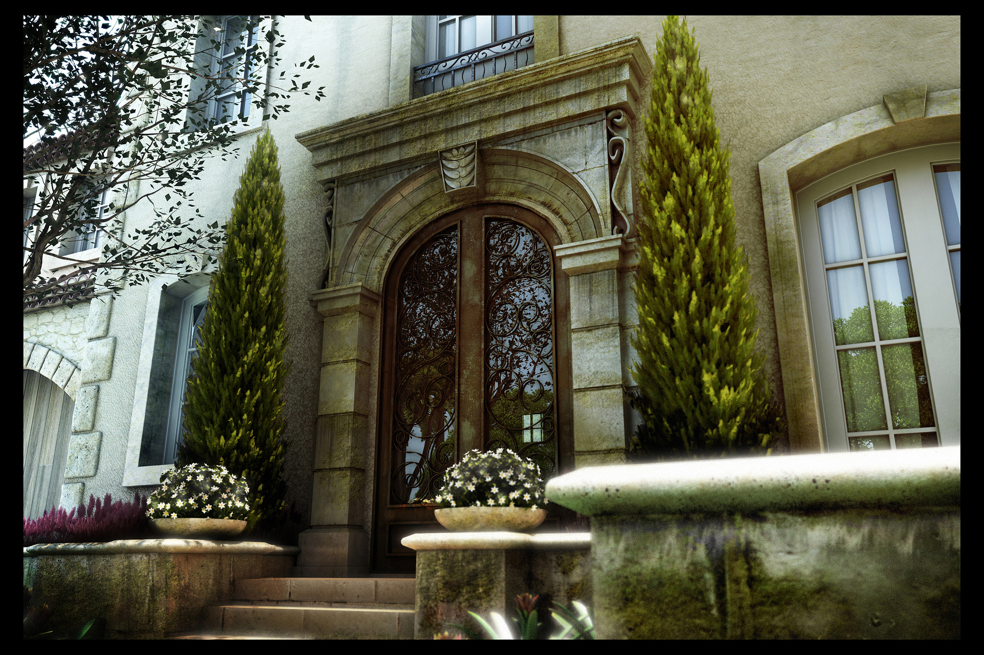
I love the richness in color. awesome

Jane Namenye
Report Abuse
This image got my attention right away when it popped up on Pro of the Week e-mail!
What I like best is the stone, both how model and texture were done.
I agree with the others on the reflection in the right hand looking a be unreal, especially compared to the rest of it.
One thing I would do is try other formats and camera angles. The interesting part of the image is the door and the rest of it needs to point this out. Try a portrait format instead of landscape is one thing I would do.
H
Hany Ismaiel
Report Abuse
Man you got amazing skills in texturing
and the image over all ambience color is awesome
the ironworks and the overall modeling skills are great
just a couple of things to mention
the left foreground tree i think its missing the leaf map because the leafs appear as rectangles
and the two similar trees around the gate have the opacity map used for the masking are not correct as some of the rectangular planes not fully transparent
overall the image is awesome congratulation on the best of the week
keep it up

Nicolas Boisseau
Report Abuse
Very amazed by your work. I particularly like the textures and the ironworks on the main door.
Bravo! Let's continue!
M
Marcos Oliveira
Report Abuse
Yes! http://www.onnovanbraam.com/index.php?tutorials/depth_of_field/

onzki Ecapet
Report Abuse
Will there be a tutorial for this? :D
M
Marcos Oliveira
Report Abuse
Fred,
In max you can use the ZDeph pass and after, in Photoshop, use this ZDeph pass in Filter>Blur>LensBlur. The Deph Map is the ZDeph pass channel that you already bring into channes (with any name, my favorie is ZDph). Hope I can help, Congrats!!!!
R
Russ Uridge
Report Abuse
It's a lovely image with a wonderful composition..
I agree with some of the constructive critisism here with a couple of suggestions of my own.
The bloom effect on the highlights (especially in the LR quarter) are too bright/blurred, but they do add a lovely warm, fantasy feel as you have them.
The UL 1/4 has some beautiful detail in the architecture, which you're covering with the tree, although I like the way you're "framing the shot".. whereas on the other hand the UR 1/4 lacks detail in the architecture, could you have the tree in the foreground there instead?
Also, the doorway is a little dark, whereas the white walls on the left are bright.. could you balance those a bit perhaps?
and maybe copy the purple plants over to the right-hand side wall to add a bit of balance and detail to that side..
fantastic job though!! I love it
I use a z-depth channel and DoF Pro (photoshop plugin) for stills and frischluft's DoF in after effects for motion.
K
KURTLAN KOGER
Report Abuse
I like it, but the glass (waviness, reflected colors, etc) seem as if it is new glazing, rather than similar age to the rest

Shane Gee
Report Abuse
Well clearly well done on the selection for pro of the week, please ignore my previous comments.
Fred Baldez
Report Abuse
Thank you for your observations, You didn't are too critical,
Thank You again, The proposal to post here it get this kind the reply and make batter next work. :)
Shane Gee
Report Abuse
Fair image at first glance, however on closer inspection a few details let you down.
Don't like the foreground tree to the top left. Photoshop real one would have been more convincing.
plants looked blur --i think to make up for the unrealistic 3d plant models?
lost the opacity on the masking of the leaves to the light green confir to the left
Not convinced on the DOF, if you are looking for a cheaper/easier method maybe try using Vray Zdepth as a photoshop channel?
but I am not sure it will be that effective on this image's composition.
Also I personally don't like the guassian blur to hightlights, so 2001, and easy way to compensate for a missing quality. Can be use but like so many other effects needs to be done sensitivily and correctly to maybe highlight an important feature? Got to be thought through
it is the details that turn an image from average to excellent.
Hope this helps, and not too critical?
Shane

Rahat Amin Chowdhury
Report Abuse
Excellent work......i really love the texture work here!......:)

Athanasios Karampitsakos
Report Abuse
Very nice!
Fred Baldez
Report Abuse
Thank you.
Fred Baldez
Report Abuse
Thank You, Alyosha.
I will keep in mind your suggestion. I didn't use any HDRI map at this scene I use the Dome's Technic that I learn from the 3Dats book ( I think was the 3ds max 2009 Architectural Visualization). Thanks again.

Kareem Karawia
Report Abuse
So amazing man ... agree with Alyosha in the glass thing ... otherwise perfect (Y)
A
Alyosha Cebokli
Report Abuse
Imo this is a great visualisation, extremely good lightning, did you use hdri or is it just the textures that did the trick?? The only thing that seems a bit exaggarated are the reflections on the glass, from my point of view they could have been toned down. Otherwise I give you 5/5, very believable and beautiful:-)