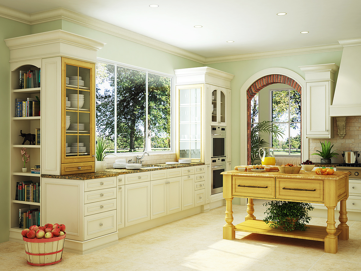
Traditional Kitchen
You must be logged in to post a comment. Login here.

Rahat Amin Chowdhury
Report Abuse
really a nice work......diffuse daylight effect near the window - nice work with details and little props. Good job!
D
David Hansen
Report Abuse
you posted this in the wrong forum, all photos need to go in the "photo of the week" forum :)
m
marwan s
Report Abuse
the thing is the cathedral was an evermotion file i ddnt know that, the guy downloaded it and just did lighting with no pro texturing... strange PROs of the week lately.

Antoine Desjardins
Report Abuse
Got my vote for pro of the week. I keep browsing to the image.. Great reference material.

Adam McPartland
Report Abuse
no probs Brad, i'm not bashing anybodys image but the attention to detail, texturing and entrourage in your image beats some of the recent more 'lightweight' entries relying on a flashy point of view and ivy generator. Still... you've been paid for this image so theres some comfort in that :)

Bradley DeWald
Report Abuse
Thanks everybody, especially to Adam! I really thought I had a shot at the 'Pro of the Week,' too. Not to sound like a sore loser, but I think maybe there should be separate categories for personal works and works for actual clients. I simply can't find the time to create a shot of a cathedral or, like some of the past winners, create about a thousand proxy trees around a house. There are plenty of awesome shots here that are actually done for clients instead of in one's spare time that get ignored.
Adam McPartland
Report Abuse
this image is tight, far superior to the current 'Pro of the week' imo

Kanashimi
Report Abuse
this render is sick!
M
Mohaned Al Sabti
Report Abuse
Hey Bradley, i like the colors and the composition but your image miss the depth. its a bit flat and the brick arch needs more attention. i like it anyway.

Frances Gainer Davey
Report Abuse
Nice work! Lots of nice detail. The modeling, lighting and materials are really good. If I were arranging things, I would take the stacked plates off the countertop and take a couple of the things from the island and put them in their place. It looks like someone didn't do the dishes before the photographer came. :D Although the atmosphere has a really nice feel to it, I'm not keen on the AO pass, but that's a minor personal preference. The brick arch looks good, but uv mapping of the jambs looks a little off to me.
Bradley DeWald
Report Abuse
Thanks! It definitely means a lot coming from you. Postings like this sometimes make me want to just give up though. I agree about the AO: it's always a battle for me trying to decide on how much AO to add--it always looks like its not enough or too much. Thanks again!

Dave Buckley
Report Abuse
It's got to be said, you've come along way since you first started posting :)
This is excellent, not really much I can add. The only thing I will say is that I feel that the AO is a touch heavy (but really only a touch) but on the other hand it does give the image it's character, almost bordering on rendered over a pencil sketch kind of feel.
But all in all its very good, great attention to detail
Antoine Desjardins
Report Abuse
Hells yea!

-.- .-.
Report Abuse
That is one bitchin' kitchen!
Bradley DeWald
Report Abuse
Thanks for all the great comments. Here's a version with an overexposed view out of the window: Better?

Nicolas Bischoff (www.burn.co.za)
Report Abuse
You are a mad man. The detail and doodads are friggin awesome.

Stephen Leworthy
Report Abuse
that's kitted out lovely.
the exposure of the externals has already been mentioned, and for some reason the horizon level doesn't sit too good with me. perhaps it's because the eye level is lower than the norm and putting things off. and the whole room is a touch over bright and not naturally contrasty enough for me, but hey, as the other say, the best kitchen render i've seen in a long while.
G
Girish D Joshi
Report Abuse
Fabulous. Well done with the modeling part. I like the way you have filled up the kitchen with so many props. Good work on the prep island as well.
What references do you use, very keen to know this.
It's mentioned above quite number of times and I would be adding to it ;) regarding the brightness of the exterior. Should be very bright.
m
marwan s
Report Abuse
it s lovely... again i agree with the above, anyway if u like to have the same exposure maybe if u add reflections or if u make them more apparent cz i think u have very faded reflections in the window and remove the glow it would look nicer... i think...

Athanasios Karampitsakos
Report Abuse
I agree with the above comments.....Very nice!