Andy Hickes
You must be logged in to post a comment. Login here.
A
Asim Khan
Report Abuse
Excellent Remake... Good luck !
J
JohanR
Report Abuse
Cool PS:ing, but the vegetation could have been a bit better.
A
Andy Hickes
Report Abuse
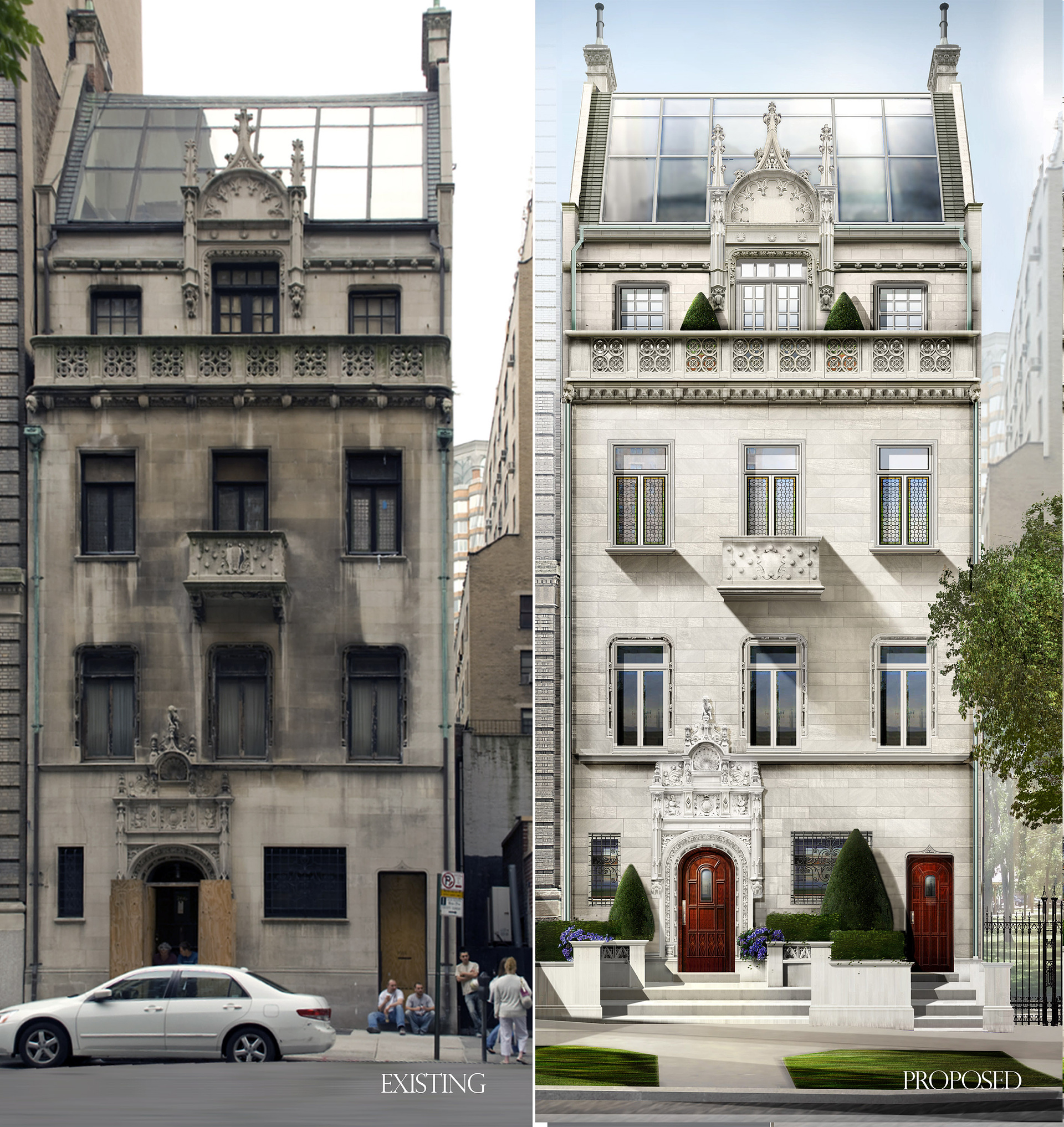
the original file is the left photo. no 3d file here.
A
Andy Hickes
Report Abuse
Actually they are the construction workers doing the renovation!

Rendering.no
Report Abuse
Great work !
maybe the vegetation needs a little more tuch, but anyway, nicely done.
Regards

Travis Schmiesing
Report Abuse
Where did the vagrant loiterers go?
t
tristan basco
Report Abuse
Great job Andy, I remember my old "AIP" books, you were one of the few artists then dabbling in CG.
M
Max Montana
Report Abuse
Nice image Andy,
I am impressed what you can do in PS.
Greetings from Austria.
Max

James Insley
Report Abuse
Fantastic image. I really like the colour tones and lighting... I would be interested in seeing the original file.
and a great website too! looks like you have put together some really interesting projects over the years.

Iain Denby
Report Abuse
Nice work Andy.
The crits I read are rediculous. ARTISTIC LICENSE. Seems to have been lost in favour of accuracy by our younger colleagues.
J
JohnFredrickson
Report Abuse
Awesome render. The only thing I don't like is the perfect angle of the shadows cast on the elevation. Other than that A+
O
Oscar Ruiz
Report Abuse
Amazing work!!!
Congratulations!!!
You're a master!!!
Everyday i get more convinced by this examples of the limitless power of photoshop. If you can, please, teach us a little about how you did compose this project in photoshop. It will be a great tutorial for people like me who are willing to learn from the masters new techniques. Thank you for posting!!!
s
simon edwards
Report Abuse
oh yeah there it is..... fantastic building...and a great old photo too...
J
Josephus Holt
Report Abuse
First of all, very,very lovely transformation...I'm sure the client was VERY pleased as it exudes the kind of quality one would look for in a $30M (???) home. Beautiful home by the way. Like the touch of the lavender foliage...nice, royal color.
In addition to other crits, it looks like the curb has been pulled halfway into the street, and perhaps this is so. I like how you use the tree to screen the building on the right, although that building seems to have been moved back much farther than shown in the existing.
What actually I saw first...after I got past "wow, that is nice!", is that the PS shadows under the third level windows and projected balcony are not correct. If you did a quick 3d model you would see what I mean. Also the shadows of the trees don't look right as the sun is coming from the left, and yet the shadows of the tree are on the sun side.
A
Andy Hickes
Report Abuse
I did not start it alone. a small group of us started it.
A
Andy Hickes
Report Abuse
I will try to attach a file of the original building showing the ground level details that are hoped to be restored.

Kareem Karawia
Report Abuse
Nice one mate .... good work (Y)

Adam McPartland
Report Abuse
I agree im totally confused about whats happening at ground floor with your levels but we're judging the illustration afterall which is very nice, maybe the grassy parts in the foreground could have used a proper texture in PS or displacement in 3d. Lovely style however.

Shane Gee
Report Abuse
looks like a very good use of photoshop colour up elevation. nice clean shiny building for the client.
Shane
s
simon edwards
Report Abuse
very nice rendering... i'm interested in the architectural solution too though seeing you have posted the real existing photo as a comparison... it appears that the whole building has been hoisted up to allow for the new stairs up to the front door? perhaps the floor height actually is this far above the pavement and its sort of disguised on the photo or the pavement has been dropped?. looks a bit like the existing car has sunk into the tarmac in the road too ? Was wondering how many alterations were done to the original photo really. I'm affraid i spotted the dissappearing neighbouring building on the right too, which magically transforms into a lovely park on the ground floor. sort of looks like the building above is hovering on structural air though...
:rolleyes:
Anyway its easy to be critical... the new building detail is very nice and very nice textures too..