Chad Warner
You must be logged in to post a comment. Login here.

Chad Warner
Report Abuse
Thanks! The thread I had this on before was for the photo sketcher program..I was excited about how great a job it did.

Travis Schmiesing
Report Abuse
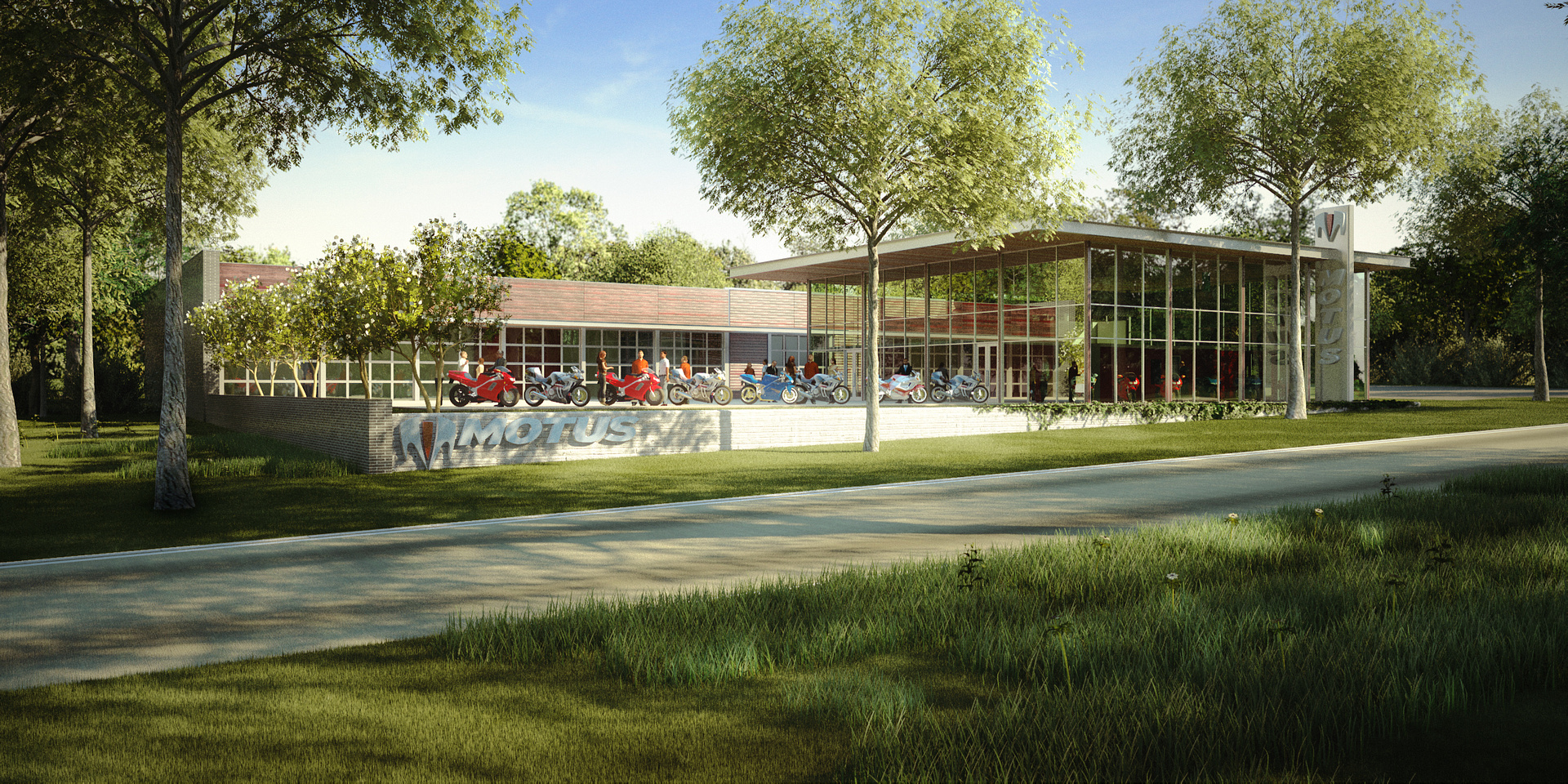
I find the colors to be pleasing to the eye. They remind me of colors you might get from traditional media. They are on the lighter side, and have almost a colored pencil feeling to them.
I think you posted a bit of this image in another thread, but I can't remember what the topic of discussion was.
Chad Warner
Report Abuse
The tall grass is a bunch of bent planes that I hand made following one of the tutorials that's been posted here. All of the trees and other vegetation is xfrog.
A
Aline Lorenzon
Report Abuse
Hello. It's a very nice rendering. Which plugin or software did you use to create that grass and vegetation? I would like to improve the landscape of my renderings. Cheers. ;)

Scott Barrington
Report Abuse
very nice! i love the landscaping.
D
DonQuePaso
Report Abuse
There have been some good criticisms this go around. I also think that you should never place the logo in shadow. Always embellish that element above all else.
The tree of the left does look somewhat strange in the environment. Some grass blades or some blurring around the base would probably solve the problem. Lastly, the long and short grass patches do look a little peculiar, but I have seen plenty of lawns where that occurs so it is entirely a subjective decision.
Other than that I think that the rendering is very, very nice.
Congratulations on the good work!

Antoine Desjardins
Report Abuse
yeah, now that I look at it... I kinda like the way the landscape evenely frames the subject. I hope the intended output for this image is on a large medium, though. Otherwise, viewers may tend to focus on the organic elements. Great image!
Chad Warner
Report Abuse
Thanks for the comments/crits, everyone. I know exactly what you mean about that tree...for whatever I couldn't get it to sit right. The vegetation and "natural" landscaping was important to show because the client wanted to show how the building nestled into the surrounding vegetation.

Brian Campbell
Report Abuse
The building interior is too dark. I see there are some Moto Models inside, but I feel as though the place is closed. I'd prefer to see the interior of the building lit up, warm and inviting for people to walk right in.
Antoine Desjardins
Report Abuse
Love it. Only crit: I'd move the camera in by about 200" or so - focus more on the subject and not the sourrounding overgrown vegitation. I know how y'all do it in Georgia... lived there a few year myself. Our patio was build 'around' the huge trees in the backyard. The whole state looks overgrown and wild due to the subtropical cimate... its kinda nice. Cheers.

erick gustafson
Report Abuse
I'd recommend not having shadows be cast on the companies logo. Regardless of whether or not that's how it would look in reality it's always best to emphasize client logos when doing work of a "commercial" nature. It seems rather downplayed in this image IMO.
E

Jonathan Sanchez
Report Abuse
I like the image a lot Chad.. great ambience and composition.. however, what's up with the patches of long grass?
S
Shahid Khan
Report Abuse
Very nice image. I like the leafy atmosphere, the building sits well in the surroundings......one minor criticism, the tree in the foreground (on the left). I don't think the trunk base meets the grass correctly. Possibly could do with some grass blades in front.
G
Girish D Joshi
Report Abuse
Nice render. Looks very complete. Don't like the background trees specially above the red bikes. Bit blurred.