arcade
You must be logged in to post a comment. Login here.
E
Eric Ji
Report Abuse
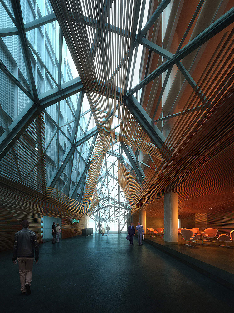
Thank you guys all for the comments. This is actually a local CG competition I entered last year and we were given the structural model for the work. I believe the wood slats is to give some warmth to the cold metal truss structures, but the placement and connection details do seem a bit harsh.
Thanks for the notes on the foreground person. I agree the darker color will make him blends better with the space.
I will keep posting some of project renderings I have worked more recently.
H
HVB .
Report Abuse
Oh thats weird, I thougt I allready posted a message to this Thread. Oh well I just write it again.
Great and cool looking model with a very nice floormaterial. The choice for the red/orange versus blue lighting really fits the image and always seems to work very well.
I agree with Buffalo Bills about the guy on the foreground, if he is a bit darker he would match better.
Besides that it's a good looking image in my eyes.
Han

Michael J. Brown
Report Abuse
You had me until my eye got over to the chairs. I do like the awesome contrast of warm vs. cool. That balance is perfect. And the architecture is quite arresting.
However, something about the seating area (perhaps antialiasing) gives it a grainy, overly saturated comic book or cheap romance novel front cover feel that doesn't plague the rest of the image.
J
JosephAHaddad
Report Abuse
Very nice rendering, nice contrast btwn warm and cold colors, nice architecture. Great work!

Brian Campbell
Report Abuse
the color theory in this image is very nice
T
Tom Svilans
Report Abuse
Very nice! Love the colors and the mood. That's a pretty nice structure.

F13 Design Studio
Report Abuse
I agree with the comment about the warm and cool color combination. the person in the foreground needs to be adjusted. I think that his legs are too light for the space that he is in currently. Texturing looks nice.
Antoine Desjardins
Report Abuse
Very nice, the logic behind the placement of the wood slats confuses me a bit, but I'm loving the warm/cool gradient you got going on in the image. Very realistic as well.