Interior With No Windows
You must be logged in to post a comment. Login here.
g
george sandoval
Report Abuse
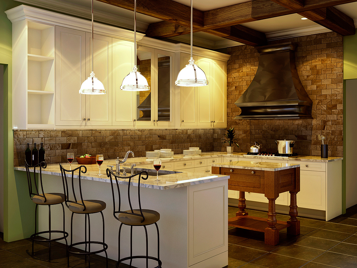
Nice overall feel. The pot is a bit too bright; looks more like silverware. There is a strange square of darker brown under the table; especially since it doesn't line up with the grout lines and doesn't look like a shadow. It's strange how some of the individual beams are half light and half dark. The items on the counter seem a little too rigidly spaced/placed. A little more casual asymmetry would add a another dimension of realism; especially the plant and the utensil holder placed so symmetrically to the sides of the hood.
w
watsdit ?
Report Abuse
the reflection on the window of the hood seams a bit weird to me but i am very new with this so maybe its me and it just look so real very nice job!

Bradley DeWald
Report Abuse
You are right, the ceiling lights are very strong. When I sent the render to the farm, it was missing the IES file. When I reloaded it, the power value was reset to something very high without me knowing until the render was done. Because I was on a deadline, I opted for just trying dim the lights in photoshop. If you think they are bright now you should have seen them in the raw render! It may be worth going back, though, just to get right.
The floor is modeled geometry, and the grout line probably is too low, thanks for pointing it out!
These are all wonderful critiques! I feel like lately people just say "nice render" and give no actual feedback (not that I don't enjoy the praise ;)), so this is definitely refreshing. Keep em' coming!

Travis Schmiesing
Report Abuse
http://www.mrcad.com/download-free-ies-lights/

Ryan Watson
Report Abuse
As always, nice render Braddewald. Maybe some dishes for the cubbies on the left? They look barren. Also, maybe a couple lights behind the glass cabinets to add some depth.
@Crazy Homeless Guy - what IES collection is that? I've been looking for a similar IES fixture but my limited resources haven't turned any up. Any info would be appreciated!
G
Girish D Joshi
Report Abuse
For me the render looks very nice. I do agree in a way with Travis.
The edges of the hanging lights look a bit strange. Also, shouldn't the ceiling spots be in the center of the boxes.
Also, from the angle it seems the last door on the upper storage area would struggle to open due to lack of space and hit the exhaust. But I guess that's completely because of the angle.
Well done otherwise. Really a good render.
Travis Schmiesing
Report Abuse
Agree. I am not sure if they are to strong, or it is the ies file. That is 16.ies from the nice collection if I am not mistaken. It is the most overused IES in renderings today, and actually I think it represents the light pattern of a MR-16 bulb.
Otherwise, good job.

Jonathan Sanchez
Report Abuse
the clg lights are way too strong Bradley.. otherwise, nice job.
D
DanielDoerksen
Report Abuse
looks awesome, a few comments from me. the wood grain seems a bit large, and high on contrast. im not a big fan on the edging on the marble counter top not that it couldnt be like that irl, but it makes me think low poly cg. either your normal map for the floor tile is too strong, or if its actually modeled tile the grout line is too low. i only say that because my eye is drawn to the grout lines. which is less then ideal imo.
overall great work the lighting is nice, maybe a little too warm if i had to crit on it.
I
Ismael 1-1
Report Abuse
I like the image too. Seems like you would not be struggling much from hereon.