proxxy
You must be logged in to post a comment. Login here.

Benjamin Steinert
Report Abuse
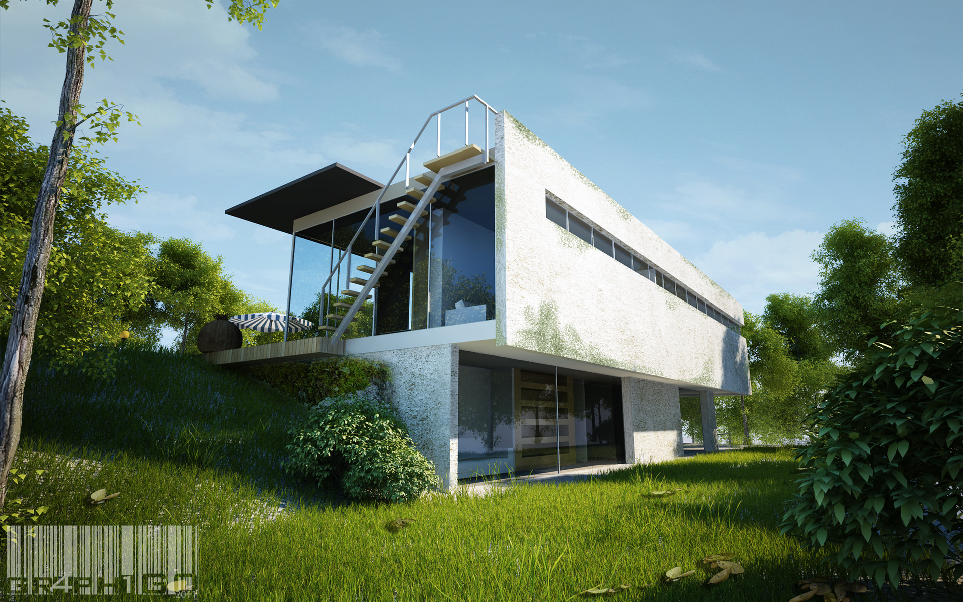
I agree. The texture on the wall needs work. Currently it looks like mold is growing on it via a photoshop brush. It was the first thing my eye was drawn to and I really didn't get over it to see what was going on in the rest of the image.
EDIT: At cgtextures.com, there is a grunge -> grungemaps section that could help to achieve a better look for what you are attempting I think.
I fail to see how your comment is better in regards to the author of this posting's request for c&c...in fact I would deem it far less meaningful to the creator of this image.
After returning to the image and ignoring the building, I think everything else looks great.
o
omec cre
Report Abuse
nice job :)

muck mews
Report Abuse
thanks boss, im flattered!
yap, a few comments on the ground color. will take a serious action on the next project.
~cheers to u too!
-muck
muck mews
Report Abuse
Dear Ethan,
thanks for the blur tips! y i never thought of if it. i will surely use it from now on! haha
~cheers mates!
muck
Marlon Giron
Report Abuse
amazing render

MikeDugenio
Report Abuse
It's this kind of critique that gets no one, no where.

Juraj Talcik
Report Abuse
Maybe it's my architectural background, but to my eye corrected verticals, so your image is just 2-point perspective look, might look better in certain instances when building is focal point and takes most of the image space.
I think it would suit this composition, and maybe slightly (just a bit) higher camera ;- )
MikeDugenio
Report Abuse
Well, when somebody asks for critique for proxy'ing, I just usually look for the common faults that tend to appear when playing with proxy.
First of all the ground plane needs a material. I like variation in growth, but when you can see through to the ground, it shouldn't be white obviously.
Talking about variation. It looks like to have 2 types of patches, one short and one very long. Perhaps adding 1 or 2 more types of grass to spread it out.
Else it looks pretty good. It's also a good idea of cover up the horizon with something.
muck mews
Report Abuse
Thanks Mauricio!
the beauty of an art is very subjective. Glad that u love it. ^_^
regards,
muck
M
Mauricio Metz
Report Abuse
Pretty cool render!!! I like the contrast between shadows and light, it gives de house
a good volumetric perception !!!
muck mews
Report Abuse
glad that u love it. will taken the advice in my next project.
thanks a lot. =]
muck mews
Report Abuse
dear Ethan.
thanks for the meaningfull comments. Hey, its a good tips indeed! will apply it for my next project.

TiM Rynek
Report Abuse
I love the composition, really great!
If You need some advice... try to use the same texture for 3d grass & ground. Cheers!

Ethan Janssens
Report Abuse
There's a fist-rule in the movie industry when making animation movies like Wall-E and so on where they're "trying" to approach a photo-real look:
-every item in the background is low on detail in the geometry, shaders, ...
-every item in the foreground is HIGH on detail in the geometry, shaders, ...
If the foreground would have the slightest more of attention, you'd be much closer to a very strong image.
Also mention what it is you do in the CG-process... If you dont model the building, but the environment, it's really mention-worthy, cause then we're not even going to check for model-mistakes in the building, that's on "Evermotion" then, not on you.
Anyway, there's some good stuff in here, just the foreground bushes and other elements need more detail. Try a blur of depth to blur the foreground if you're not up for added the amount of detail needed m8 ? Always does the trick for me
cheers
muck mews
Report Abuse
thanks mate ! it just a 3d library collections. =D

Peter Mitchell
Report Abuse
All looks nice and lush to me. I actually feel my hayfever coming on...
muck mews
Report Abuse
thanks MD. appreciate that! =]
M
Mark Daniels
Report Abuse
I see - the materials and foliage are excellent - well done.
muck mews
Report Abuse
dear MD,
the model are just a sample from Evermotion model collection. i did not touch the model at all except the materials. anway thanks for the comments. ~cheers!
muck mews
Report Abuse
thanks for the comments. actually it meant to be gravel. thats it looks greyish. =]