Minimal Loft
You must be logged in to post a comment. Login here.
D
Dennis Brunn
Report Abuse
Great design and color style.

Carlo Pascaran
Report Abuse
absolutely STRIKING!!!...

Michal Ziobro
Report Abuse
Viz of a week at least. Concept lightning cam etc. are perfect. Congrats
Juraj Talcik
Report Abuse
Thank you :- )
They do appear quiet big, but the riser is proper, from Lehman's formula :- )
Mario De Achadinha
Report Abuse
Great work

Prashant Sahai
Report Abuse
Hi Juraj, these are the amazing renders.
I just want to know about the riser of the stairs... are they are not even and big or is it my eyes?
And Tron thank you for such a lovely script for the stones. thanks. :-)
G
Girish D Joshi
Report Abuse
Beautiful renderings ! love the mood setup. Excellent feel to it. The bed needs a lot of work. It's look to plain.
Oh the add a light on the dinning area :) I can't what am eating at night :P
T
Tiago Alexandrino
Report Abuse
Really nice concept, love all the composition! Congratulations! :D
Juraj Talcik
Report Abuse
That's amazing script ;- ) Thank you.
Antoine Desjardins
Report Abuse
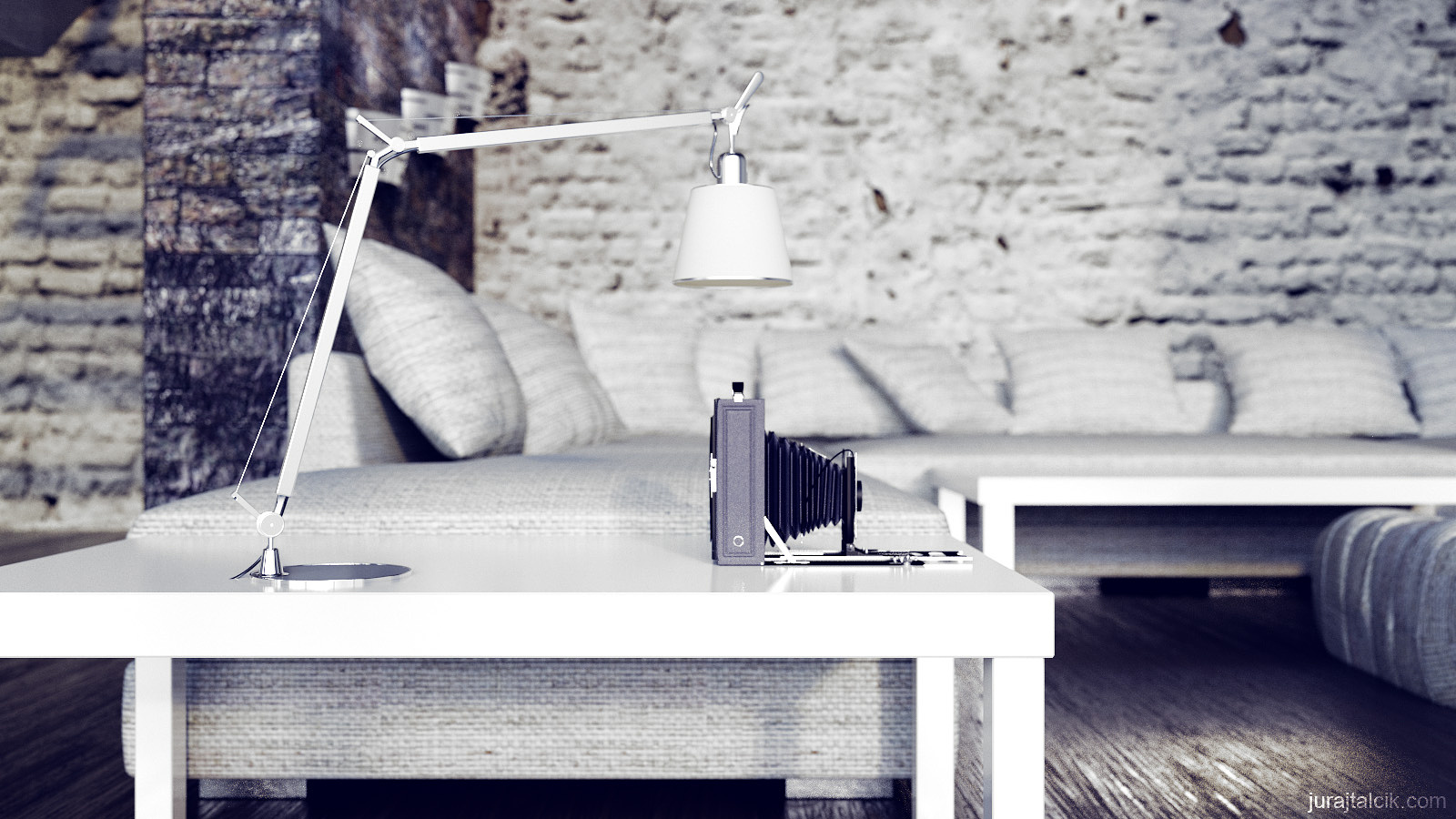
there is a stone script that builds modeled stones.. this might add more realism to that foreground brick wall. check it out: http://www.scriptspot.com/3ds-max/scripts/stone-placement-tools
Might be the way to go to get more convincing bricks if the cam is close-up.
again.. these images are amazing... its just that brick.. fix it and you got some top notch stuff.
Juraj Talcik
Report Abuse
It does look flat, and reason is that I can't make proper displacement maps. Even though now there is displacement, it's visible only at close angle, and the effect isn;t too pronounced.
You might be right about the texture too ;- ) I allways eye-ball this one, and sometimes wish to show it too much.

Dusan Stevic
Report Abuse
Great composition and definitely great atmosfere. Materials are awesome!

bartek stanczak
Report Abuse
Nice work Juraj ! If I was to change anything it would be the texture on the couch - it's way too big. Also the brick wall, although it has a high contrast it looks flat. Besides that good job ! Nice floor on the second image. Cheers !
Juraj Talcik
Report Abuse
Thank you Tron. Are you sure it's that blurry ? It's not the most highrez texture I could get, but it's still pretty large at over 6000x8000px. The first picture uses mild DOF. at small resolution here it can look confusing, I am not sure.
Juraj Talcik
Report Abuse
Hello , thank you for comments ;- )
First, I forgot to clarify it, I did model most, but not all, I think you'll be most interested in the Camera and the Telescope :- ) You can find those on 3ddd.ru which is great russian site for 3D. You have to become member though, and use translator, but it's worth it !
As for the color mapping, this was all intentional here. I used "Soft light" in photoshop to get the extreme contrast, I used blue undertones and I calibrated the white to be just that... only white :- ).

Abdullah
Report Abuse
Agree with everybody concerning the design and render quality. may be the images would look better if you could take care of the following issues-
1. The white colors are washed out in most of the images.
2. you got strong illumination coming from the outside. I dont see that source though. may be the camera position. but after all the source of the light could be a bit more visible by showing a sharp light coming from there. well IMHO. tell me if I am wrong.
3. you can adjust the color mapping a little to have the darker part a little more bright. and thats all.
Again its very minor issues that came into my mind. very nice set of images. nice models. did you buy them (source?) or you modeled yourself?
Antoine Desjardins
Report Abuse
Really nice.. maybe a higher rez map for the foreground brick in the first image.
H
Hoa Dinh
Report Abuse
Very nice iamges, but I think the dirty brick wall has wrong bump texture (maybe I'm not right :) )
I like your work, Congrats
M
Mark Daniels
Report Abuse
Great images. The textures and materials are fantastic.

Tom Livings
Report Abuse
Nice work Juraj. I like the crushed colors.