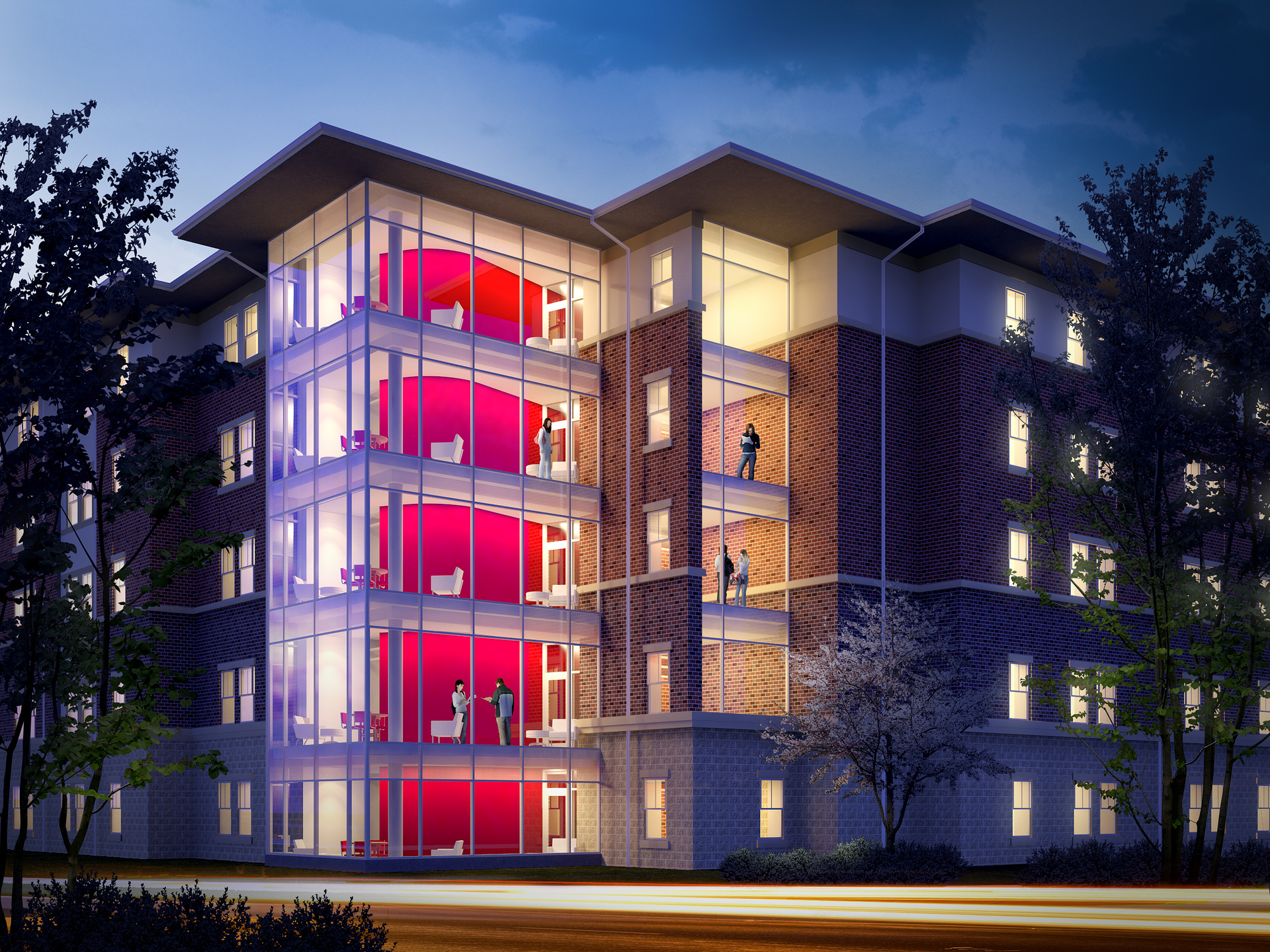
Student Housing - Dusk
You must be logged in to post a comment. Login here.
T
Tiago Alexandrino
Report Abuse
Like very much the mood and the environment :) For me, the only thing, and don't take it as an error, it's the repetition of the decoration in every floor. Great Job!

Ryan Watson
Report Abuse
Thanks for the suggestions guys - really helpful. Agree on all of it.
* Black foreground in elevation shot was used as a titleblock.

Andrew Ryan Parker
Report Abuse
I think the purple in the top image is a little too strong for the actual colour of the sky used. Maybe some more reflections on the windows and a reflection pass used over the people to blend them in more.

Stephane Vanaubel
Report Abuse
First image seems good to me ! Model, light, mood.
Maybe, re organize a little bit seats and chairs. Perhaps a plant or two.
=> To much similarity between floors.
For the second one, seems to be a kind of elevation. Seems good too. Why black foreground?
Ryan Watson
Report Abuse
One of the other images. The perspective isn't too exciting - was meant to show from a particular vantage point.
Need some crits!