
Making Of
The Making Of ReConstruct
INTRODUCTION
Hey guys, my name is Sava Zivkovic and I’ve been working as a lead 3d artist at Whale Shark Studio for the past 3 years. When it comes to 3d we mainly deal in logo idents, archviz and some vfx, but as I come from interior design background every chance I get to do a personal project I gravitate towards architecture as the subject matter, simply because of my ever growing love for it.
This making of article will explore my process for creating ReConstruct, an animated short that has been selected as the winner for 2015 CGarchitect 3d Awards in the non-commissioned category. I’ll go pretty much over the whole process since this project was so much fun to work on. Although I won’t be focusing on the modeling and shading much since it’s been done in so many articles, instead I’ll touch upon some tips and tricks not commonly seen in arch viz tutorials like working with a music composer, pre-viz and some technical stuff as well like pflow, frost, rayfire etc.
So with that said let’s get started because it’s going to be a long one☺
Here's the final animation and process video:
THE IDEA
Last year I was lucky enough to get a nomination in the same category, and even if I didn’t win I got the chance to hang around at Mundos Digitales with some of the best from the industry and listen to some amazing lectures as well. One of those lectures was VFX of “Transcendence” starring Johnny Depp, which I didn’t see prior, but as soon as I saw the shot of the nanotechnology coming out of the ground I immediately thought of the idea for the animation.

I envisioned how cool it would be to have this technology available for architecture construction, or for that matter reconstruction. And as soon as I thought of reconstruction, the Museum Of Contemporary Art in Belgrade popped into my head, since it has been sitting neglected for so many years. This is all happening at the lecture by the way☺So by the time it was over I already had a rough idea for the animation, which I started working on as soon as I got back to Belgrade.
THE GOAL
Win the 2015 architectural awards☺On a more serious note, I was hugely inspired by all of the amazing work from last year that I simply had to give it another go. So I analyzed the submissions, and the winner was vastly different in two regards, style and the animation itself. Most of the arch viz short films are still using Alex Roman style, myself included, probably because we are still inspired by him. And copying, or using his style is essential, while you’re learning. Once you’ve made your first film you should really try and make something a bit different and find your own style, otherwise you’ll just end up making the same thing over and over again.
So, back to the submissions, everybody had the exact same type of animation, camera only movement with some trees and grass waving around, Alex Roman-esque split screens, focus pulling sound fx, film grain and a very calm orchestral music or a piano track. But John Szot with Brooklyn Digital Foundry did a fresher approach, where they did this clean modern look with some impressive animation of bricks forming the building and some very creative light projections. The music was also very different and contemporary.

So with all this in mind I made my list:
1. Tell a simple story about reconstruction with nanotechnology (so it’s a bit more than just a collage of renderings)
2. Hire a professional music composer and sound designer (I didn’t want to be constrained in the edit or the mood with premade songs)
3. Make animated elements that matter in context of the story (trees waving around does nothing for this short except prolong its render time)
4. Go bigger (aerial shots and full HD 1920 by 1080 render)
INSPIRATION AND REFERENCE
Whenever I start my projects I copy my template folder structure that looks like this:

Then I start looking for reference and inspiration. Reference could be photos of the museum itself, which is nearby so I could visit anytime if I need more photos, or it could be photos of a particular look like a foggy morning, or how a river looks like from the air, anything I might need for a specific shot.

Inspiration however, are things that inspire me and might not have anything to do with the animation itself, but they do awake some emotion that might push me in a certain direction. So it could be a cool music video, title sequence, game trailer or a specific sound design from an unrelated animation.

Since we're talking inspiration and reference I highly recommend this video, as well as all of the other videos on the Division05 channel as they provide invaluable information about composition, editing and motion graphics in general.
PRE-VIZ
I'm starting off with pre-viz since this is the most crucial stage when attempting to do any type of animation. We all tend to lose ourselves in the endless modeling, focusing down to the details that won't ever be seen in the end product, probably because we want to respect the architecture we are portraying. Generally the more detail you have the better, but sometimes this is actually hurting your flow and production time significantly.
So from the get go I knew that there are going to be two models of the museum, the current neglected state and the restored one. The idea was to start building the restored version and then slowly destroy it, but in doing so I got stuck in the modeling process and nearly forgot that I didn’t have a plan for the animation other than a vague idea in my head. I immediately shifted my focus to creating the animatic because I realized that once you have the completed pre-viz you can work on a per shot basis, tackling them one by one, never worrying about the stuff that’s not seen by the camera and ultimately saving a ton of time.
The first thing I did was determine the duration, I wanted it to be very short and to the point, and keeping in mind that I had little time, the shorter the animation was the better. Also I had to consider the budget, because composers usually charge per minute, so again 2min animation seemed to be the way to go. One thing I had to leave out due to the short duration was the interior of the museum, which I regret the most since it’s really a prime example of a well thought out space. Not focusing on the interior tough saved a lot of time in the modeling stage.
The next step was to lay out the first edit. The rough structure for the edit was basically consisting out of three parts:
- Establishing shots showing the current neglected state of the Museum
- Reconstruction
- Rebirth of the Museum
Once you have a rough structure you can start exporting previews and filling up holes in your edit. One thing that helps a great deal is to compile a soundtrack that is going to be used as a temp score. This is extremely helpful when editing since you have some beats to work off of, and it also helps the composer to get an idea about the tone you’re after.
After 12 different versions this was the final locked pre-viz
I wish I could give some more concrete editing advice, but I’m pretty much a novice in this field. The only thing I could say is watch a lot of movies and animations, pay attention to the pacing and where and why the cuts are made, and try to replicate. Do not rush your edit and when in doubt go with your gut.
WORKING WITH A COMPOSER
Premade songs are great, and sometimes you just find a song that fits perfectly to your animation, but using them can sometimes get you into trouble with copyright issues etc. That said, I’ve always wanted to work with a composer but never had the chance, until now.
It’s often said that sound and music are 51% of the whole film experience, it’s more than the image itself, and I absolutely agree with this! Music has the ability to control the emotion unlike any visual and can bring the most mundane piece to life, and good sound design can make an effect look far more believable. So hiring a professional sound designer and a composer just opens a whole new world of possibilities for your film or animation and brings up the production quality significantly.
While working on the previz I was constantly scouring vimeo and soundcloud for sound designers and composers, looking for people who worked on tonally similar projects, and I have eventually made a list of about 15 sound design studios and composers. At the top of the list was one of my favorites, Joel Corelitz http://waveplantstudios.com/
Ever since I saw the loom animation by Polynoid a couple of years back I’ve dreamt of having sound like that in my work someday, so it just felt natural to try and contact Joel first.
So I sat down and wrote the most sincere email I could, explaining that this is my first time in working with a composer etc. and to my surprise Joel replied, and was very interested in working with me on this project!
One advice I could give that I think would help is to have the pre-viz and some still frames ready when you approach composers, that way they can already see if this is something they’ll be interested in without even reading one word from your email.
These are some test renders I’ve sent to Joel alongside with the pre-viz

Once we’ve made an agreement Joel started working on the score and sound, and since the pre-viz was locked, meaning there won’t be any editing changes, I could go in and finish the animation. The important thing to note is the order in which I completed shots. I focused primarily on the reconstruction stage since that part needed the most attention in sound design, and then turned to all of the other shots since the music is mostly ambient in those stages. This way we were working in conjunction and managed to save a lot of time.
At the end I was blown away by the result and I still get goosebumps every time I watch it!:) I would highly recommend you to hire a composer at some point if you have the budget, not just because they will most certainly elevate your work, but because it’s a must have experience if you want to work in the animation or film industry.
MODELING
I won't focus much on the modeling process since it's been covered so many times before, and frankly modeling a cube like building is fairly easy.
Museum
Here's a brief overview, first I downloaded a rough model from 3d warehouse, and this provided a great reference since it had correct scale and proportions.

The main bulk of the model is just regular box modeling, with most of the detail being on the rooftop. I started with the concrete structure.

Next came the walls and windows.

Followed by the roof, this had the most detail, represented in the lightning rods and ventilation.

A couple of general modeling notes:
Always chamfer edges, there’s simply no perfect edge in real world, plus this way you get a nice highlight.

Use floor generator script for tiles and always use random tilt option to get those imperfections

Use noise modifier as much as you can to get rid of those perfectly straight lines

Here are a couple of small details that help break up the silhouette a bit.


When you copy things around be sure to offset the position and rotation ever so slightly to get that random look.

For the current state/destroyed model I only modeled some broken windows and concrete pillars that were visible in the close up shots. Most of the other damage was done in the texturing phase.


The pillars were hand modeled, then for the high detail I selected some faces, detached them as clone and applied standard 3ds max displacement modifier

I also modeled some blinds with simple planes and noise modifiers, the only variation being the diffuse color and some of them had random cuts to make them look old and used up.

One more tip taken from one of Tamas Medve tutorials, when making windows make sure to use double glazing in order to get those nice double reflections, it’s very subtle but the secret’s in the details.

Lastly since I wasn’t focusing on the interior I modeled a simple ground level with some walls, stairs and dividers, just to make the viewer think that there’s something going on inside.

Environment
For the environment I started with the opening aerial shot since it was the biggest one to tackle, and it would dictate how big the environment should be. I used google earth to scout the location and easily pick the shot I need without modeling a thing since it has 3d buildings. Here’s the location with some chosen shots.

After I chose this shot for composition purposes which I’ll discuss later, I started modeling only what’s visible in the camera, and that would define the whole scene because all of the other shots are much closer to the museum.
First off I had to block out the main land masses, this was done with simple plane modeling, extruding edges along the reference image and adding a turbosmooth on top.

After that I decided to work on the Kalemegdan fortress, which sits right on the confluence of the two rivers. I used this great technique for extracting google earth models to 3ds max directly

After the import the models are pretty messed up, and cannot actually be used due to the insane number of double faces, missing polygons, un-welded verticies, low res textures that are scattered around in ridiculous numbers etc. But the models give you two very important things:
- Correct scale and position of objects as they are in real world
- Reference for re-modeling final assets
This is the final Kalemegdan fortress model after re-modeling, it’s super low poly since it’s far away and we only see it properly in the first shot.

To add detail in the foreground I’ve modeled various benches, trash cans, street lamps, signs and electric posts and copied them along a spline. I’ve also made something like a river trash bundled up on the shore, just to break up the shoreline a bit.

As for the foliage I used forest pro and a bunch of premade trees from Evermotion and iTrees. I’ve created some splines based on the tree density in the original google earth image, which dictated where various types of trees would scatter. Grass wasn’t scattered in the first shot since it's not visible at this distance and it was easier to tackle it with a large texture.

Lastly I just had to add the famous Belgrade riverboats. These re-purposed floating junkyards are now some of the best nightclubs Belgrade has to offer, and also they too help break up the shore and introduce randomness and realism. They are also very low poly since they’re basically going to be silhouetted when the lighting comes in.

As for the grass in all of the other shots I used the same technique as with trees, converted the premade models to proxies and scattered them with forest pro. I used two different grass lengths to add variation as well as some scattered leaves.

Sculptures
The Museum is surrounded by a sculpture park that is filled with works by some of the most important Ex Yugoslavia’s sculptors of the 20th century. I knew that the sculptures themselves are going to be a very important element and there was no going around it. Some of the sculptures were hand modeled like these more geometric ones

And for some of them I had to use Zbrush, and I’m no Zbrush artist so please feel free to make fun of my technique, or I should say lack of it☺ The one thing that took the pressure off a bit was the fact that the sculptures were fairly abstract, so I didn’t have to worry about the correct anatomy that much.
First I posed the pre-made model, then used boolean to merge it with some basic geometry and export to Zbrush where I have sculpted the final model.This was then repeated for all of the other human sculptures.

Here are the finished sculpture assets

As you can see the models are not that detailed, but as I’ve known that from the start I relied on the textures and lighting to help me hide the imperfections and basically have them silhouetted. And since the sculptures are mostly silhouetted foreground elements in the final animation, they’re not really the focus, but they absolutely had to be there.
MATERIALS
Most of the materials are pretty standard setup, simple vray material blended together with a couple of layers of dirt.
Here’s an early test for the concrete material, it had four dirt layers:
- on the edges of the model using vray dirt texture as a mask
- same material but with different vray dirt settings in order to interact with other geometry
- leak mask on top of the model
- black and white mask for random dirt on the entire model

Here’s a bit more in depth breakdown for one of the statues shader. I took a bunch of reference photos for each of the statues for modeling purposes but for materials as well, reference plays a huge role in this stage. As you can see the material is bronze with some heavy patina stains and leaks as well as a lot of dirt.

First off I’ve made a base old metal shader that consisted of a diffuse texture, two same textures in the reflection and glossiness slots and a different one for the bump. Then I blended it with the same but glossier version to give it some wet spots

Then I started working on the diffuse component since it needed the most work. I didn’t unwrap anything, every single object was mapped with standard uvw modifier. I made heavy use out of 3ds max composite texture since I like the speed it gives you, and you don’t have to leave max and work in Photoshop.
First I used color correction and a blue overlay to change the color a bit

Next step was to add some dirt spots, this was achieved with a dirt texture and a high contrast noise mask so I can procedurally control the distribution.

Next was some dirt leaks done with the same texture but with a different mask, which was a black and white texture map this time

And lastly a layer of patina on top of everything, this was done with the same diffuse texture but color corrected to a more green color and using a different leak mask mapped on top of the model.

And here’s the final shader and a comparison

Looks pretty close, throw in some color correction, final lighting and grading and you won’t notice the sloppy uvw mapping :)
I won’t go further into shading since the process is basically the same, but the same principle from the modeling stage applies here. Only spend time on complex shaders if you know they’re going to be seen in the final shot or if they play a major element, if it’s some small screw on the other side of the building a simple metal shader with no textures will do just fine.
LIGHTING
This will also be a brief section because I want to dive into compositing, and most of the mood was achieved in post anyway.
So while I was developing the concept for the animation I always knew that there would be two lighting scenarios. A very dark and cinematic early morning, cloudy and misty blue to correspond to the neglected look of the museum and evoke a very cold and forsaken feeling. And as a contrast to that, a bright sunny day with some leftover clouds casting soft shadows all over the bright new museum façade. There was also a transition between the two, with a very warm, morning orange color.
For the first part I used a single vray dome light with an overcast hdri image, and that’s really it, all of the work was then done in post. Here’s a raw final render and a final composited image for comparison

For the transition with the sunrise I used standard direct light, I still prefer it to vray sun since it gives me manual control over the color. I animated the position of the sun, color and intensity to give it that morning sunrise look. To mimic the skylight I didn’t use vray sky linked to the light, I just left the hdri in the environment slot but turned off the dome light. Then I replaced the sky in post.

And lastly for the daylight scenario I also used a direct light with the same overcast hdri image in the environment slot but with dome light turned off. I’ve also placed a noise texture in the light’s projector slot to simulate some leftover clouds from the earlier storm, and basically use them as a diffusor.

One important thing to mention here is the lighting continuity, and that you don’t have to follow it always. Typically in film you have to keep track of the light positions in order to keep the continuity, so for example an actor’s face is lit from the left side and then two shots later he’s lit from the right, that sort of thing sticks out. But rules are there to be broken at some point, as you can see in these two shots from the fellowship.

The moonlight is clearly coming from behind Frodo, but then it’s behind Sam and the guys as well in the next shot. Do you notice this while watching the film? Absolutely not, because you’re drawn to the story, plus there is a sort of continuity going around in the color and mood of both shots.
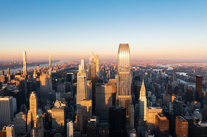
This is also way more applicable to animations because at the end of the day you’re just making images that need to look as nice as they could, so you can use the light as a tool to help you create a more appealing composition. If you think you absolutely have to use the correct sun position as it is in the real world then you’re seriously limiting the advantage of CGI. This obviously doesn’t apply to a commercial skyscraper project in New York where the sun direction has to be accurate.
The continuity tips were taken from the Gnomon Workshop’s Efficient Cinematic Lighting, I highly recommend checking out the lecture.
http://www.thegnomonworkshop.com/store/product/981/Efficient-Cinematic-Lighting#.VcZTH_mqpBc
COMPOSITING AND SHOTS BREAKDOWN
Here we are at last, everyone’s favorite part☺ I’m going to go over all of the different effects and break them down individually.
Opening Aerial Shot
After I replaced the sky the main render elements compositing on this shot is pretty straightforward. I used lighting, GI, specular and reflection passes blended in various modes to darken up the grass and some models that were sticking out a bit. I also used ambient occlusion to add some additional soft shadows.

The main work is then done with compositing the fog using zdepth pass. The common mistake is to just invert the zdepth and use the screen blending mode and call it done, but the real power of zdepth is to use it as a luma matte and composite a variety of different fog elements. When looking up references I found that fog is rarely that uniform, it will usually be denser in some areas while being slightly broken up in other, so I tried to replicate that.
First off there was a straight inverted zdepth pass, followed by background fog sitting in between the main environment and the sky, and then some horizon fog to soften that harsh horizon line.

Next up was fog footage layer made up of various stock footage smoke elements to give the fog some life and have it actually move a bit.

And lastly I used after effects native camera tracker, tracked the scene and threw in some 2d clouds on the upper right. I scaled them and offset their z position in order to achieve a slight parallax effect.

After the shot was nice and foggy I started working on the first color grading pass with magic bullet looks. I often make a couple of adjustment layers when color grading, that way I can easily control the opacity of an effect if I want to dial it down a bit.

Next up is the curves and color balance adjustment layer, giving a cooler feeling to the whole image.

Followed up by the MisFire vignette and frischluft depth of field

And lastly an image filter and film convert pro. I didn't use film grain on this project as I was after a cleaner look than my last year's Case Study project, but I did use film convert's awesome color grading tools.

I want to mention that I still haven't found the most technically correct layer order, but I'd dare say that in the end it's inconsequential, and if you focus on other aspects of your film like story and design, viewers won't even notice the compositing mistakes.

Adding 2d trees

On this shot I decided to add a 2d tree in post since I felt the frame needed more depth and I needed a way to make it cut better with a previous shot which was full of bare trees. Adding the tree was fairly easy since the overall lighting is very dark and the tree would be out of focus too.
First I tracked the scene, again with after effects camera tracker, then added some tree cutouts. I created two layers of trees and offset their position to make it look as if the branches have slight parallax, otherwise it would look pretty flat and you could tell it's a cutout.

Trees were then color corrected and I applied frischluft out of focus on both layers to introduce some depth of field.
Rain Effect
Rain was achieved completely in after effects with trapcode particular in conjunction with some stock footage elements. There were two particle setups, one for the main rain and one for the ground splashes. For the foreground windows I tracked the camera and applied some rain stock footage, this approach had the best quality/speed ratio since it was easier to control it in post rather than to create the whole effect in max. Lastly vray wire color pass was used as alpha matte for all individual passes, which made it easy to composite everything in.

Pflow Setup
There were only two fairly simple particle flow setups in max, one for the nanotech coming out of the ground and another one for particles crawling over the sculptures. First one is just a standard pflow, emitted from a square icon, driven by wind and drag forces to give it initial velocity. Then the other particles are spawned by travel distance in a new event.

The other setup was similar with two key differences. The particles were scattered on the statue with position object operator, and the speed and movement was controlled with speed by surface operator. Then the trails were also spawned by travel distance.

Light strobes
This effect was achieved by rendering a separate lighting pass and compositing it back in post. The lights used were 3 regular spot lights whose rotation was controlled with noise controller. The whole pass had a black glossy standard material in the material override slot so that it could be blended easily with screen blending mode.

The background transition to white gradient was animated in after effects since the sequence had alpha channel included.
Particle Restoration
The three close up shots of particles were done with rayfire voxels modifier, and standard displacement modifier. Basically we have two simple subdivided planes, the first one has a displacement modifier with animated radial gradient to drive the displacement. The second one comes on top and has a rayfire voxels modifier with animated noise texture that controls the scale, rotation and position of the particles.

The whole inspiration for this effect comes from the last year's winner in commissioned film category, so thank you Revolution studio!
Dissolving and assembling objects
Here are the two instances of this simple effect, made easy with the use of several awesome plugins and scripts.

First for the cable dissolving we have Rayfire for fracturing geometry and La Ola which is a free script that lets you control the animation delay effect in real time. You can achieve the same thing with Key Transfer which is also free, but La Ola gives you that real time control.
The light fixture assembly was done with animated slice modifiers and La Ola for adding variety with the smaller pieces. You should always try to make a couple of "layers" of effects, this way you're making something that's fairly simple look a lot more complex.

Here are the links for both scripts:
http://www.scriptspot.com/3ds-max/scripts/la-ola
http://www.scriptspot.com/3ds-max/scripts/key-transfer
Window Restoration
The effect was achieved with pflow and Thinkbox Frost. The pflow setup is pretty much the same as with crawling particles only this time the base geometry was just a flat window. Frost is then used to mesh the particles, and it has a smooth modifier applied in order to get that geometric feel for the glass. I used anisotropic meshing option as that gave me the result I was after, and was able to easily fine tune the look with max stretch, radius scale etc.

Sculpture facets
This is another example of an effect being very simple but effective. The original model was copied and had optimize and smooth modifiers applied to get that polygonal look. Then the copy was scaled with push modifier in order to fit in the original model, and the animation was controlled just with animated noise modifier.

Rust Dissolve
To pull off these two shots I relied on several render passes and compositing techniques.

The setup in max is we have a blend material with a base metal and a coat rust material which are blended together with an animated noise mask. The noise mask is animated in a way that it goes from a high contrast black and white to a completely black map, resulting in complete removal of rust material. There is also a copy of the same noise but set up in a way to only show the edges, this is later used for glow. This is rendered via vray extra texture render element.

Then in after effects we can easily add glow effect on the edge noise render element, and we have a nice glow effect eating the rust away.

The problem is it's too uniform, and even if it fits perfectly to the rust shape it's just not that visually appealing as it could be, so the next step is to break it up a bit. I did this by pre-composing the noise element and adding a black solid on top with a turbulent noise. Then using this solid as a luma matte you can get some interesting shapes, depending on the noise type. Experimentation is the key!

And here's the comparison, the result is a much more visually appealing effect in my opinion

The same technique is used in these window shots, only in this case I used vray edges texture for glow instead of the noise.

Closing Shot
This was the only "cheat" 2.5d shot in the whole project. The reason being since the background is far away and the camera move is a very calm pull back, you don't really see that much parallax in the background so it just made more sense to break the scene in two parts.

First I rendered out a single frame for the background in higher resolution since I wanted to have the ability to scale it in post. After painting in some adjustments in photoshop I brought the BG layer to after effects and started adding people and birds footage, replacing the sky and animating the water.

The water was animated with a displacement map effect in after effects, using an animated turbulent noise.

Next up for the foreground I modeled a simple walkway and positioned a box to cast a shadow over the whole foreground element which will end up silhouetted against the museum.

The foreground was then rendered as a sequence since we're close up and we need to see the actual camera move, plus it was fast to render since the rest of the frame was empty. This is how it looked like when comped in with frischluft out of focus.

Next up was the fog and god rays, achieved with turbulent noise and trapcode shine. These two elements were then composited in with zdepth as a luma matte.

I also wanted to put in some spectators in the foreground, marveling at the reconstructed museum, so who better than my girlfriend and my dog?:) I've shot them against a white wall with canon 650d but I could have easily just use a phone since they are going to be out of focus anyway. The white color of my dog and the black and white shirt Bobi had that day made it very difficult for me to pull a good luma matte. In the end I had to use after effect's roto brush tool, which was a little sloppy but it worked since the foreground is out of focus.

I wanted to have some slight movement of the leaves in the foreground so I ended up shooting some trees at my backyard and comping them in with some tree cutouts. They were shot against a bright sky so this time I could easily pull a luma matte just by adjusting the contrast on the footage.

And lastly all layers were color corrected and the final color grading was applied. Here's the final before and after comparison:

Composition
When framing my shots I'll always try to use rule of thirds, but I'll also try and find any natural lines or contrasting elements that can guide the viewer's eye towards the subject.
Here's an example of the two techniques in the opening aerial shot:

Also when framing shots that have a very prominent horizon line it's always a better to put the horizon either very low or very high. Putting the horizon line at the middle is always a bit jarring to look at, something just feels wrong, but that could also be the way to go if you want to convey that feeling.
Here are a couple of more examples with the same two framing techniques:

Other than these two techniques I'll try and mix it up a bit with other composition techniques like symmetry. It's very simple but super effective as it gives this dominant look when framing architecture.

Another very visually pleasing technique is contrasting elements, usually between the foreground and background.

If you're looking for some more composition tips I'd highly recommend this short video:
and this longer one:
Also concept artist James Paick has this tutorial on environment design which has some advanced composition techniques, I'd say it's a must watch!
And while you're at it I'd also check Feng Zhu's and Scott Robertson's youtube channels, concept artist in general have a vast and invaluable knowledge about composition that can be easily applied to architecture visualization.
TECHNICAL DETAILS
A brief section for all of you technically savvy people who want some numbers from this project:)
The project took 3 months to complete from start to finish, but the work was stretched over the course of 6 months working on and off. The main bulk of the work was completed in the last month and a half before the deadline.
The whole project was rendered on my two machines, a dual Xeon E5-2620 with 32GB RAM and a i7-5820K with 16GB RAM
Rendering process lasted one whole month, with some shots going as high as 3 hours per frame!

The final shot count is 44
All of the shots with moving objects are rendered without GI to ensure there's no flickering and to speed up render time.
The render passes were saved as 32bit .tga images, open exr would have taken up enormous hard drive space
Polygon count was only around 11 million
The project was separated in two scenes, one for the neglected state and one for reconstructed, but there were numerous separate files for all of the effects shots.

The final project folder size is about 200 gb
LEARNING FROM MISTAKES
This project was in my opinion my best work to date, but in the end you have to be able to look at your work critically and try to learn from it and see what could have been done better.
The biggest issue I can find now is that I could have made a better use of the setups and payoffs. For example you see the light fixture assembling but you have no idea where it's located. I could have had an establishing shot showing the holes on the bridge roof where light fixtures used to be and then when the reconstruction starts you'd know where everything is.
The other things are motivated vs unmotivated camera movement, pacing and editing. All of those things maybe seem minor but are the hardest to even try to master, and also they are the key component to making a good film.
These are the things you notice on insane number of repeated viewing and input you get from other people while working.
Which brings me to this, ALWAYS have a select number of people commenting on your work while it's in development. The input you'll get is invaluable as you can easily get blind and not notice obvious problems simply because you're starring at the project for so long.
Also a very important thing I'm including here is strategy for launching your film. You have to have a plan that's going to get your film out there to the most viewers as soon as possible. While I was uploading to vimeo, I was simultaneously making a project on Behance and writing emails to all major arch viz portals as well as posting in all cg forums I could find. In the end the one thing I regret the most is not having the making of video and article released with the short film to maximize the views.
Here's a great, must read article on this subject:
https://www.shortoftheweek.com/news/how-we-launched-our-film-online-the-thomas-beale-cipher/
CONCLUSION
My last year's submission seemed, at the time, like the most amazing thing I've done. Only now I see how it pales in comparison with this project, both in concept and execution. This just proves to me again that if you keep chipping away at the thing you're passionate about, you're certain to get better.
This making of article has been a ton of fun to work on, and I really wanted to include and share all of the things I learned along the way while making ReConstruct . I hope you'll find some of this useful on your own projects some day.
Thanks!
Sava
https://www.behance.net/SavaZivkovic
You must be logged in to post a comment. Login here.
About this article
The Making Of ReConstruct by Sava Zivkovi. Winner of the 2015 CGarchitect Non-Commissioned Film category.
visibility23.8 k
favorite_border25
mode_comment20
Thank you very much. It's amazing how the text was structured. You managed to transport me to the development of this incredible work.
Thank you very much