Making Of
The Making Of Hotel Room
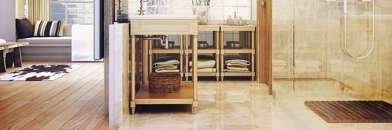
This "Making Of" features the recent work of Alejandro Aguilera and his Greek Hotel Image
Hello friends of "CGarchitect"! It is an honor for me, at the request of Mr. Jeff Mottle, to introduce my first "Making Of". This project is about one of my latest work, a hotel room for the Greek designer Anastassis Vamvakas.
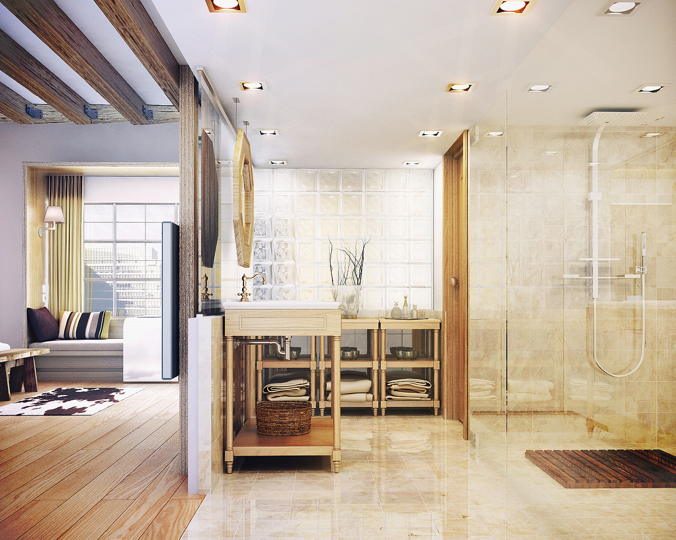
The image is part of three part series. I will focus on the bathroom scene which was created the way I regularly create my scenes, except for one thing: I usually model architecture in 3ds Max however this time I used almost exclusively a client's model made in SketchUp. I added more details where requested or where it was useful for definition. I used V-Ray for materials and lights, and then adjusted the raw render with Photoshop.
The first thing I'll focus on are the references provided by the client. The client had a clear idea of what he wanted in terms of equipment, textures and color, but want to be open about the mood that I could suggest. I decided to create lighting similar to that of earlier images I made, with a very global and diffuse light. I created different shades slightly washed-out, giving an air of peace and tranquility which is ideal for a hotel room. The customer used as reference some of my own previous work to describe what he was looking for.


My initial settings are highly variable depending on what I am trying to accomplish. In this particular case I was seeking a washed-out look. I started with the parameters "Gamma and LUT" as follows:

Modeling
I will not focus too much on the modeling since I do not consider myself a good modeler. I took the architecture modeled in SketchUp by the client, just adding details, beveling edges etc. Many items I use models my library of 3D models. For the hardwood floor I used the big "Floor generator". I thought to do the same for the ceramic floor but in the end I decided to do it with a simple plane texture. I modeled some of the simpler items like the wooden furniture and the mirror (which ended up not being seen) based on excellent references provided by the client.


Point of View
After the scene was modeled I placed cameras with a nice composition. Of the three images made for the hotel room, this particular composition was provided by the customer. I love the front camera with little perspective, especially when it comes to conveying peace and tranquility. Another thing I liked about this camera position was that I could play with different lighting levels, differentiating the light coming from the window background and artificial lighting of the bathroom itself.


Lightning
With the full model and the camera positioned I began the next step: the lighting. It's good to take a look at the artificial lighting because it speaks often to how the client imagines lighting.
As I mentioned earlier I had already given some thought to how I wanted to handle this issue: diffuse lighting coming from the window background, contrasting with the golden hue artificial lighting that I planned to use in the bathroom. I applied a method I've used in the past. Diffuse illumination is emitted by a large cut sphere to which I applied a VRay light material with an HDRI.

These are the SETTINGS of VRay light material. In this case it is very important to select the "emit light on back side".

This is the HDRI I used. It is from the collection of "Viz people" with the following settings.


The other sources of illumination are VRay planes, instanced in every place where there's a light in the bathroom. The lights are as in the following screenshot with warm lighting and a slightly golden tone.


This clay render shows the differences in lighting levels I mentioned. The effect should be subtle so it can be adjusted in post. Obviously the intensity of the light must be tempered with the materials, but this gives us an approximation.

Materials
Let's move on to the materials. The idea was to create a warm feeling, which is not so easy in a bathroom. In the room wood prevails, combined with ceramic beige tones proposed by the customer. We begin to see the wood for bathroom furniture.

These are the maps I created. I used a light oak wood as the diffuse map and then the same bitmap with "color correction" to use as reflection and bump. I made an inversion on the last one to use as glossiness.


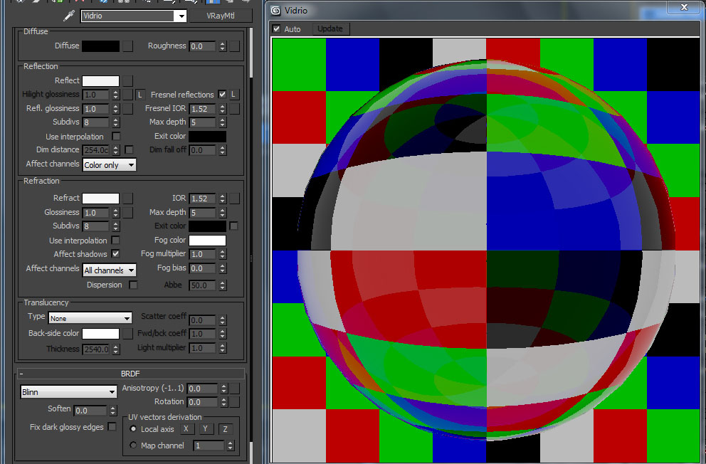
This glass is set as standard for all. Please note that neither the reflection or white reflectance must be absolute.
This is the glass brick at the bottom. It has a map applied to reflection to better control the Fresnel instead of just checking the box.


The following is the wood flooring material using the multitexture as diffuse (I loaded 50 different ash maps) and variants thereof, with color correction for reflection, glossy and bump, as in the previous wood material.


So that the textures look good, I recommend lowering the blur of maps depending on how close you are to the camera and how defined you want the material to display. Almost all my materials have a Fresnel reflection, with regulated intensity to make the material look as real as possible. In the case of wood, as you can see, are values close to 4 which I use.
A very important material for this scene is the ceramic tiles. Here we must be very careful with reflections. If it reflects too strongly the scene will be confusing and difficult to read. If the reflections are too weak the scene will not look realistic and interesting.

This is the base map I got from CGTEXTURES.COM, one of the best sources of free textures out there. From this map I generated a changing pattern trying to ensure there is no repetition, using maps "tiles" and "mix".

I began by using a mix as diffuse and loading the bitmap we saw before in both colors. Each map will give you a slightly different treatment. One will give you a 2-tiling both vertically and horizontally. The second will give you a 2.3-tiling both ways. In both cases the blur went down to 0.1 to get a sharp image. Then, as "mix amount" will use a 20x20 tiles white, with a minimum grout. Then we increase enough color variance to generate a black and white varied mosaic, mixing both maps to generate a map of good size and without repetitions. I then applied this to the floor and then to walls. This "mix map" is the diffuse color of a new tiles.


With another map tiles, this time simple, applied to reflection and bump, we end this material, which is more or less like this:


Camera and Render Settings
At this point I think we're in a position to get the raw render so we can get to the the most important part for me - post production. I think that every step must be carefully crafted to achieve a good render. It's not just a matter of trying to fix everything in Photoshop. The modeling should be careful and detailed, and you should work only with quality models. Materials should be studied carefully, based on reality as possible. Lighting should be thought of in terms of what you want to show and the mood to be transmitted. Below I will share the camera parameters and settings to get the final render.


Along with the raw render I also output a couple of elements that I will need in post production: zdepth, wirecolor, raw reflection and an ambient occlusion pass through a script that you can download for free from the following website: http://www.creativecrash.com/3dsmax/downloads/scriptsplugins/
rendering / other-renderers / c / vray-ambient-occlusion.
With this we are ready to begin in Photoshop.


Post Production
Before we begin I would like to clarify an important point. When preparing the final render we must anticipate that the image will go through a post process. By this I mean that it is desirable that the image obtained is washed and without too much contrast, so we can adjust it better in Photoshop. We start with the three basic steps: curve correction, brightness and contrast and hue saturation. For curves, I always try to achieve a result like in the first image below, without actually getting over exposed areas, or too dark. In the next adjustment, increase contrast, and reduced a little brightness. Obviously the result is a saturated image. For that reason, the third step is to reduce this saturation, while increasing slightly the brightness.


While the image still looks washed-out these steps began to give depth. After these generic adjustments, corrections are made in different parts of the image to achieve results in different planes. I want to generate a significant input light from the window behind, so with an adjustment layer exposure, and a mask made with zdepth I set to the following setting:

Working in the same plane I tried to smooth the result using an adjustment layer Hue / Saturation with the same mask applied and the following parameters:

The next step is also vital: Color correction. I always try to do color correction differentiated by zones so that the image is not flat. For this again I use the zdepth as mask for the adjustment layer. I have two different color corrections, a level close to the bathroom, where I will try to take a little yellow tone overall; and one for the far plane of the window. For this I will use the inverse of zdepth as the mask. This last will take it to a slightly cooler tone.


Now we will give the image a little more power by adding a new layer with raw reflection in overlay mode with an opacity of 50%, and also the ambient Occlusion pass in multiply mode, this time to 100%.

The image is almost ready. Using the colored wire, I select certain elements that I will copy from the original render to adjust separately for various reasons. For the wood floor I gave a little more strength, the basket under the sink was very dark, and the wooden furniture in the bathroom were a bit washed-out.

To differentiate a few more color areas, I created a new layer and gave it a gradient color from purple to an orange tone and then put that layer in to soft light mode opacity 20%.

To finish add a vignetting effect at the edges, small flashes with the plugin Knoll Light Factory in spots, and a photo of some washed background to complete the picture and get the following result.

Well that's all folks! I hope this tutorial will be useful. Any comments or criticism are always welcome. You can contact me whenever they want through my Facebook page: http://www.facebook.com/ADAguilera3dVisualization
Until next time!
You must be logged in to post a comment. Login here.
yamenKH kh
Report Abuse
thank you so much for such nice & pro work
beautiful and inspiration tutorial ..

Jake Bae
Report Abuse
Just wondering would you mind sharing your vray lights subdiv
amount? I was just wondering given your subdiv amounts on your
materials, it just looks amazing on the final outputs.
Also do you mind letting us know what resolution did you use
for this project ?
Thank you , I truly admire your skills and artistic talents!
N
Nebiyu Ahmed
Report Abuse
It was a great tutorial for a new vray and sketchup person like me. It is well explained. Thank you Alejandro.
A
Alejandro Aguilera
Report Abuse
Thank you very much Ricardo and Varum! I'm glad to be helpfull.
v
varun kumar
Report Abuse
nice one...thanks u...
A
Alejandro Aguilera
Report Abuse
I really can not explain the reason for my settings .. I'm not really incisive in technical subject. I have tried many types SETTINGS I have observed in other excellent tutorials. All that I can say is that in this way I get my best results, but I can assure that they are the most optimal. My technique is much trial and error. Thanks for the feedback!

OlaRenders
Report Abuse
great work, the final image looks really nice. I´ve noticed that your render settings really differ from the ones i regularly use, like turning off the antialiasing filter, and cranking up the global subdivisions multiplier up to 8. can you explain me a bit about this settings?
saludos desde argentina!
A
Alejandro Aguilera
Report Abuse
I do not remember exactly but the render took a few hours. Maybe 4 or 5. As for my computer has a Core i7 processor type 4 cores of 3.4 Ghz and 8GB of RAM. Thank you for your comment!
A
Alejandro Aguilera
Report Abuse
I'm talking about aditional lights, but in this case wasn't needed.[/QUOTE]
Hi Alejandro,
Some additional questions, hope you can help me out on this.
your additional lights will places only on the opening ares or surrounding that requires lighting?
For those additional lights, just Check affect Diffuse will do?
What about Specular and reflections? is it needed as well?[/QUOTE]
It all depends on the scene. In most cases I do that only affects the diffuse.
S
Spark Sue
Report Abuse
[/QUOTE]I'm talking about aditional lights, but in this case wasn't needed.[/QUOTE]
Hi Alejandro,
Some additional questions, hope you can help me out on this.
your additional lights will places only on the opening ares or surrounding that requires lighting?
For those additional lights, just Check affect Diffuse will do?
What about Specular and reflections? is it needed as well?
A
Alejandro Aguilera
Report Abuse
I'm talking about aditional lights, but in this case wasn't needed.
S
Spark Sue
Report Abuse
Hi there,
Thanks for your reply. You mean 'light support' as in? we need to add in the additional lights or actually use the sphere that you made? Increase the light density?
L
Leandro Nunes
Report Abuse
very nice...
Rendering time ??
Computer configuration ??
thanks.. great job

ravim shinde
Report Abuse
very nice it is very helpfull to all ,excellent work .........
A
Alejandro Aguilera
Report Abuse
I usually make the full model. In many cases it is important for things that can be reflected. Then, if I need changes in illumination, use "light support" where needed.
Thank you for comment Bing
S
Spark Sue
Report Abuse
Hi,
Also I am curious know abt this. Does your model / room is enclosed? As in all the walls to be build?
What about doors / windows that cannot be seen from the render angles.
Should we close it to make it darker or brighter it up by opening the door / windows?
Any tips on this?
S
Spark Sue
Report Abuse
Hi!
Appreciate for mentioning that fresnel reflection is important to look real. Together with the bump, reflection & Rglossiness which I can actually use the same material and change it using color correction. Thanks again!
Almost all my materials have a Fresnel reflection, with regulated intensity to make the material look as real as possible. In the case of wood, as you can see, are values close to 4 which I use.
A
Alejandro Aguilera
Report Abuse
You are wellcome San Mahajan!

Sachin Mahajan
Report Abuse
Great work and tutorial :) Thank you :)
A
Alejandro Aguilera
Report Abuse
Thank you very much Ricardo!
About this article
This "Making Of" features the recent work of Alejandro Aguilera and his Greek Hotel Image.
visibility54.6 k
favorite_border42
mode_comment28