Tutorials
Tutorial: Color in Composition
Color is an integral part of the visual experience of humans. Through color, we receive a wealth of information about light, materials, and textures, which is critical during our interaction with our environment. In our image-making context, color can either make or break a scene. Using it correctly can help us convey the intended mood and guide the viewer to what’s important. Using it wrongly can destroy continuity, impair realism, or otherwise disturb and confuse the viewer.
This is the second chapter from a full workshop that comes under the title Understanding Color. Having already covered some introductory material about color physics and the human eye, it is now time to go back to our image-crafting context and try to understand the role color plays in our scene and ultimately in the story we want to tell.
The Three Uses of Color
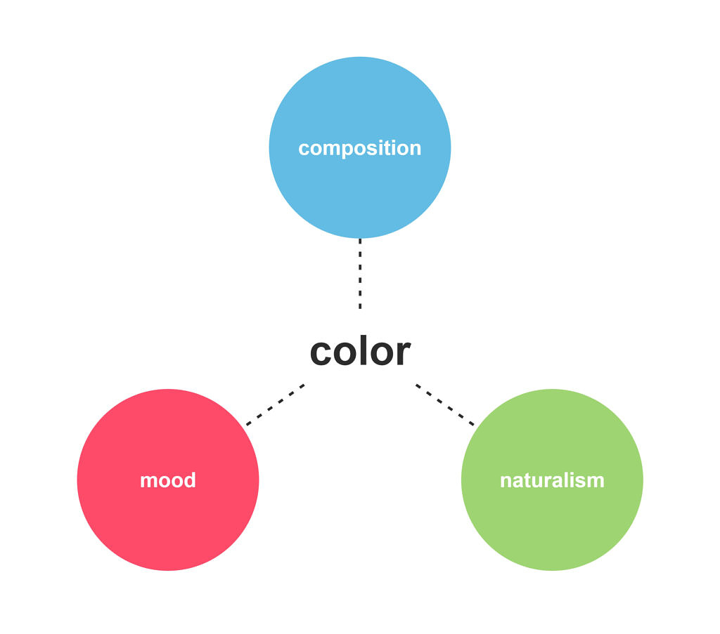
We can identify three different levels at which color can affect our scene: composition, mood and naturalism. The composition is about setting up a focal element through the use of color contrasts and hierarchy. Mood refers to the psychology of color and its effect on the viewer’s emotional response. Naturalism refers to the correct use of hue, saturation, and brightness to produce a result that closely resembles the real world. In this chapter, we will expand on the first level, composition. The two following chapters will focus on mood and naturalism respectively.
Composition
Composition
As already covered in this tutorial, the main goal of composition is to establish a focal element, so that the viewer’s eyes are casually and automatically drawn to what’s important in the scene, thus avoiding confusion and information overload. Since we’ve already elaborated on the topic, we will only spend some time applying the theory in the context of color while also adding some important new ideas.
a. Contrast and hierarchy
To use color as a compositional element we need to think about contrast (remember, the same is true about value and saturation). The eye will be naturally drawn to the areas of the scene where the highest color contrasts appear.
b. Clean shapes
When building an image, we shouldn’t only treat color as an attribute of objects but as an object itself, in the sense that it creates shapes and forms. This sounds weird at first, so let’s go through an example that illustrates the idea.
The take-home message from this chapter can be this: we need to treat color not just as an attribute of the image but as a compositional element in itself. We identified two different levels at which color can be used to improve our compositions, the first being contrast and hierarchy and the second being clean shapes. Mastering these skills will give us the ability to create simpler but more sophisticated scenes — to say more with less. This, for example, is more evident in graphic-style and abstract works where color is the primary compositional tool.
And one final note: we cannot emphasize enough the importance of contrast in image-making. Make it a habit to always look at the relations between elements and not their absolute values. The human mind perceives the world through contrast.
You must be logged in to post a comment. Login here.
About this article
This is the second chapter from a full workshop that comes under the title Understanding Color. Having already covered some introductory material about color physics and the human eye, it is now time to go back to our image-crafting context and try to understand the role color plays in our scene and ultimately in the story we want to tell.
visibility1.2 k
favorite_border1
mode_comment0


