Making Of
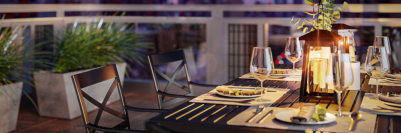
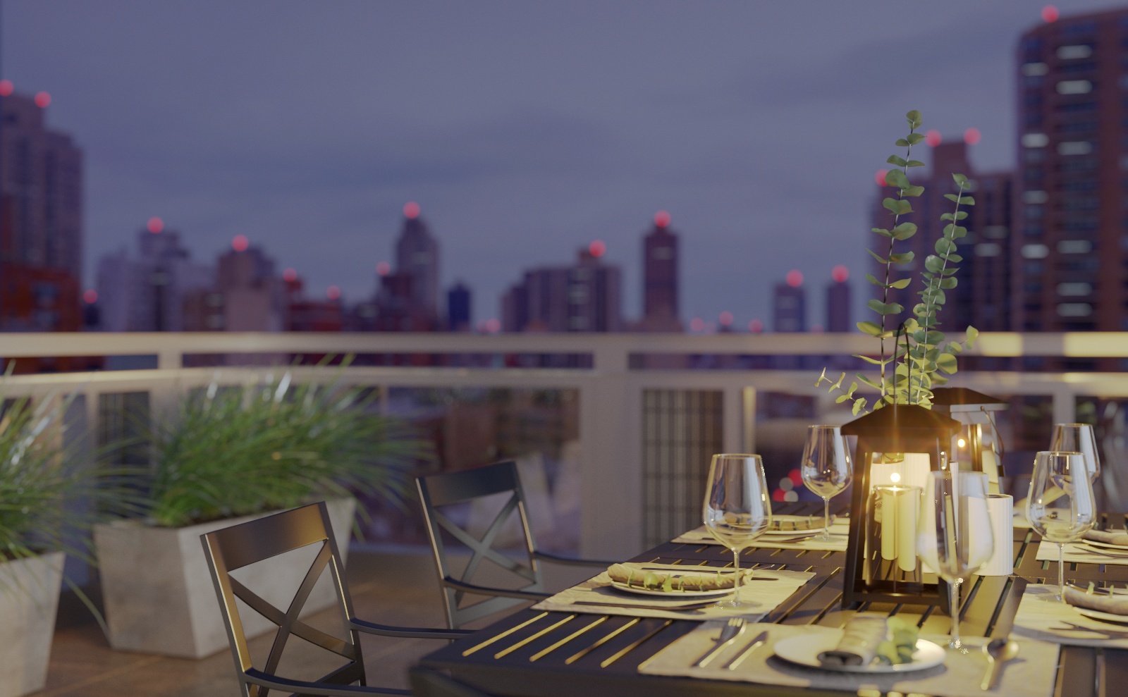
Moise Safra Center vignette

Hope everyone out there is well these days! Many thanks to Jeff Mottle for the opportunity to present this making-of tutorial. I hope it will be helpful to your work. In this article, I want to share a quick approach to creating small vignettes that are intended to support larger "hero" renderings. If done well, they can create a deeper narrative within a set of images. Tools are 3dsMax & VRay, plus a little bit of Photoshop.
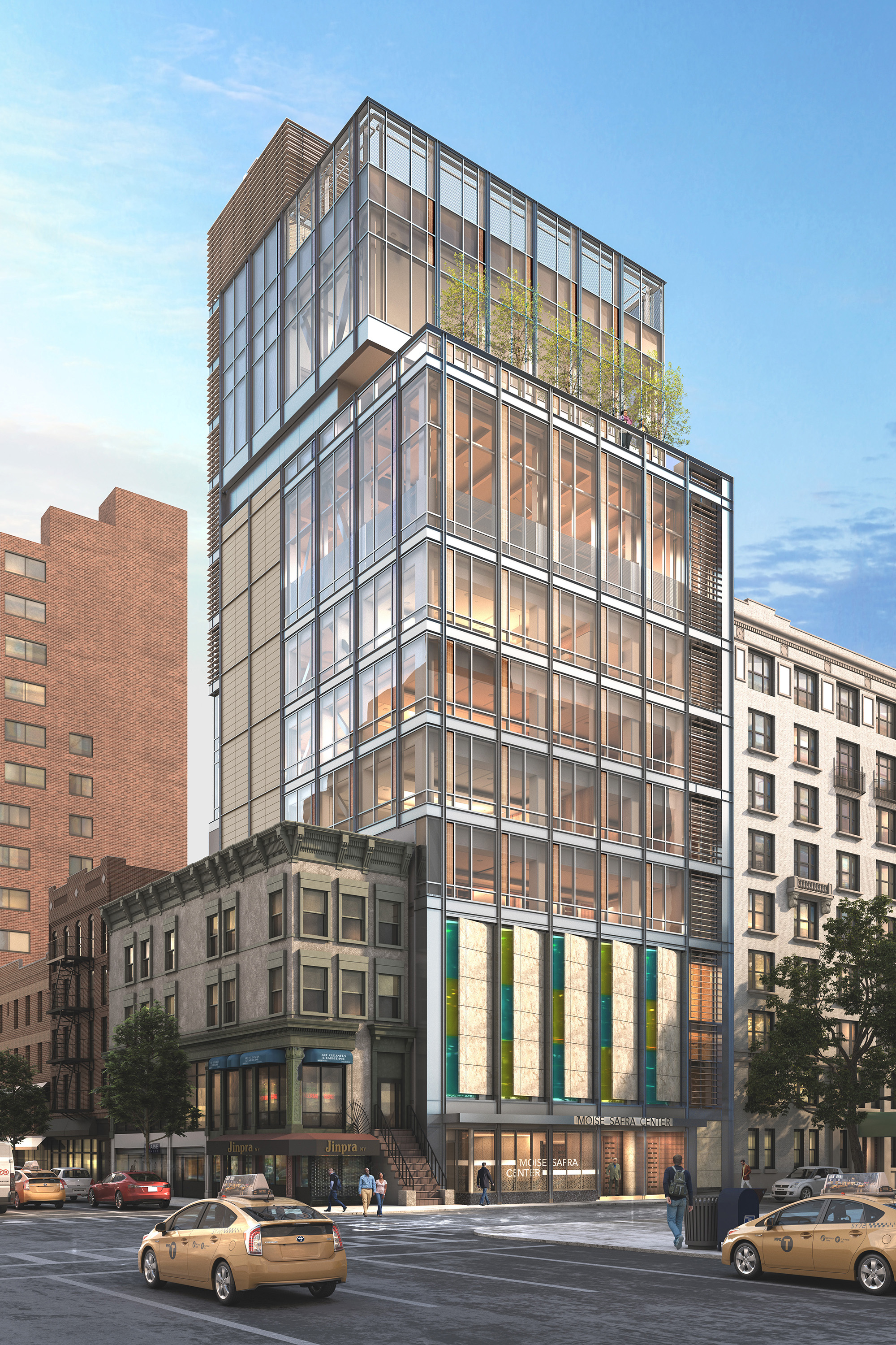
Before we get going, I’d like to give you a little background on the project and how this image came about. The project is the Moise Safra Center, located on the Upper East Side of Manhattan in New York. About a year earlier I had done several exterior renderings, and the congregation (client) wanted to see some of the interior spaces rendered while the building was still under construction. Below is the original overall exterior rendering to give you a feel for the scale. The vignette (above) is taken from the outdoor terrace near the top of the building looking out across the city - specifically, standing at the close corner in this view just next to the potted trees.
Before we get going, I’d like to give you a little background on the project and how this image came about. The project is the Moise Safra Center, located on the Upper East Side of Manhattan in New York. About a year earlier I had done several exterior renderings, and the congregation (client) wanted to see some of the interior spaces rendered while the building was still under construction. Below is the original overall exterior rendering to give you a feel for the scale. The vignette (above) is taken from the outdoor terrace near the top of the building looking out across the city - specifically, standing at the close corner in this view just next to the potted trees.
For these new interior views, the client charged us with creating images to not only “see” the spaces, but more importantly to “feel” what it would be like. We did nine or ten renderings in total which included views of the sanctuary, indoor pool, gymnasium, classrooms and many others. Everyone has their own opinion of course, but I’ve always liked this image as the best of the set. Part of the enjoyment I received from this effort was creating a replicable workflow specifically designed to capture small “moments”.
Additionally, I pushed myself to take this rendering as far as possible within the VRay frame buffer to maintain total flexibility as we went along. If you are familiar with my earlier work, you can see what a challenge this was for me!
With that, here are the steps that I used to create the image:
Give yourself a road map.
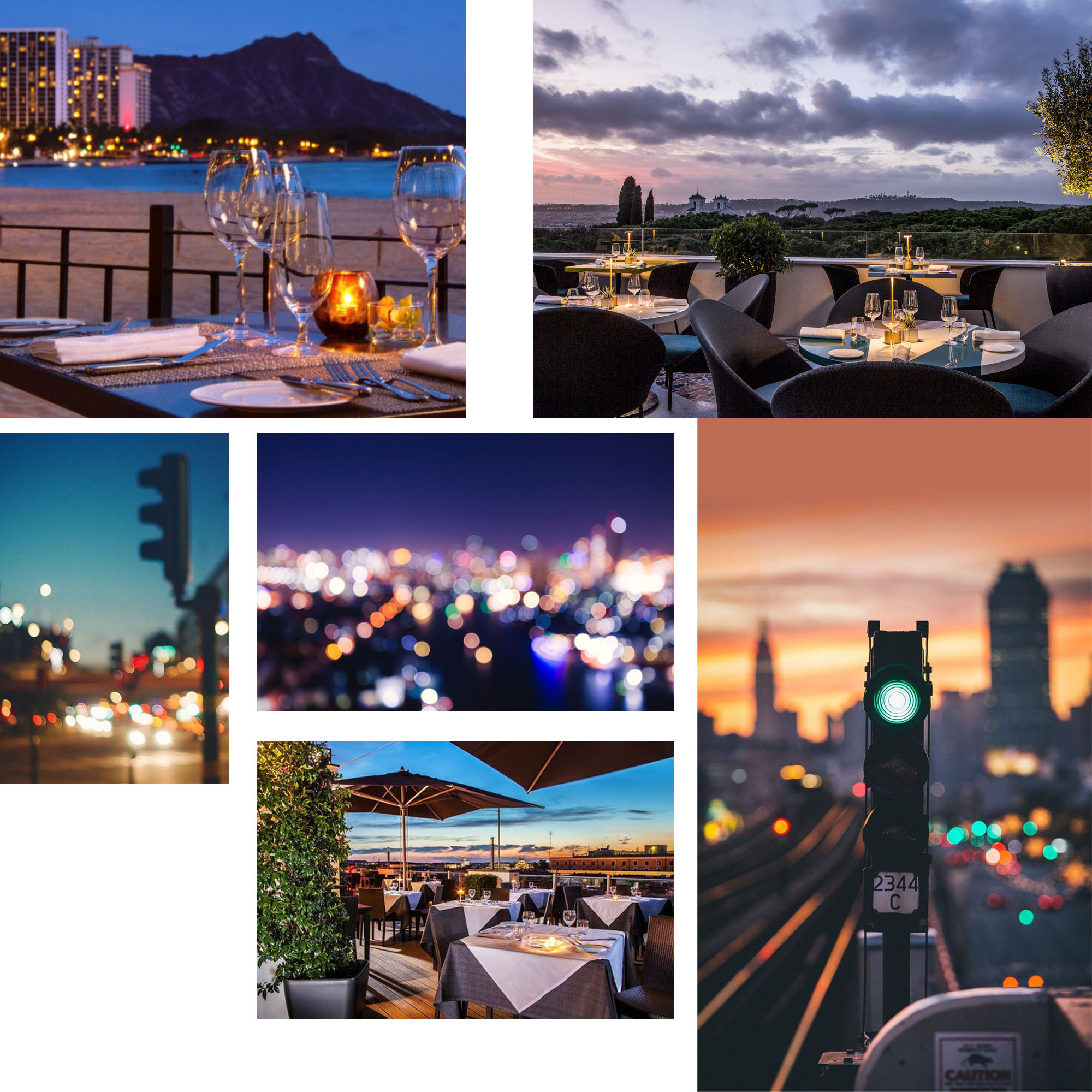
It’s always tempting to jump right in and start setting cameras right away. But it’s essential to first do a bit of research and gather good reference. Define the scope & overall mood and then dig around on Pinterest or also Google Images. I find the hardest part is finding the first image or search term, and then I can go down the rabbit hole of visually similar results. In this case, I found an image of a table setting (in Hawaii of all places!) and it turned out to seed a lot of interesting results. Once I have 10-20 images, I'll put together a quick mood-board for the client to make sure we are of the same mind.
Also, I try to use photography for reference as much as possible instead of other renderings. If you feel like your work is starting to all look the same, it might be because you are self-referencing! I know I’ve certainly been guilty of this habit.
Here are a few of the images that I ended up referring to the most along the way. Some are for color, and a few of the fuzzy ones helped me to get the depth of field / bokeh effect that I knew I wanted to incorporate. Once I had a good vision of what the final image should look like, these references helped "steer" me through the process towards the right solution.
Keep it simple.
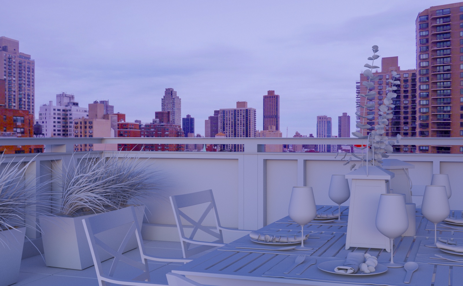
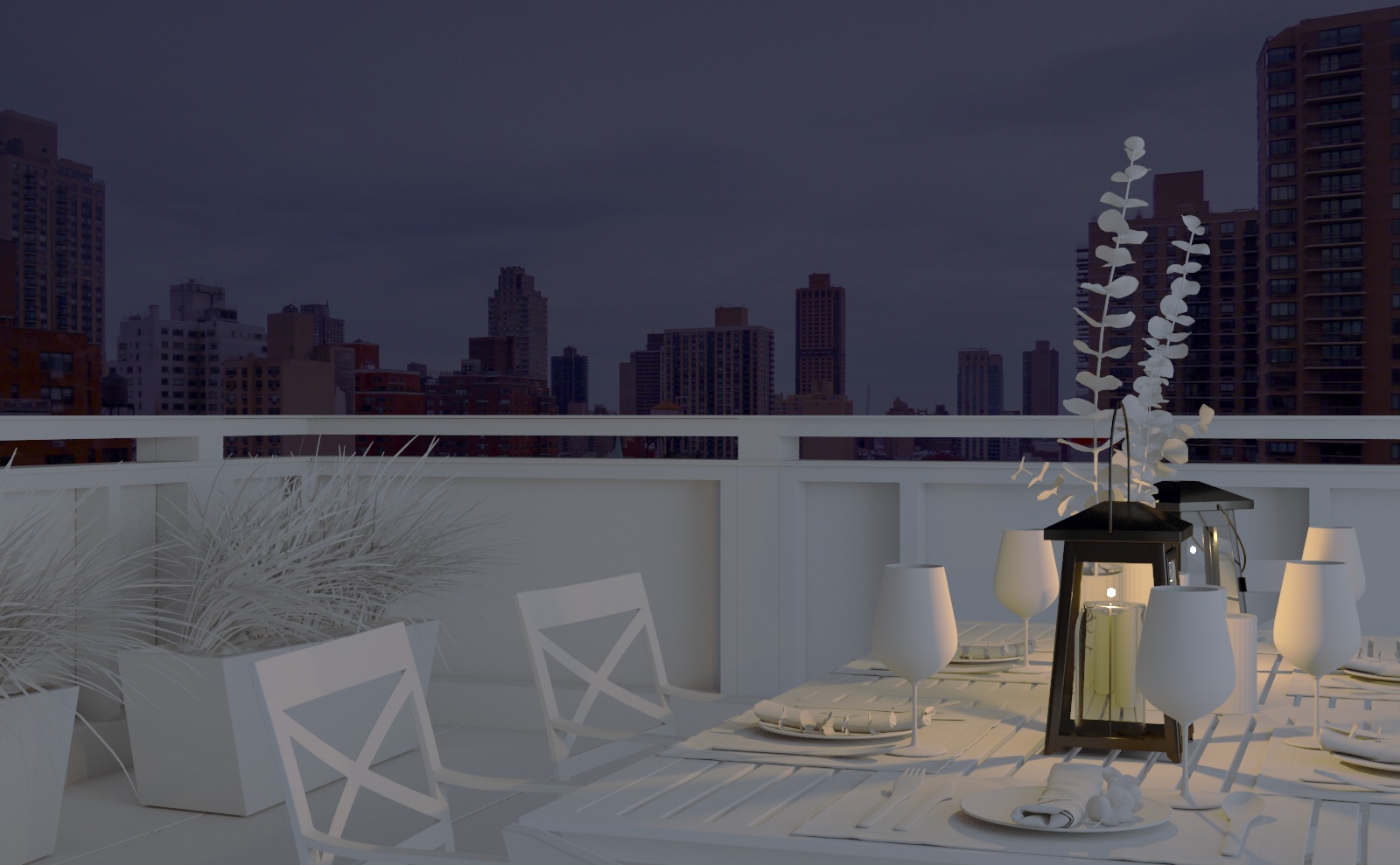
Knowing that this view would be smaller-scale and looking away from the building, I could remove the bulk of the model's geometry and strip everything down to a very light file size. Though I had most everything textured already, I set up a material override in VRay to eliminate any distraction and focus on the viewpoint and lighting. At this point, there’s not much left! But, I can add a VRay plane for the background photo (remembering to exclude it from the override) and start to get a sense of the view. After a little bit of trial and error with spinning and bending this plane, I was able to get the perspective to match up pretty well. Drop in a dusk HDRI and here it is at this stage:

Now that I know about how much of the deck will be visible I can gather 3d models for foreground table setting, planters and shrubs. We don’t have anything specific in mind for these elements so I can keep it pretty generic. A couple things jumped out at me about this particular table model (from 3dsky) - it was mostly dark, which is great for a dusk shot, and it also had a little bit of greenery that would relate to the shrubs beyond.

Keep the material override turned on and arrange the new elements in the scene. With that, it looks something like this:
Make it real.
Set up the physical camera with “real world settings” as much as possible. I sometimes get lazy and just use global exposure, but I do find that I have more control over the lighting (and especially the depth of field) if I go through the exercise of setting up the ISO, aperture, etc.
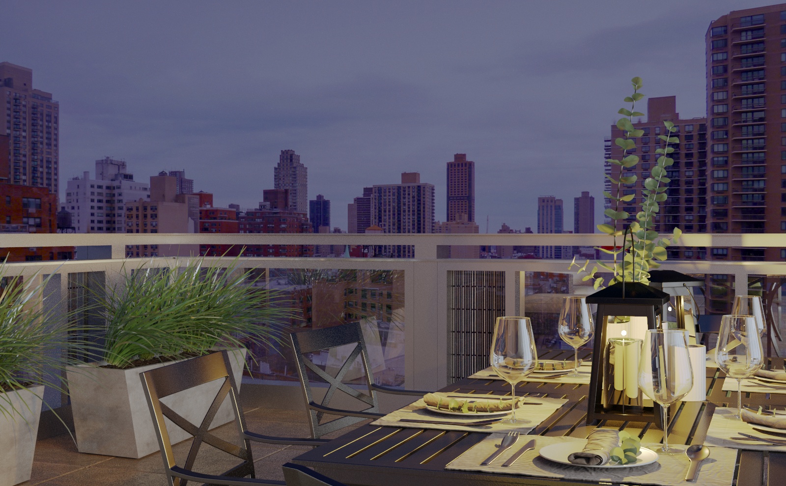
I then created a large fake light located off camera to the right to indicate the glow coming from inside the building. I also wanted to test the light from the candle included in the table model, so I need to exclude these objects from the material override as well. With a little experimentation, the image now looks like this:
Rough it up.
Now that the lighting is feeling good, I can move on to the materials. Time to switch off the override settings and double-check the materials of the imported models. I needed to fix a few of the Normal Map settings, but everything looks okay.
Since most of the finishes are pretty dark in this scene, I had to bring the camera exposure up a bit to compensate. And, some of the reflective objects are now brighter as a result so I had to tone some of them down.
The materials for the building were already done, which was a great jump start in this case. But, because the camera is so much closer to the subject here, I added a number of imperfections to the various surfaces as it would have been very flat without them.
I found a bunch of good imperfection and grunge maps from Quixel and Poliigon to get started. It's generally a matter of adding the new map into the glossiness and/or bump/normal slots and mixing it with the base material settings. In some cases, it's necessary to add an additional UV modifier so the new maps can be scaled independently from the base. I really only had to worry about the pavers and the metal railing, so this step went very quickly.
Set the focus.
Now I can experiment with the depth-of-field effect to make the image more photographic and keep focus on the table. Here are a few F-stop options: 4.0 is pretty subtle, 1.0 is pretty extreme, and 2.0 seemed to be the "goldilocks" setting for this image.

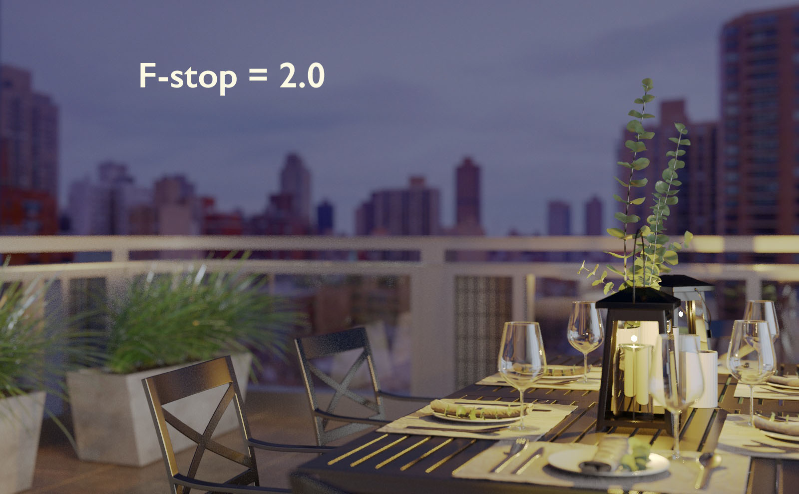

Once I had the depth of field effect nailed down, I needed to revisit the reflective levels of a few of the materials to create highlights and a bit of sparkle in the grasses.
Bring it to life.
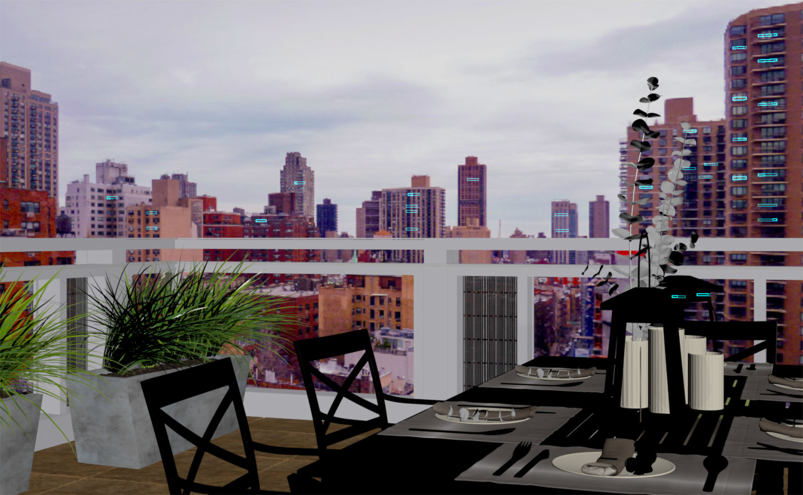
The DOF is good in the foreground, but I still need to get the background light bokeh effect that I was looking for at the outset. Time to revisit the reference! To get started, I added stretched-out boxes in front of the background buildings in perspective. The boxes get a VRay Light Material with a pale yellow color.
In the model, these boxes are floating out in space just in front of the VRay plane that serves as a backdrop to the whole scene. I varied the length and width of each copy of the box as a way of varying the intensity and color of the lights. In the interactive render, I could tweak them as necessary to get the proper read.
With a similar approach I set red point lights at the top of the buildings. These are just small VRay light spheres with a pure red color. They're also floating in space, but carefully lined up with the building tops in the camera's perspective. There's a little bit of the street visible below, so I dropped in a couple more point lights to indicate cars down there.
Note that the placement of the light boxes and point lights is highly dependent on the camera. As a result, it is essential to lock down all camera settings before going through this step. That includes the DOF, which has a big impact on how clear and how strong these background lights will be in the render.
Here's a screenshot of the model with the light boxes selected so you can see them more clearly:
I take one more look at the camera exposure and experiment with different light mix settings, bloom/glare, curves, LUT's, etc. with the interactive renderer going. Then it's time to set up the render elements and final settings. About an hour later, this is what I got straight out of VRay:
Make it real (again).
This is as far as I could take the rendering in Max. But of course, I couldn't resist the temptation to tinker with it a bit more in Photoshop!
My process for this is really simple. Stack everything up in Photoshop with the built-in "Load files into Stack" script. Get rid of any passes you don’t need in the rendering - I usually run a sample rate and a few of the ID passes to test the scene but rarely need any of them in Photoshop. Put the "effectsResult" on top of the stack and convert it to a Smart Object. Experiment with the Camera Raw filter - it's amazing how much the rendering can change in this step. I find that it helps to toggle the preview on and off pretty often to make sure I don't stray too far from the reference. And because this layer is a Smart Object, I can always change my mind later.
My process for this is really simple. Stack everything up in Photoshop with the built-in "Load files into Stack" script. Get rid of any passes you don’t need in the rendering - I usually run a sample rate and a few of the ID passes to test the scene but rarely need any of them in Photoshop. Put the "effectsResult" on top of the stack and convert it to a Smart Object. Experiment with the Camera Raw filter - it's amazing how much the rendering can change in this step. I find that it helps to toggle the preview on and off pretty often to make sure I don't stray too far from the reference. And because this layer is a Smart Object, I can always change my mind later.
Then I'll do a little experimentation with the GI and lighting passes to see if anything pops up. I usually have some luck setting these layers above "effectsResult" and changing the blend mode to Soft Light or Overlay. The ZDepth pass can also be handy but I don't need it in this case. Group any of these layers together and toggle the group visibility on and off as before to make sure the adjustment isn't too extreme.
The last step is to bring some more imperfections to the final image. I'll make a new group on top of the stack and experiment with light leaks, lens distortions & flares, glows to see what happens. These layers are usually set to Screen or Color Dodge. This should be very subtle! It's so easy to overdo this effect. Here are a couple of the imperfection layers set to Normal so you can see them:

Dodge and burn here and there to get a little more punch. Create a new flat copy of the stack (Ctrl-Alt-Shift-E) and add a high pass filter over the whole thing. Done!
Thank you so much for going on this ride with me, and I truly hope this is helpful to you. My one big takeaway from this experience is to keep everything as simple as possible. It's really easy to get lost in the complexity of someone's else's 3D models and assets. Pin down scope as quickly as you can and eliminate everything you don't need. And, stay true to your original intent!
I hope you enjoyed this article - please feel free to leave a comment and of course ask any questions, I'd be happy to help. I'm looking forward to hearing from you!
I hope you enjoyed this article - please feel free to leave a comment and of course ask any questions, I'd be happy to help. I'm looking forward to hearing from you!
Postscript - Recently I've had a lot of really interesting conversations with other artists discussing strategies for coping through this economic downturn. You may encounter significant pressure to reduce your rates here in the short term, but it's really important not to give in! Both for your sake, and for the sake of our archviz community, we need to be fairly compensated for the value we bring to our clients.
One of the ideas that has come up a few times is instead of caving in on price, offer to do a little more than you might otherwise to keep the fee up. And making sure the client understands the deal they are getting of course! Offer to do a night version of a daytime scene for instance, or... offer to do a small vignette of a space that has already been rendered. Another perspective of a small "moment". If you decide to go that route, hopefully I've given you some tools for getting these done and keeping your clients happy! Thanks again, and stay safe!
One of the ideas that has come up a few times is instead of caving in on price, offer to do a little more than you might otherwise to keep the fee up. And making sure the client understands the deal they are getting of course! Offer to do a night version of a daytime scene for instance, or... offer to do a small vignette of a space that has already been rendered. Another perspective of a small "moment". If you decide to go that route, hopefully I've given you some tools for getting these done and keeping your clients happy! Thanks again, and stay safe!
You must be logged in to post a comment. Login here.

Clean image, the coziness of the effect brought the focus to the little things you really want to be there in the environment, I believe that is the intention, where every campaign has to reach, beautiful work.
Thanks for sharing.
Excellent!! Thank you so much for sharing! : )
Hi Joel! Thanks so much for the feedback. Really glad to hear it's helpful. Let me know it goes, and of course feel free to contact me if you have any questions! Hope you are well,
Excellent writeup, Scott! I like how you kept the background and bokeh effects so simple and part of the V-Ray render in the virtual frame buffer. You've inspired me to experiment a bit!
I'm glad to see your last comment on fees and the current issues we're faced with regarding the pandemic and the economy. I've been doing exactly what you suggest - offer your clients added value without compromising on fees (like an additional view that doesn't impact your time significantly). So far, that approach has been working well and my clients have been very receptive to it!
Thanks for your contribution here and kudos to Jeff Mottle for the new site too - excellent work all around!