clemson -
clemson
rhino,vray,photoshop
Hello!
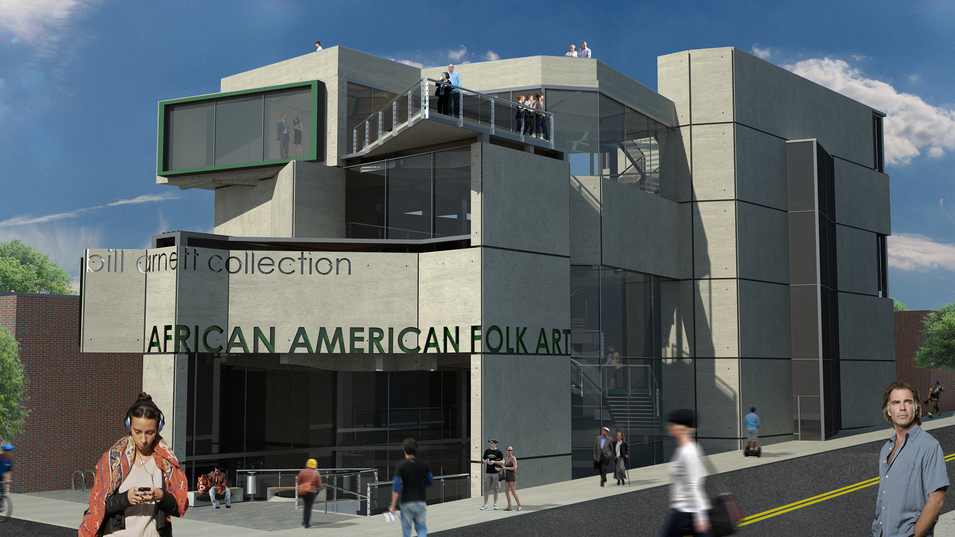
I'm a third year architecture student looking for some feedback and advice on the first rendering I have done for my current project which is due in a little over 2 weeks. The project is a museum/residence in downtown Greenville, SC. I used Rhino and Vray with some Photoshop... I have never been able to find 'good' 3d models of people so I have photoshopped people in (a pet peave of many of you I have noticed ;) ). We aren't really taught anything other basic (and I mean ) Sketchup and Rhino, so what I have is what I have learned from friends and mostly myself. As a side note, I am learning Max in my spare time but not comfortable enough with it yet to do a full project with a deadline that will show up in my portfolio :)
I'm just looking for some feedback, I'm going for a realistic approach here (which I hope is obvious). Some things I'm not sure about are shadows (particularly on people which I added in PS), the motion blur (I thought it gave the image more energy), and the reflections of the glass and concrete. I'm sure there is more I overlooked--luckily I have 2 weeks to iron these sorts of things out!
Thanks :)
There are several methods you can use to "dirty" up your concrete. One method is to simply apply an ambient occlusion "dirt pass". Not sure how to do it with Vray, but here is a good quick tutorial from Ramy Hanna on his blog: http://3dsmaxrendering.blogspot.com/search/label/dirt%20pass Another way is to take a map similar to the dirt map and use it to mix 2 maps together. Sometimes I'll just take a regular concrete map, create a duplicate and darken it some. When you mix the two, it can appear to be water or other staining. I used this technique on my poorly done attempt here: Scroll towards the bottom to see my post/image. Lastly, you can always "paint" it on with photoshop or whatever. Just depends on how much post you like to do.