Naughtone Furniture
You must be logged in to post a comment. Login here.

Dave Buckley
Report Abuse
Sorry guys for letting this hang for a bit. Been away for the weekend. But yes, I did indeed ask for a critique, and your first response was exactly what I was looking for.
Everything has room for improvement. And I do appreciate all the comments saying it's good etc, but I get more out of it when people are critical. But everyone is also entitled to there own opinion.
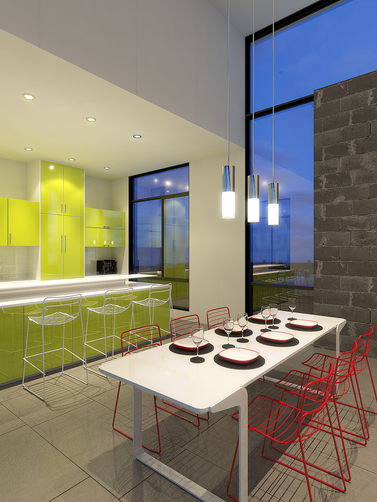
The reason I agree with Matt's original response is that he clearly knows his stuff. I did have the Ikea webpage open on my second screen when looking for ideas for units/finishes etc, well spotted. The lights above the dinner table are confused because they aren't lights. Just self-illuminated cylinders inside some frosted glass. And the comment about the arch photographer not choosing my shot makes a lot of sense to me.
Anyhow all good comments and gives me stuff to think about.

Matt Vernon-Clinch
Report Abuse
He asked for a critique so i gave him one. IMO there is quite a lot that could be done to improve it.

AdriaaN van Jaarsveld
Report Abuse
MR POOPY PANTS, so you have nothing good to say?? I don't agree with your reasoning about breaking the frame. you can break any frame as much as you want any way you want.... and actually you should as it suggest that there is a story outside the frame.
Dave, I would go for the ikea look in the render and re-work it in post

Athanasios Karampitsakos
Report Abuse
Nice work Dave.
Matt Vernon-Clinch
Report Abuse
the composition is too wide angle, and it makes it awkward and too in-your-face. there are too many objects unnecessarily breaking the edge of the frame - red chairs top and bottom, table at the bottom, lights and window frame at the top.
it's quite telling that an architectural photographer has been in this space and of the many views produced, none were your shot...
your floor and stone wall materials need work. the glossier materials are working, but really don't suit the space, too plasticy and garish - all looks a bit ikea, which is at odds with how much the house and naughtone furniture would cost... saying that, i don't like the choice of furniture in the photography..
the chrome should be brushed aluminium or brushed rhodium plate... etc
and your lighting seems a little confused - hard shadows from big soft pendants?
M
Dave Buckley
Report Abuse
me to now I've seen them. Good reference that you can trace from too. i'm taking some time out to model lots of accesories/filler objects
this needs some more stuff on the table (cutlery and perhaps a smaller bowl inside the deep plate)
The raised ledge on the island also needs something I feel (possibly just gloss accessories with a dash of colour to tie into the room) and possibly some place settings at the breakfast bar?
D
Dean Punchard
Report Abuse
I just love those wall panels!! :)
Dave Buckley
Report Abuse
cheers for the pointers.
the original building is here, http://www.archdaily.com/105577/lujan-house-robert-gurney-architect/
that's where I got the layout from, I'm just changing the furniture etc, so the brick wall actually exists but I see what your saying, how it doesn't quite work with my new furniture.
if you can see on the original, this room actually continues for the full length of this building, so I'm not sure about black gloss tiles. They might work all the way the through. Will test it out.
Thanks for the link to the panels
D
Dean Punchard
Report Abuse
Nice design, I like the set and layout.
Im not a fan of the brick wall though, I think if you want contrasting materials, Id go for something like cedar panels, or some funky wall tiles. http://www.bnind.com/FINAL_ICONIC_PANELS/Iconic_Panels_Opener.html
I also think the floor is a little dull and conservative, Id try some black high gloss tiles :)
Dave Buckley
Report Abuse
Yep, it is lowered, eventually this will be a full finished model, with surrounding environment etc. Hopefully you won't see the horizon line as it will be covered by foliage.
As I say I just wanted to start getting some feedback about this one. Again more so on colours/composition/light etc
AdriaaN van Jaarsveld
Report Abuse
Love it Dave!!
Only comment from me would be the horizon line outside is a bit low
cool