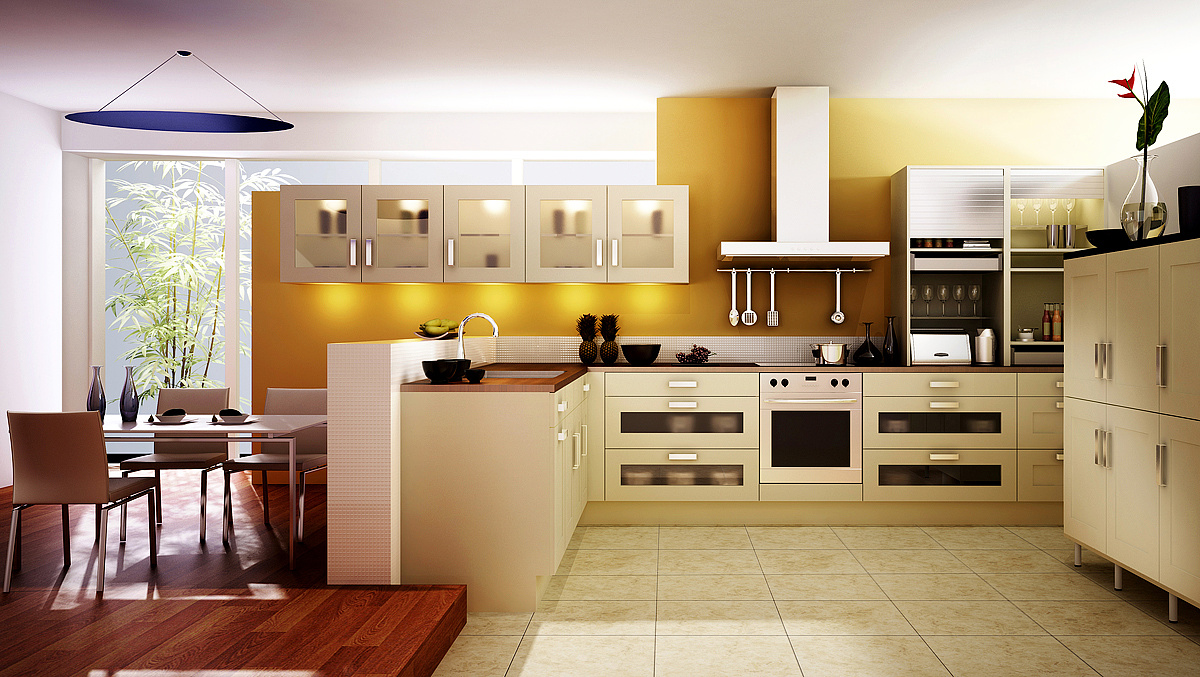
Modern Kitchen
You must be logged in to post a comment. Login here.
S
Salvatore Tinervia
Report Abuse
Absolutely beautiful design but I feel like the lighting and reflections are very unbalanced. The scene is looking very realistic towards the windows but begins to flatten the once you reach the kitchen. Inside your kitchen I feel the reflections are too spread out and unrealistic and may be a result of too much artificial light along with your glossy reflections set to a very low value. I'm in love with your design tho!!! :)

Gary Ledgerwood
Report Abuse
I too love all of your renders. I agree about the background outside and I also would change the fixture over the dining table. It appears like it was added in Photoshop and doesnt blend quite right. I also dont really dig the two pineapples. These are just nit picky things since you were looking for critics. Otherwise, it is a wonderful image.
M
Miguel Antonio Cortes Munoz
Report Abuse
It's a nice kitchen, but on a closer view it looks rigid. I see lot's of squared/straight shapes everywhere. Also, there is too much light in there, natural illumination should be enough.

Bradley DeWald
Report Abuse
What do you mean by "more reflections?" It seems like the materials that are reflective...look reflective, and those that aren't, don't.

CG Daniel Castillo
Report Abuse
very good indeed, only in the area of the campaign there was rare in the shadows, in addition to what has been said before reflexes.
m
middi middi
Report Abuse
Nice one..would u plz also help m for adjusting interior lighting.

-.- .-.
Report Abuse
Yup.
J
JosephAHaddad
Report Abuse
Nice work but I do agree that it needs more reflections since i think there is any at all. What did you mean by photomatch? where is the matching part. You need a background at least behind the window. But in general I will buy the design! Great work!

Antoine Desjardins
Report Abuse
I like all of your work. You are the kitchen master! Keep it up.

Bradley DeWald
Report Abuse
I've updated the image. Please keep the critiques coming!

Athanasios Karampitsakos
Report Abuse
The image needs more reflections, more work on the materials and the environment colour the you can see from the window in order to give life to the scenery.

