Kitchen Gourmet
You must be logged in to post a comment. Login here.
M
MaxMalyy
Report Abuse
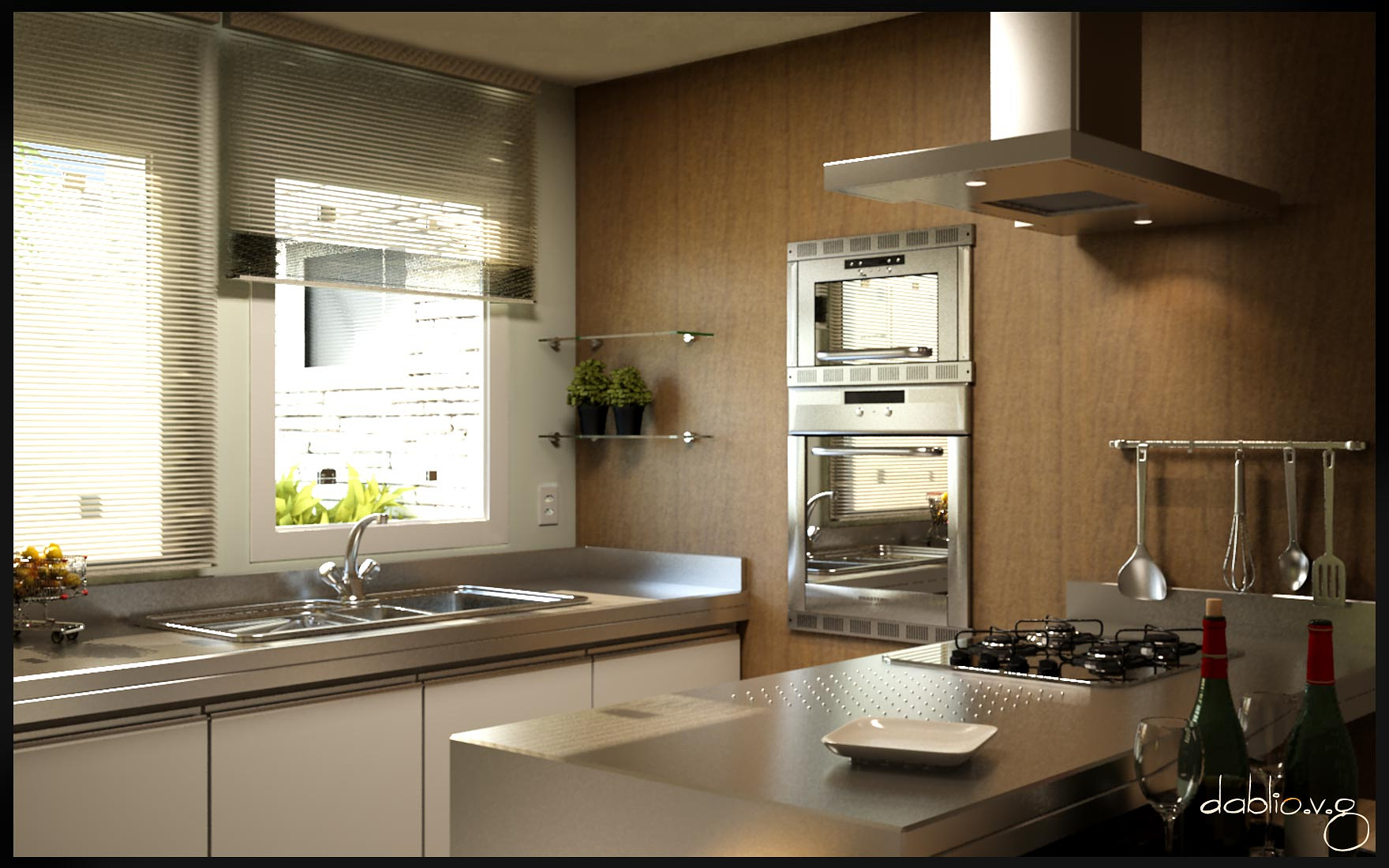
Nice work, but background need corrections

Stephen Leworthy
Report Abuse
great image. just 2 small factors that for me -
1) way too over exposed out side
2) confusing general ambiant light. dont know whether it's mean to be light naturally only or you have an internal light switched on somewhere with that yellow tinge to the pic.

William Garcia
Report Abuse
Thank you imccrajames,streetsounds and Fran.
Imccrajames, were 18 hours to surrender myself, and I did not expect all this time.
And Thanks again Fran, for the comments, I make an effort and put an update that image with better definitions, soon I hope.

Frances Gainer Davey
Report Abuse
Hi William,
This is a nice scene, with the exception of the anomaly with the window blinds. The composition, lighting and materials are all good. But you could use some help with the Vray settings. The image is blurry except for in the foreground, which tells me your camera target needs to be more central. Also, the aliasing on very bright diagonal edges is very bad. The 18 hour render time is another clue that something is wrong with the Vray settings. My suggestion is for you to post this over in the Vray section and ask for help.
You have obviously put a lot of effort into this scene, and I would love to see it with improved settings. I haven't used Vray much at all in the last few years, so I can't give you specific advice. But there are a lot of Vray experts here who would be more than happy to help. :)
s
streetsounds
Report Abuse
Amazing, you guys are truly gifted. I am learning 3ds Max but find Cinema 4d r11 a little easier to use, will post a rendering in the next few days.
Again, lots of talent on here :-)
i
imcrainjames
Report Abuse
By 18 hours do you mean to build this from start to finish or to actually let the rendering engine churn it out?

Antoine Desjardins
Report Abuse
Very convincing! I like the style and form factors you have employed. Unfortunately, my eye's drawn to the blinds... the bunched up area looks like an error, but that could be attributed to your output settings or compression in post. Either way, its soooo close to a fantastic image - good work.
William Garcia
Report Abuse
Thank you shaheenshy

AHMED SHAHEEN
Report Abuse
very nice render
William Garcia
Report Abuse
No problem Bradley , image got on the internet (http://proveneer.com.au/products/), and did the bump map and reflection.

Bradley DeWald
Report Abuse
Would you mind sharing the material setup for the wood cabinets?
William Garcia
Report Abuse
Thank you Ali, and Eloy Georege. And George, the absence of many elements is deliberate, may have to distribute it better, but I preferred to choose the "less is more".
g
george sandoval
Report Abuse
Hi, Nice render..... but the windows look a little too burned out - that yellow green plant is calling too much attention to itself.
The small shelves on the side can have more interesting things on them other than 2 small plant pots. Just look at interior design magazines.
Wood grain is getting fuzzy - especially vertical seams which should be razor sharp.
Just needs a little tweaking!

Ricardo EloyVanguard
Report Abuse
Very nice pic, brother! Great mood, lighting and materials. Congratulations! ;)

Ali Eslami
Report Abuse
I like the mood and realism, good job!
William Garcia
Report Abuse
Hi Inxa,
Thanks for the comments. I'll review, but I'm not finding the errors that said ... on the counter of the sink? the shutters? Maybe yes, when I reduced the resolution.
G
Girish D Joshi
Report Abuse
Looks good when I see it in the small frame. I really like the light and the feel of the room. Nice ambiance as well. But it's really blurred when I open the high res. Edges seem to have a lot of problem. It could have happened while saving at lower res.
William Garcia
Report Abuse
Hi Andrew, thanks!
A
Andrew Crowther
Report Abuse
Really like that, lovely render.
William Garcia
Report Abuse
Thank you all.