Pedro Fernandes
You must be logged in to post a comment. Login here.

PedroVanguard
Report Abuse
Hey Jacinto!!
Thankyou so much for the great words, I know your work very well, and it's truly inspiring, and even more so knowing your Portuguese!!! (um grande abraço e saudações lusitanas). Fantastic work on the Evermotion competition, those renders of Siza's Architectural School, just out of this world, hope to see more things from you and also to chat a lot more with a fellow "compatriota" hehe
Abraço

Metro Cúbico Digital
Report Abuse
Well done Pedro Fernandes. Wont forget this name. ;)
Abç de Portugal.

Erich zumBrunnen
Report Abuse
Nice mixture of architectural asthetic. Good work

Victor Karpikov
Report Abuse
Great work! I like lighting and materials! Well done!
PedroVanguard
Report Abuse
Hi everyone.
Firstly thankyou so much to all moderators and people at cgarchitect,was so good to see work featured.
Now in response to everyone,thankyou for comments,will have to strive for better,completely on board with the facets which should be curved,the poly moving should of been better in that case.
Thankyou so much to everyone and a big shout out to everyone who enjoys makings dreams come true in 3d.
T
Tarontis
Report Abuse
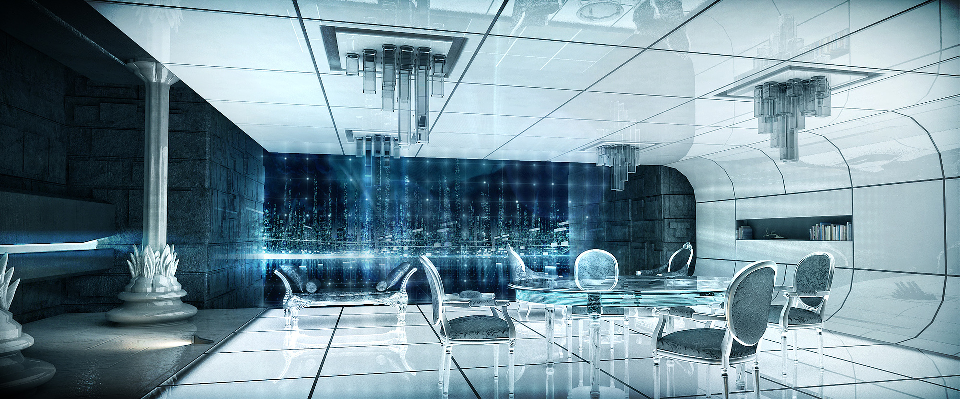
I was thinking the same thing about the faceted wall... does seem a bit odd, especially when your more complex classical pillars are not faceted.
Still very cool though!

Dave Buckley
Report Abuse
I like them, but the only thing that really bugs me is the facets on the curved wall of the 'tron' style ones. Doesn't take much to divide the segments unless you've purposely tried to achieve that look. Other than that they are pretty cool.

neil poppleton
Report Abuse
Vrey Nice. Similar to Tron Legacy...
T
Tempest1295
Report Abuse
These came out great, my favorites are the tron inspired rooms. :cool:
R
Roberts Wrong
Report Abuse
I like them all.
I'd lose the singular lensflare on the 1st shot (the cortenish one).
PedroVanguard
Report Abuse
Thanks for the response guys.
Oanav, I tend to agree with you, although my initial intention was to make it oversized, but it probably didn't go right.
I have posted some more images from the "Tron Legacy" Inspired images, the close up shot is a little more of a playaround with photoshop and the mood lighting of the seen, hope you like thanks. Larger Res images on my site arqui.com
Thanks
O
Oana Vinatoru
Report Abuse
I love the first two, colors and textures capture the cave ideea well. I like the fact you succeded a strong attention grabbing image without too many details. On the critique side - on closer inspection I wonder if the floor texture is so large on purpose? It's really out of scale.
And I really like the stencil on the wall in the first image :)

Gary Ledgerwood
Report Abuse
Love these. Great mood.
M
Mark Daniels
Report Abuse
Very well done - these are great.

Sketchrender Ltd
Report Abuse
well done beautifull work.
crackin