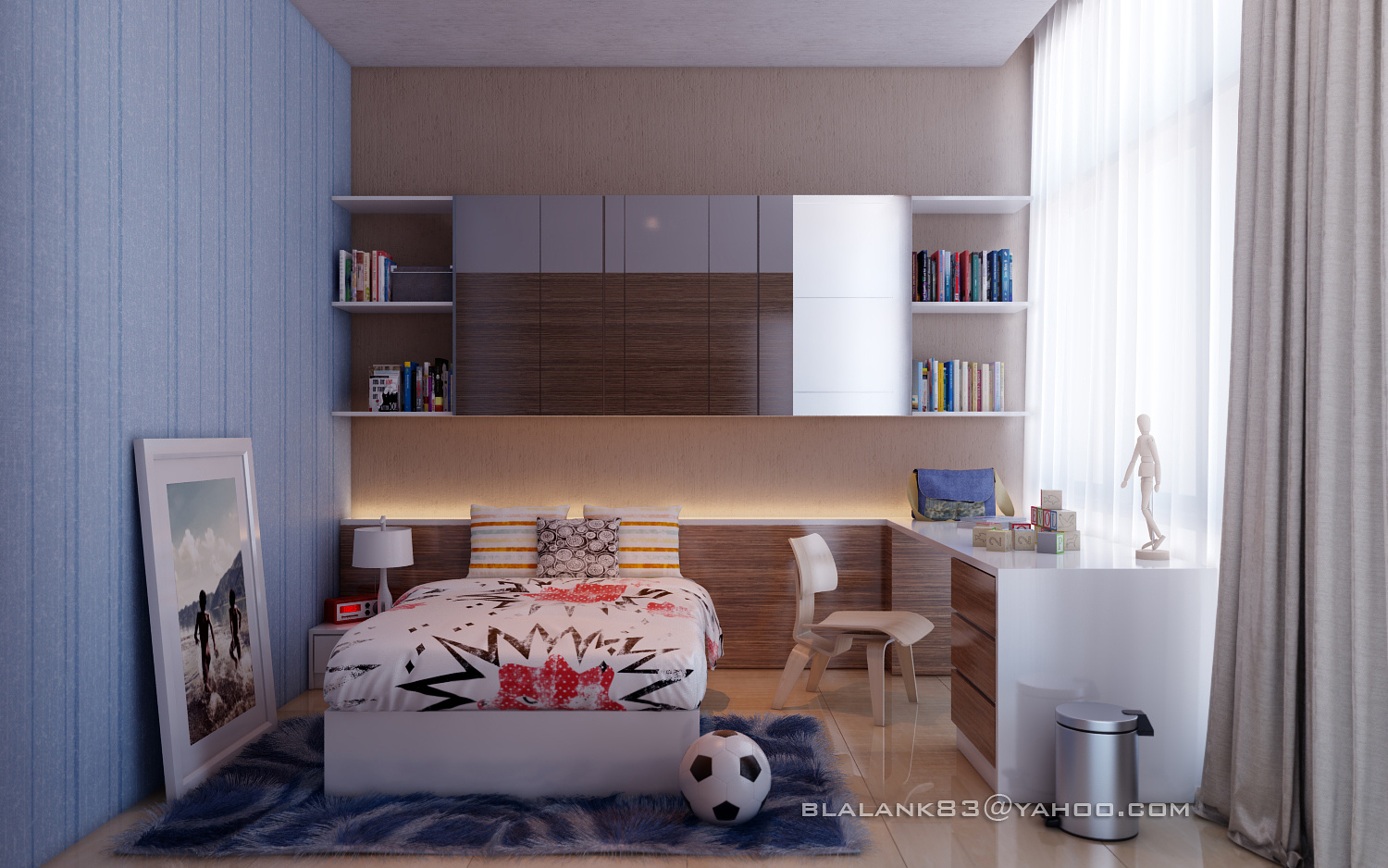
Kid's Room
You must be logged in to post a comment. Login here.

blalank 3dviz
Report Abuse
thanks :)
c
cradam Argol
Report Abuse
very nice!
blalank 3dviz
Report Abuse
ha ha nice input.. I will learn about the scale now :)
wood texture... it's from my client...
Vladimir Savkovic
Report Abuse
Upon closer inspection, it looks like most of the objects are disproportionate: the ball is too big compared to the books, the bed looks like it's a normal-sized one just scaled down (the pillows too small?), the chair is too low compared to the desk (uncomfortable), the bed lamp is too small compared to a child's bed, and, as the previous poster noted, it could look better with more child-oriented colored fronts instead of classic wood.
To sum up: it looks like most of the objects were just scaled down arbitrarily.
Excellent atmosphere and lighting though. I like it.

Jon Berntsen
Report Abuse
I like the mood and realism in it, but I'd really like to see blue or pink/purple fronts instead of those "classy" nut textured ones. :) Also the motive in the picture could have been matched better to fit a child, and no harm would be done to hang it up on the wall.