Making Of
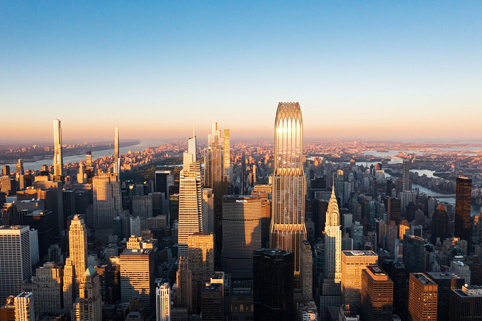
The Making of NYC Super Highrise
The Making of the NYC Super Highrise - by Christopher Malheiros

Hi all,
Thanks for this oportunity and i hope you’ll enjoy this different approach on architectural visualization.
Just a small introduction on this «making of»
This was an idea I had for a while and I made some tests before. It's is a critic about the evolution of architecture, the fact that it's becoming commercial and all about image (in a way it's good for us visualizers!). The fact that everything is becoming corporate and the world is entering in this era of economical unbalance. The whole scene is partially inspired by futuristic movies like Blade Runner and the 5th element . I always enjoyed the futuristic themes and how architecture could adapt to this situations!
(Editor's note: Check out the 2004 CGarchitect interview with Eric Hanson about his work on the 5th Element).
Now about the process. There is a small detail that is quite important to mention. There is no 3d in this, it's just a matte painting and it all started with this photo:

This was a photo I found on Internet (sorry but I couldn't find the link for this making of!)
The first step was to sketch some lines, finding the correct perspective lines and trying to define where the towers would be.

Then I tried to find a good texture to apply on the buildings. I liked this one, the dark steal and strong structural beams were features that I had in mind.

Here I'm skipping some boring steps of matching the buildings with the photo, it’s almost like 3d camera matching. And here's the result:

Now a bit of balance to try to match the towers with the photo and to insert them into the overall picture.

The bridges where something I thought about when I was at this stage. I liked them so they stayed.

Now adding some detail, helicopters, logos and contrasting the white parts in the ground.

The construction of the image is done, now I'll add some balances: desaturate the image, contrast, curves and levels.

The final stage: adding some color balance, a bit more contrast and some sharpening. The image was also cropped on the right side to center on the buildings.

Thanks for following,
Cheers!


About this article
Christopher Malheiros shows us a quick breakdown of his NYC Super Highrise matte painting.


