
Tutorials
Miscellaneous Topics

Miscellaneous Topics
Ted Boardman tedb@tbmax.com http://www.tbmax.com
Yeah…well…any of you in the mid-west and northeast just realized another foot and a half to two feet of snow just fell on top of what has hardly melted at all this winter. Just like when I was a kid! Here, on the coast of New Hampshire, the smaller bays are frozen over and the water temperature at a sea buoy about six miles off shore is around 34 degrees Fahrenheit.
I’m going to try to cover a few topics this month that have been coming up on the support forums and from inquires I’ve gotten recently. I’ll give you my views on the topics and some exercises that will get you started on solutions you might able to utilize in production.
Radiosity and Specular Highlights
Radiosity rendering in max and VIZ is by its very nature rather flat because of diminished specular highlights. The amount of direct light from the light sources combined with the light bounces from surfaces reduces that directional quality that can add punch to your images.
In my opinion specular highlights do not receive enough attention as it is. The specular highlights tend to add balance to the darker shaded areas of a scene to give a full range of contrast that makes an image have “depth”.
Also, specular highlights are really the first clue that we have to identify most materials. Specular highlights are the scattered light bouncing from a surface and are primarily a function of the molecular makeup of the material.
A hard surface has a tight molecular structure and the light striking is mostly bounced directly back causing a small (Glossiness), bright (Specular Level), hard-edged highlight. Soft materials, on the other hand, allow the light to penetrate the surface scattering and absorbing the light with only a small amount bouncing back to the viewer. This results in large, dull, soft-edged specular. The shape of the highlight is affected by the “grain” of the molecules and by the surface conditions of the material. Plastic tends to have round specular highlights while rolled stainless steel has elongated highlights. These attributes are controlled in max and VIZ by the Shader of the material.
Because the photometric lights used by the radiosity process and the bounced light reduce the impact of the specular component and because the photometric lights lack some of the control of standard lights I have been using standard Omni lights in my scenes that only affect the specular highlights of the materials.
I’ll post a small max 5 file as an example. It’s the interior of a simple kitchen with a couple of stainless appliances. This file is not an example of modeling, lights, or materials specifically so concentrate on the specular highlights, please.
Figure 1 shows the kitchen with “normal” glossiness and specular level settings in the stainless material used on the refrigerator and the stove. The stainless uses a mix of bump maps in a Raytrace material to distort and “scratch” the surface. The lighting in the room is two Point lights in the fixtures hanging from the ceiling and one Linear at the fixture to the left.
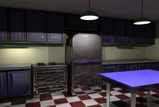
Figure 1: A radiosity scene with three lights and a stainless steel material on the appliances. Glossiness and Specular levels are set to 40 and 75 respectively, fairly normal amounts for metal materials.
In Figure 2 I have added a Falloff map with a steep mix curve in the Glossiness slot of the material. This brightens the specular highlights and gives a harder edge where the specular transitions to diffuse. This technique works well for shiny materials from steel to glass to water. The Falloff settings can be seen in Figure 3.
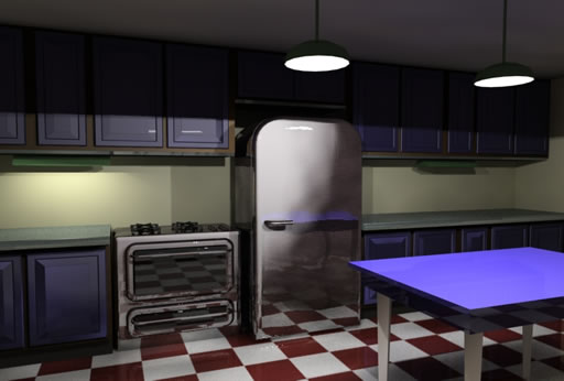
Figure 2: Specular highlights for the stainless material is boosted and given a harder edge through the use of a Falloff map in the Glossiness slot.
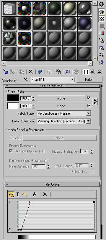
Figure 3: I have added two control points and adjusted the steepness of the Mix Curve of a Falloff map to make the metal material more convincing.
I wanted to add more “sparkle” to the metal in the scene to contrast with the dark upper cabinets and ceiling. I added a Standard Omni light to the scene and placed it outside the room. Make sure you turn Cast Shadows off if you are using VIZ.
Note: Photometric lights don’t have control over Exclude/Include or the ability of the lights to only light the diffuse, ambient, or specular components of materials so a Point light wouldn’t do the job.
In the Advanced Effects rollout, I set the Omni to light only the Specular component. In the Exclude/Include dialog, I moved all the range and refrigerator objects into the right column and checked the Include option. In the Intensity/Color/Attenuation rollout, I set the Multiplier to 2.0 for a very bright light.
Note: If you are working with an outdoor scene or a room with bright lights you will have to adjust the Physical Scale in the Exposure Control dialog to boost the power of the standard omni to match the scene lighting. This will also boost the effect of the raytrace reflections.
Then, in the Camera viewport, I selected the Omni light and used the Place Highlight tool (a flyout of the Align tool) to position the specular highlights on the top front edge of the range.
Figure 4 shows the extra boost the specular highlights get without affecting the rest of the scene much. This, to my mind, increases the perception of reality even though it has nothing to do with reality. Think about how artists paint that bright 4-paned window on an apple to make you think it is round and hard. Same thing here.
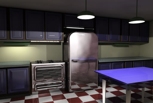
Figure 4: Adding a strong Standard Omni light and excluding all but the metal objects, then setting the light to affect only the specular areas adds sparkle to the scene. The specular highlights can be positioned for maximum effect with the Place Highlights tool.
There are certainly scenes that benefit from soft, flat illumination but in most scenes the specular highlights are critical to a sharp image and are often neglected.
Spanish Tiles
While there are a plethora of maps available on the internet for Spanish style terracotta tiles you have a map type in max and VIZ that allow very flexible control of creating and adjusting good mapped tiles.
There are three elements of a good Spanish tile map that you have to control; color, bump, and glossiness. Often maps are used for the bump and color only but not in a way to enhance the overall illusion of the shape of the tiles.
I’m including a simple VIZ 4 file to illustrate the approach I’ll outline for you here. I’ve only mapped to one plane of the roof, but you’ll be able to see my methods.
My maps are all Mix maps that combine two Gradient Ramp maps to emphasize height or shading of the tiles. One map defines the tiles across the roof while the other defines the overlapping of the courses of tiles. I use two UVW Map modifiers to control the repetition of each map independently by setting the Map Channel in each UVW Map modifier to match the Map Channel of the map itself.
Figure 5 shows the Bump map Gradient Ramp on the left that controls the tiles across the roof and the Gradient ramp on the right that controls the courses up the roof. The UVW Map gizmos and/or maps have been rotated accordingly. A Mix Amount of 25 sets the tiling map to influence the Bump 25 percent while the coursing map is 75 percent.
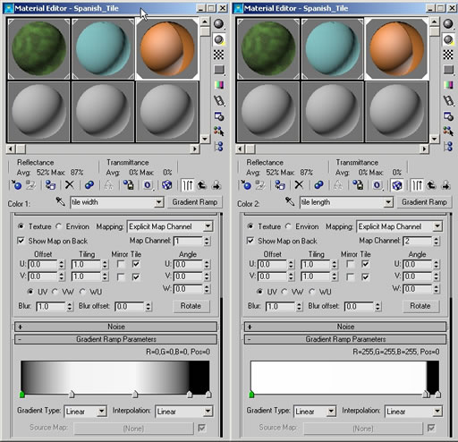
Figure 5: A Mix map with two Gradient Ramp maps are used in the Bump map slot. One the left is the “tiling” map, on the right is the “coursing” map. The Mix Amount is set to 25.
I then copy the Mix map from the Bump slot to the Diffuse color slot and change the white areas of the maps to terracotta colors with similar shading. Not having the colors consistent over the entire tile increases the illusion of low and high areas caused by the Bump maps. Again, this would be what a traditional artist would do to trick the viewer into perceiving 3D.
Next, the Bump map is copied into the Glossiness slot and the Invert option is checked in the maps Output rollout. This causes the high areas of the Bump map to be glossier than the low areas further enhancing the illusion.
Figure 6 shows the Mix map in the Bump slot, the rendered roof, and the Map/Material Navigator showing the hierarchy of the entire material. Feel free to open the file in either max or VIZ and play with the material settings to adjust it to your liking.
Figure 6: The Material Editor at the Bump level, the rendered tile roof, and the material hierarchy.
Note: as with any Bump map the position and shadow casting of lights in the scene will have a large affect on the quality of the map. A modeled drip edge could be added to the roof to enhance the illusion of half-round tiles at the eaves.
Border Blending
This topic was prompted by a tutorial that Lucas Feld posted on the max forum a while back and, like Lucas says, it’s one of those techniques that has been around but needs refreshing or to used in a different manner to give users new ideas. His example was creating “dirt” in materials to rough the scene up.
In my example here I’ll use the method to blur the edge of materials in a landscape where the grass meets the gravel. I’m going to use a mesh with a ShapeMerge gravel path. The closed shape cuts new edges into the mesh, which allows you to select the newly defined faces and assign a new Material ID number to work with Multi/Sub-object materials.
The problem is that the new edge is a sharp and clearly defined transition that would rarely occur in the real world. The key to making this technique of blurring the edges is Vertex Painting, a tool intended for computer gamers primarily. Vertex painting allows you to assign color to vertices that will bleed to the neighboring vertices.
While I am applying this method to different faces within the same object you could also make it work on adjacent individual objects by applying the same material and modifier to both objects.
Follow along carefully, it seems confusing at first, but is actually quite simple. The technique uses a Multi/Sub-object material made of one Blend material with grass and gravel and one material of just gravel. This will allow blending of the gravel into the grass areas.
You then take advantage of the Mask slot in the Blend that uses a grayscale map to reveal one or the other material. This mask is not a bitmap in this case, but a Vertex Color map. Vertex Color map allows each vertex to be colored with a special modifier called Vertex Paint that is applied to the landscape via the Vertex Paint modifier.
I’m keeping the materials in this example very simple so you can study and see the process then you can substitute the simple materials for materials that fit your needs.
Figure 7 shows the VIZ scene with a rendered sample, the Material Editor with Map/Material Navigator and a shaded Perspective viewport so you can see where I have painted the vertices. I actually painted in the Top wireframe viewport so I could see where the edge of the gravel road is.
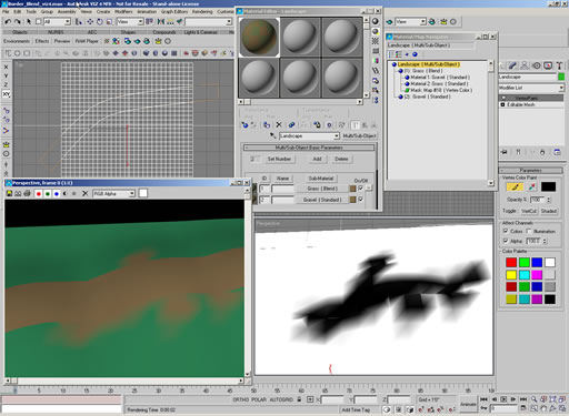
Figure 7: Scene with ShapeMerged road in a landscape. A Multi/Sub-object material with a Blend and Standard material can be manipulated using the Vertex Paint modifier and Vertex Color map to bleed on material into another, avoiding sharp transitions.
The Vertex Paint modifier uses black, white, or gray colors to reveal one material through another in Blend masking. You can pick the Vert Color toggle to see the painting in the shaded viewport and check Colors and Alpha for the best results.
Because the colors of the Vertex Paint modifier are blending from vertex to vertex you will have smoother transitions in areas with denser vertices. It would be possible to apply a Tesselate or HSDS modifier to increase the vertex density in the areas where you need more control. As always though, don’t add any more geometry than you absolutely need to make the images convincing.
Summary
Specular highlights, Spanish tiles, and gravel roads certainly do qualify this month’s column for the miscellaneous category. Hopefully I’ve managed to shed some light on issues that may come up for you or at least given you food for thought that may lead you to other solutions.
Practice with simple examples and work up in complexity when you see fundamentals being applied. Each small piece of the max/VIZ puzzle you understand will enable you to build combinations of tools that will increase your productivity.
Good luck and have fun.
You must be logged in to post a comment. Login here.
About this article
Miscellaneous Topics
visibility2.16 k
favorite_border0
mode_comment0