
Making Of
Making of the Bergman Werntoft House
Reinaldo Handaya a.k.a mutsu80|3dartist| from Surabaya, Indonesia
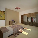
Hello everyone, it's very nice to see you all here in CGarchitect. First i want to thank Jeff Mottle for giving me the opportunity to share my tutorial. Today I will try to explain my interior renderings for "dinning room and pantry". The idea is based on the Werntoft House. Actually this is a very simple house but I felt very comfortable when I saw the photo. Here are the reference images:

Reference Photograph #1

Reference Photograph #2

Reference Photograph #3

Reference Photograph #4
Please look carefully at the 2nd and 4th images. All of those images are in the evening when the sun is about 40 - 45 degree from horizon. In my country this will happens around 16.00 WIB.
Now do you know what the biggest challenge is with these images? If you guessed making the interior bright, you are correct. As you can see, the floor in the dining and the pantry area has a dark floor. That is why you can see the ceiling is not as bright, it looks dark. This is happening because the dark color of the floor will absorb lots of light and this will make the bouncing of the light decrease.
Here is the program list I use:
1. 3ds Max 2011
2. V-Ray 2.0 SP1
3. Adobe Photoshop
Ok, now lets move to the next section.
1. Workflow
My workflow may be the same as other 3d artists. Here are the workflow breakdowns and explanation:
1. Preparation
1.1. Gamma
In this part I must select the gamma I will use for this scene. For me there are two ways: First we can use gamma 1.0 which means we use the default 3ds Max gamma settings, and the second, we can use Linear Workflow gamma 2.2. I always use Linear Workflow gamma 2.2. This scene will be very easy to get correct brightness if we use Linear Workflow gamma 2.2. but this time I choose gamma 1.0.
1.2. Modeling
For all of the modeling I use 3ds Max 2011. There are no difficult objects in this scene. I only modeled the house and the furniture, the rest I use Archmodels. But still there are some details we need to preserve in the image below:

Point A: Give a chamfer to the edge of your objects, don't leave them sharp or it will make your final image look fake.
Point B: Give a proper distance between doors, usually 3mm.
These two points are only an example. In interior rendering you must do modeling as close to the way objects are in real-life. We will need to do this because in interior rendering the camera position is not that far away from the objects. You need to make all of your object detailed as it looks in real-life.
Below you can see the wireframe of my interior scene without accessories. Only the room and the furniture.

1.3. Material basic
I always use the VRay material, I never use another material (ex: standard material). And now perhaps you are asking what I mean by a basic material. A basic material in my workflow only uses a bitmap and standard reflection (only use RGB, without bitmap in reflection bitmap slot). If I already have the library I will use my material library, but here, the floor and the wood are a new material so I use only standard settings just to speed up my process when it comes to the lighting setting. After I finalize my lighting settings I'll go back to the material I need to further tweak. The more detailed material settings will be shared it in next section.
1.4. Preset Settings

These are the preset settings I use in most of my renderings, but for irradiance map, this time I try to use high, but in daily work I only use medium.
2. Camera & Lighting Setup
For me the lighting setup is the fun part, but also the hard part. For interior rendering, I always avoid using the VRay light plane on windows. By using the standard VRay light plane it will drastically increase your render time, and if I use a skylight portal the result will not turn out the way I want. I only use VRay Sky for GI. For spotlights I use VRay IES and for hanging lamps I use the VRay light sphere.
To create GI in your scene using only the VRay sky has never been easy, but for me it is the best way to achieve real GI. I always remember what my teacher Nelson Liauw (www.nelsoncourse.com) said: "V-Ray is just numbers, the important thing that you need to know is how the sun, the sky, and camera settings work in the real world". That is why in my conceptual work I never have a fixed setting for the VRay Sun, VRay sky and VRay physical camera. I always explore with every scene I make. Based on his instruction, I always set the type of mood I want in my rendering.
For example, in this interior scene, I want to make an evening visualization with all the lights on, and to create a cozy and cool atmosphere in the room. Another important thing is I don't want the VRay sun beam to go into room, so in this this case I only use GI and I turn off the VRay sun. Based on this mood I try to create the lighting. From the beginning I create the VRay physical camera with an angle that can show the entire room, just like the wireframe.
From there I start creating the GI. I use the VRay Sky and I manually connect it with the VRay sun, because I want the glare of the sun in the VRay Sky exactly the same as the VRay Sun position. After a lot of trial and error I found the settings you can see the image below.

As you can see there is nothing special with my GI settings. Almost all standard settings. I also add a landscape texture using the V-Ray material as the background of the room. You can see this in the image below.

After I set the GI, the next step is to set the artificial light. Here I've selected a VRay IES light instead of a regular photometric IES because it's faster. I adjust the color and the intensity until it's bright enough. You can also see my artificial light, VRay IES and VRay light sphere positions.

Now it's time to render a preview. Here is the result:

OK, now the brightness of the VRay IES lights and the GI are good enough and also the color of the GI is just how I want it. But it still needs more work for overall lighting. I will show you more in the next section.
3. Advanced Materials
In the image above look at the wood and the floor material. The material is too standard and it needs more work to make it look more realistic and dramatic. In any rendering, exterior or interior, material settings have their own settings. We must make the materials look like in the real-world and to do that we need to use a bitmap in the reflection slot and reflection glossiness slot. We also need to use Fresnel to make the reflections physically correct.
Here are the settings for the wood and the floor material.


These are two materials which I think have a very crucial role in my interior scene. Lets go to the next section.
4. Adding More Objects
After all the lighting and the material settings are done, its time to add more objects like fruit, microwave, oven, refrigerator, hood fan, spoons, forks, plates, plants. Here are the wireframes after I placed all of the support objects.

OK I think all the detail I need is set. Now it's time to go to the next section.
5. Composition
Many great 3d artists use composition for their image. In photography there are a lot of rules about the composition, such as rule of third, diagonal rules, golden section, and many more. Here I'm using the rule of thirds, because I think it's very easy to use, and more importantly we can show the grid in the 3ds Max viewport. How do you do that? Go to Views and then choose viewport configuration and see the image below.

Here I will provide an example of one of my camera compositions.

Look at the vertical cyan colored line and the horizontal yellow color line. That's the guide line for the rule of thirds. To keep the explanation simple lets just say about 1/3 and 2/3 of your image. You will see with my dining table, the width of the table is about 2/3 of the width of the image. If you look at the island table and the refrigerator area, it fills 1/3 of the image composition. Using this composition technique you can direct the focus to the dining table and the island table looks further away and will create depth in your image. I think its OK for now, so just press the holy magic button, F9, RENDER!!!. The best part! hahaha.
6. Render result and V-Ray frame buffer image processing
Now, we can see the result in the V-Ray frame buffer.

I feel I still need to add more dark areas so I tweak it using V-Ray frame buffer by activating the curve option to adjust the dark areas.

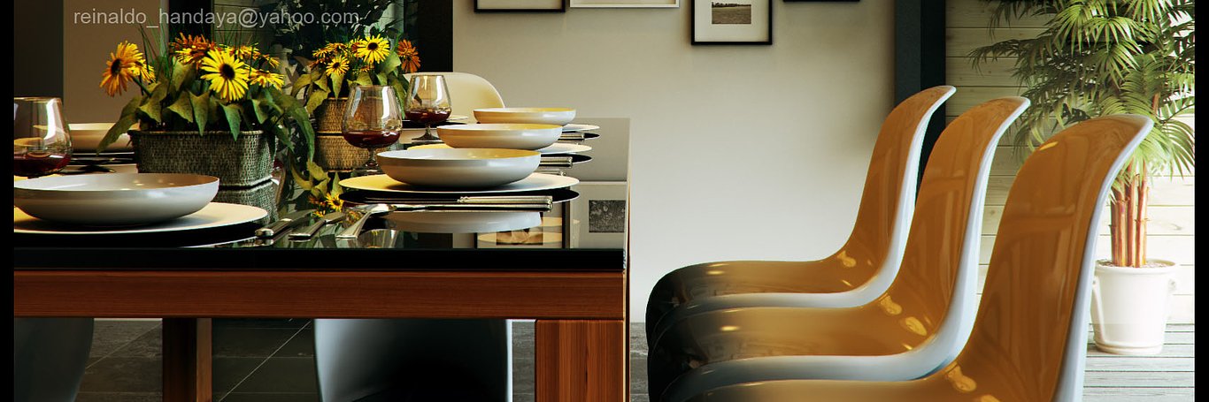
And here is the final result:

OK its good enough I think. Lets go to the last section. Post production.
7. Post Production
In this post production process, I want to change the mood to a greenish tint. I was bored of the original mood. To change the mood I use color balance to do it. Here is the step by step process:
7.1. Mood changing
1. Copy your original render
2. Go to image, adjustment, color balance
3. Adjust the midtones, shadow and highlights

4. Reduce the opacity as needed
5. After that I merge it to be one layer

6. I want the result to have more contrast, so I adjusted it below.

7.2. DOF Effect
After changing the mood I add a depth of field effect using Z-Depth Here is the Z-Depth map I've already tweaked:

I only want to blur the chair. Here are the steps to create a DOF effect using Photoshop:
1. Copy your layer and give it a mask
2. Copy your Z-Depth image then go back to your render image layer and go to channel

3. Select the last channel and paste your Z-Depth (control +V)

4. Back to the layer and select the image. Don't select the mask.

5. Select filter, blur, lens blur, change the parameter as you like.

6. Select the mask and right click on your mouse and delete the mask. As you can see the dinning table also gets blurred. Next I want to erase the blurred dining table.

7. Select eraser and erase everything except the chair near the camera.

8. Flatten the image to see the result.

7.3. Chromatic Aberration
The last effect I want to add is Chromatic Aberration. Usually CA occurs because of imperfections in the camera lens. It usually happens if you use old lens. This time I used Photoshop CS2 to do it, because I cannot get a good result if I use Photoshop CS5. Here are the steps:
1. Go to filter, distort, lens correction
2. Change the parameter like the image below

Here are all the final render results:


I hope this tutorial will help you all in the future, and don't forget, the important thing is always practice rendering and sharpen your sense of art. With a combination of both you will automatically create your style and it will be your differentiation in 3d market. Hopefully we can meet again in the next tutorial.
You must be logged in to post a comment. Login here.
kuldeep shekhawat
Report Abuse
special thanx for composition.

Akshay3ds
Report Abuse
Such a amazing woth tutorial to study..
Dear jeff..
Can you please guide me to learn asthetic of visualization.?
i can post some of my work quality that where i stands and want to go with this quality.?
D
Dimitris Tsioris
Report Abuse
Hello Reinaldo Handaya, thank you very much for this Making Of.
This article is a reference for me for every 3d i start.
I tried your settings and i have one question about the ies lights, they seem so real. Could you tell how much power you give to them? The default power of 1700 won't do nothing in my scene, even 10.000 doesnt seem enough most of the times.
Thank you in advance and Gz again for this 3D.
3 vendhan
Report Abuse
goody
Rio reo
Report Abuse
Awesome tutorial - thanks Master Reinaldo

irad urbalejo
Report Abuse
OK...!! TKS
M V
Report Abuse
This is one of my favorite How-Tos!
D
Dion Ekalaya
Report Abuse
This is really something!! love it mate, thanks for sharing..
Muhammad Arsalan
Report Abuse
holly cow... beautifull and speachless work mate..
H
Hoan An
Report Abuse
@@ awesome, great job!! :"> love it
R
Richard Klimov
Report Abuse
Thank you Sir for your tutorial, it helps me a lot, especially in postproduction part, which is good enough.
Thank you :)
C
Camila Gomez Cualla
Report Abuse
wooww!!!! love it!!!
r
rajarajan raja
Report Abuse
im speechless... excellent
S
Saurabh Narvekar
Report Abuse
Thnaks a lott...Sir....it was helpful for me,....once again thanks ....n keep sharing...
a
ariel anuevo
Report Abuse
applaud!!! thanks for sharing
f
fajar Hermansah
Report Abuse
Keren banget om.
thks a lot good tutor .keep sharing.
Terry Irawan
Report Abuse
. . . . . GREAT !
.. Thengs bang mutsu . ..

Robby Cahyadi
Report Abuse
Amazing work dude.... Hidup Indonesia!! >.<

Jared Foley
Report Abuse
Reinaldo, what was your reasoning for using 1.0 gamma over 2.2? I tend to stick with linear workflow because materials render more accurately. But I do find with interiors that 1.0 is much easier to achieve the contrast that I'm looking for. Would love to hear your thoughts. Great work, thanks!
S
Sejin Cheon
Report Abuse
Thanks a lot, 100 X better than big books on my shelf.
About this article
Reinaldo Handaya provides an us exclusive "making of" article from his latest Bergman Werntoft House renderings.
visibility64.1 k
favorite_border102
mode_comment68