Making Of
Making of Urban Contrast by Dark Band Studio
ABOUT DARK BAND STUDIO
Dark Band Studio is hub based in London since 2019, exploring day by day new areas of development for archviz aiming to support architecture and design practices.
www.darkbandstudio.com
Dark Band Studio is hub based in London since 2019, exploring day by day new areas of development for archviz aiming to support architecture and design practices.
www.darkbandstudio.com

INTRODUCTION
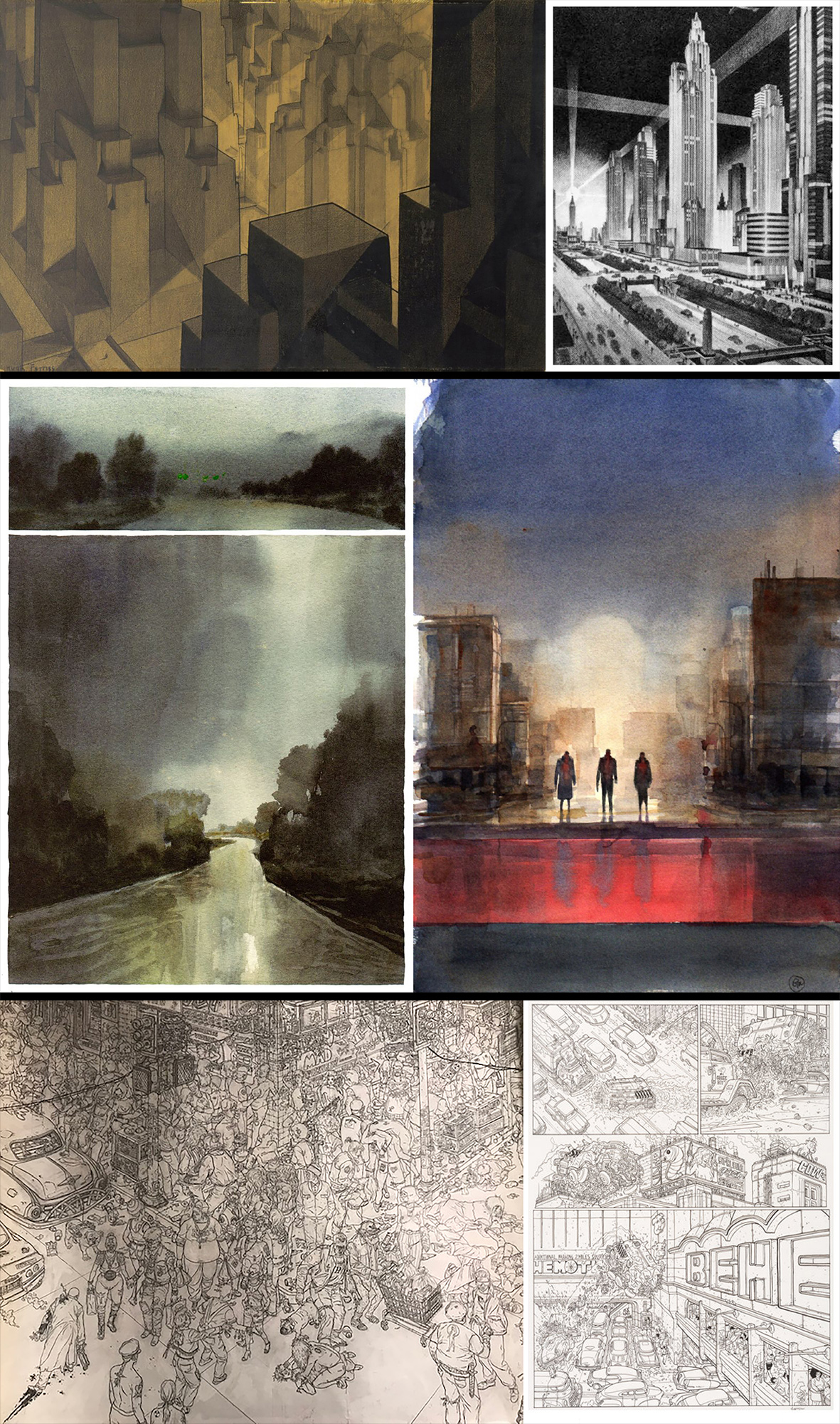
Before introducing the project, I would like to thank Ronen for contributing to his website, which is a great source of inspiration and skills. I would also like to thank to Fabio Palvelli and Jason Bergeron from D2, Mike Golden and Mengyi Fan for including Urban Contrast project within Top 25 shortlist for the first D2 Challenge. For the first D2 Challenge the jurors decide to propose as the main guideline the works from American architect and illustrator Hugh Ferriss.
Before introducing the project, I would like to thank Ronen for contributing to his website, which is a great source of inspiration and skills. I would also like to thank to Fabio Palvelli and Jason Bergeron from D2, Mike Golden and Mengyi Fan for including Urban Contrast project within Top 25 shortlist for the first D2 Challenge. For the first D2 Challenge the jurors decide to propose as the main guideline the works from American architect and illustrator Hugh Ferriss.
Urban Contrast was born in a relatively short range of time after the FIRST SUBMISSION for the D2 Challenge in October 2020. I was curious to explore a completely different solution and style compared to the first one, selecting a different source of inspiration. For this process, the software used are 3D Studio Max + Vray Next and Photoshop for post-production.
REFERENCES
Bearing in mind the remarkable reference from Hugh Ferriss, there are a series of multiple inspirations besides the main groove. I have been a massive fan of the American comic book artist and Geof Darrow (The Matrix, Hard Boiled, Shaolin Cowboy, and many others) and his attention to datil for his super-dense illustrations and I was really committed to have the whole composition imagined through the color eye of the Italian cartoonist GIPI (One Story, Land of Sons, Notes for a War Story) and his astonishing passion for watercolor drawings. The main target for the project was to try summing all these references, from different contexts, into something new.
Bearing in mind the remarkable reference from Hugh Ferriss, there are a series of multiple inspirations besides the main groove. I have been a massive fan of the American comic book artist and Geof Darrow (The Matrix, Hard Boiled, Shaolin Cowboy, and many others) and his attention to datil for his super-dense illustrations and I was really committed to have the whole composition imagined through the color eye of the Italian cartoonist GIPI (One Story, Land of Sons, Notes for a War Story) and his astonishing passion for watercolor drawings. The main target for the project was to try summing all these references, from different contexts, into something new.
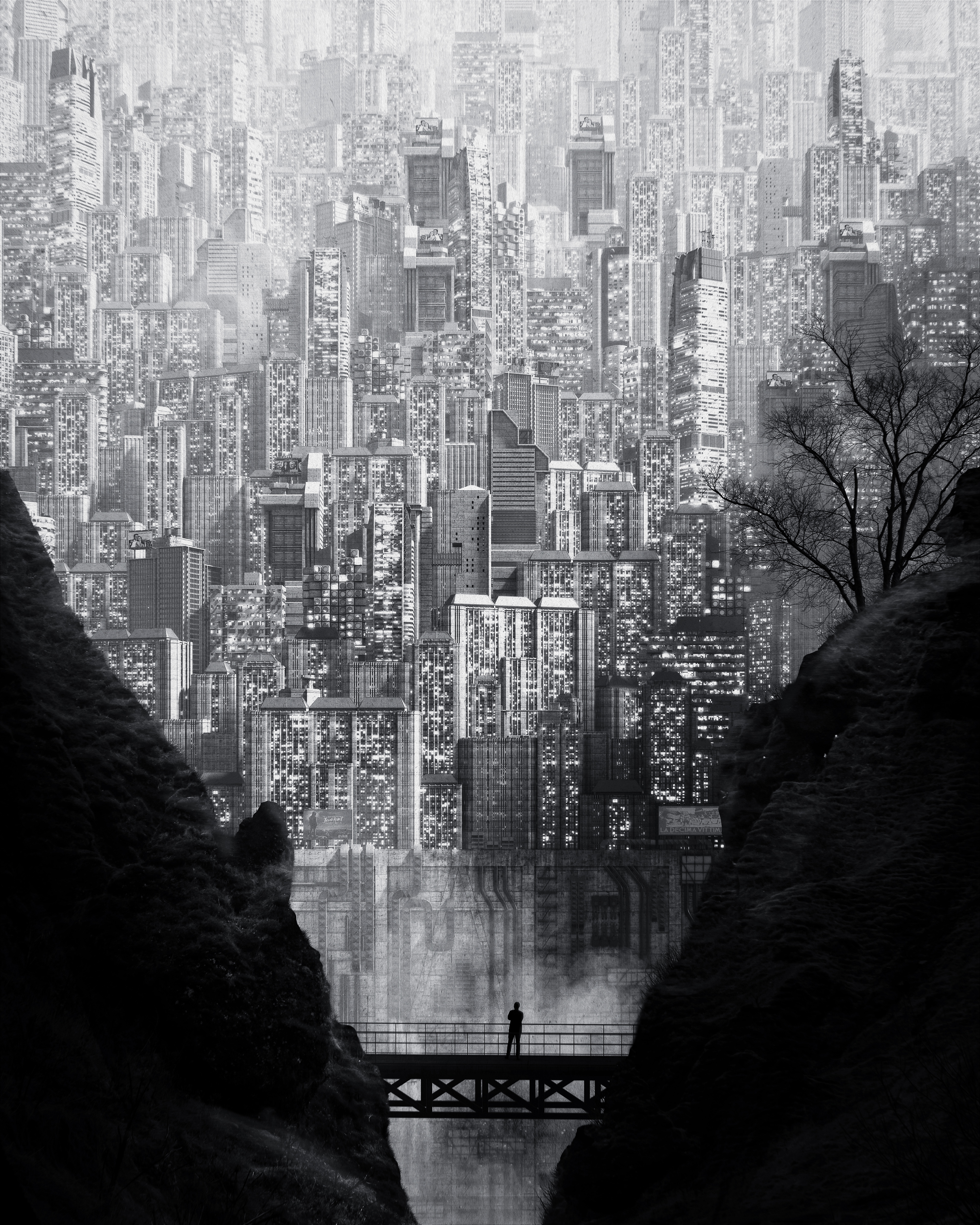
COMPOSITION
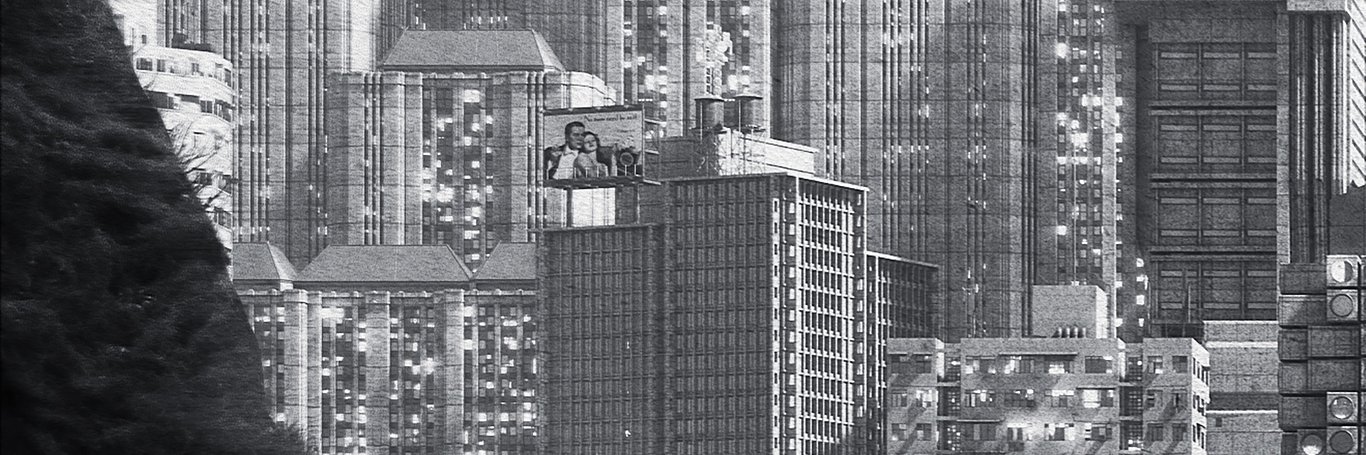
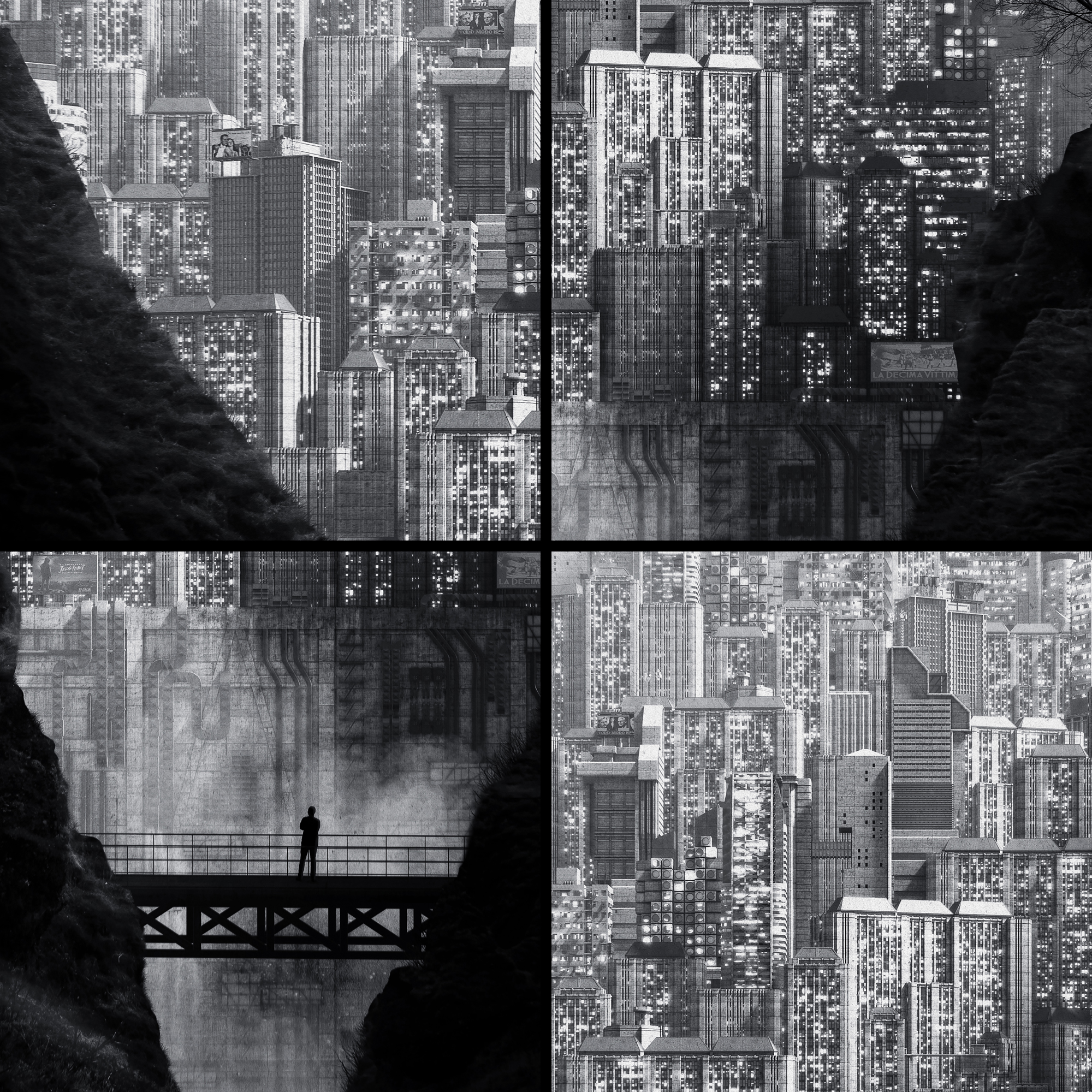
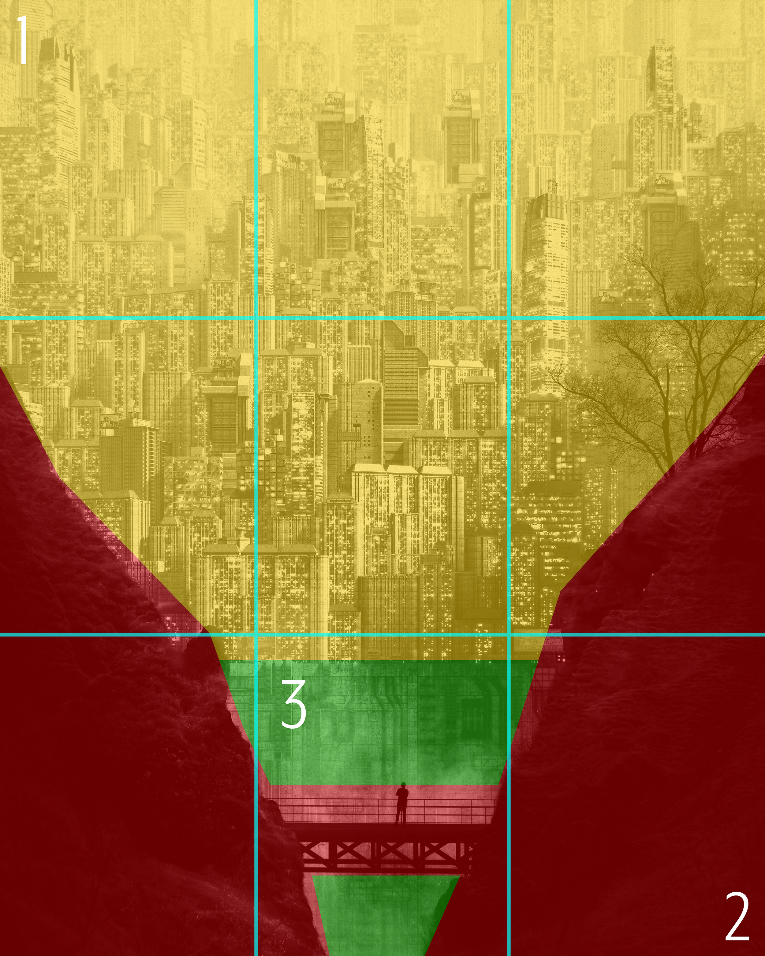
Having a good sense of depth in an archviz image is always one of the greatest challenges. Thus, the main composition has been set on a vertical ratio and the concept is orbiting around an idea of three different depth levels. The foreground was dedicated to the nature and the foreground to the urban, while the third level had to be a kind of separation between these different worlds, materialized by a strong concrete barrier. Considering all the elements the general image composition was made considering the rule of the third along image vertical length keeping the nature in the lowest part, the city on the highest section and an even split between the two elements in the center.
Having a good sense of depth in an archviz image is always one of the greatest challenges. Thus, the main composition has been set on a vertical ratio and the concept is orbiting around an idea of three different depth levels. The foreground was dedicated to the nature and the foreground to the urban, while the third level had to be a kind of separation between these different worlds, materialized by a strong concrete barrier. Considering all the elements the general image composition was made considering the rule of the third along image vertical length keeping the nature in the lowest part, the city on the highest section and an even split between the two elements in the center.

3D MODELING
Many 3D models were modeled and provided by Mike Golden, following Hugh Ferris style, but there is also an integration of high detailed smaller models aiming to recall a kind of “horror vacui” and attention to detail, typical in Geof Darrow drawings.
Many 3D models were modeled and provided by Mike Golden, following Hugh Ferris style, but there is also an integration of high detailed smaller models aiming to recall a kind of “horror vacui” and attention to detail, typical in Geof Darrow drawings.
TEXTURE & MATERIALS
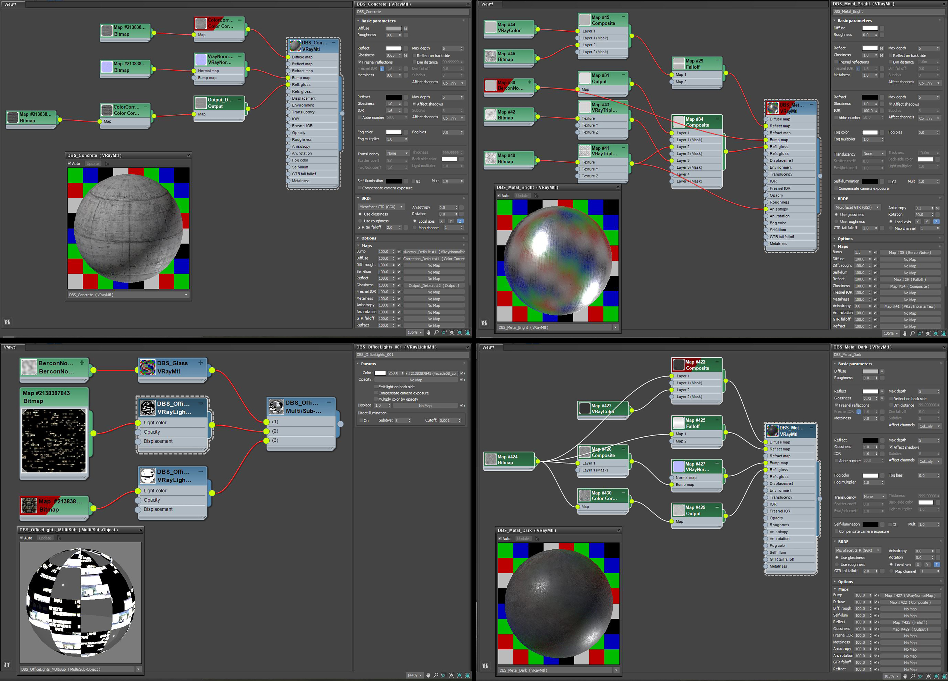
“Keep it simple” was the main concept for developing the material, in fact the materials used are only five. The main material is the concrete for buildings and the barrier which was made using a very contrasted texture giving a nice effect of weathered material. Two different materials for metal parts to mix bright and dark areas this time with 3D elements and not just with textures. The glass material was very basic with just a noise texture for the bump slot. Finally, last but not least, a couple of light material was made using night-time textures to have a nice feeling of variation on top of building facades. All the material color tone was completely bypassed as the concept has been designed as a black and white image. This key aspect helped to speed up the process for post-production extra focus.
“Keep it simple” was the main concept for developing the material, in fact the materials used are only five. The main material is the concrete for buildings and the barrier which was made using a very contrasted texture giving a nice effect of weathered material. Two different materials for metal parts to mix bright and dark areas this time with 3D elements and not just with textures. The glass material was very basic with just a noise texture for the bump slot. Finally, last but not least, a couple of light material was made using night-time textures to have a nice feeling of variation on top of building facades. All the material color tone was completely bypassed as the concept has been designed as a black and white image. This key aspect helped to speed up the process for post-production extra focus.
LIGHTING
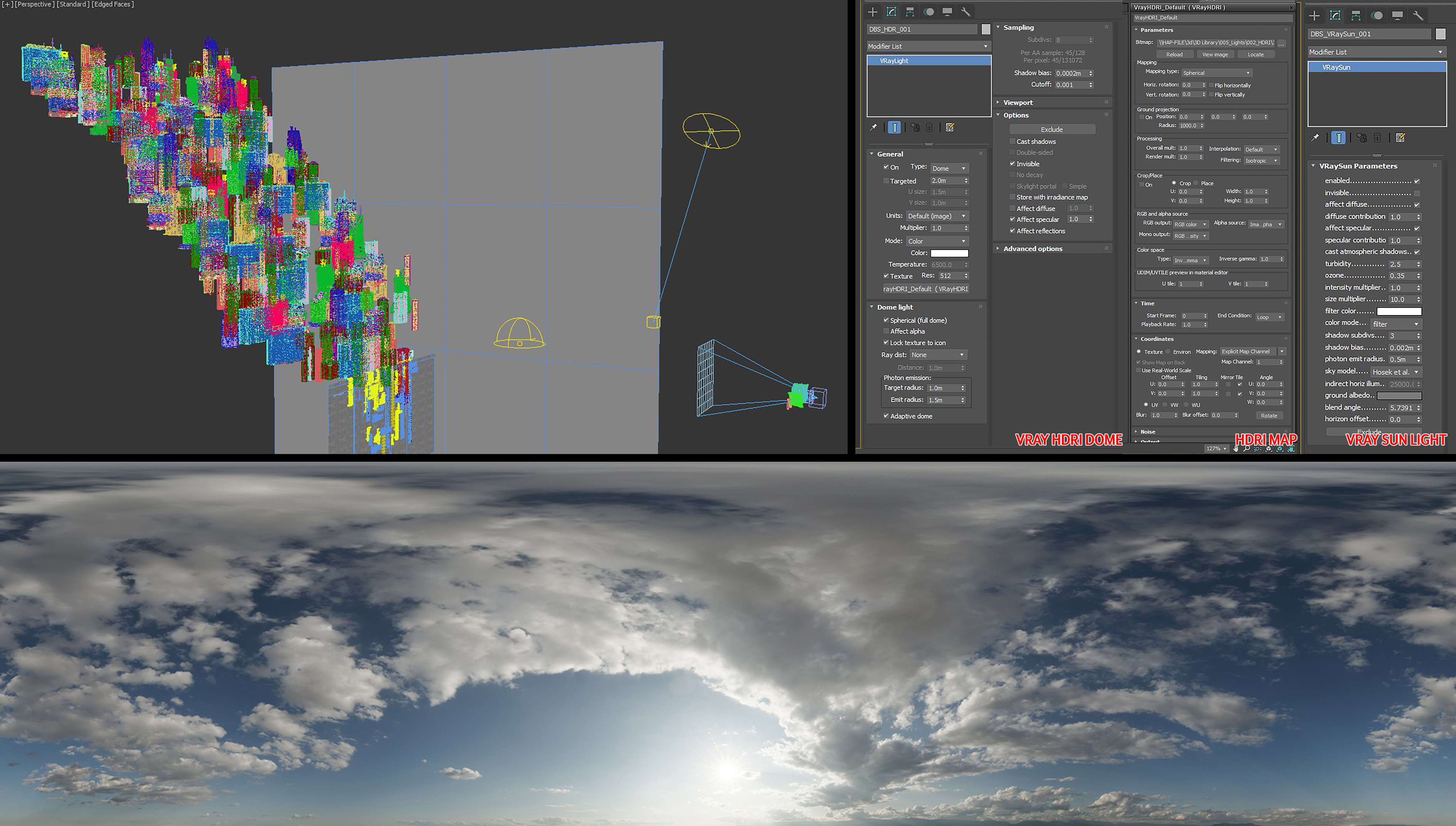
The rig used for lighting setup was very simple as well. Just a VraySun was used for direct lighting along with an HDRI cloudy day map included in a VrayDome light. In order to increase the depth feeling, there is a plan projecting shadows on right-hand-side buildings.
The rig used for lighting setup was very simple as well. Just a VraySun was used for direct lighting along with an HDRI cloudy day map included in a VrayDome light. In order to increase the depth feeling, there is a plan projecting shadows on right-hand-side buildings.
RENDERING & CAMERA
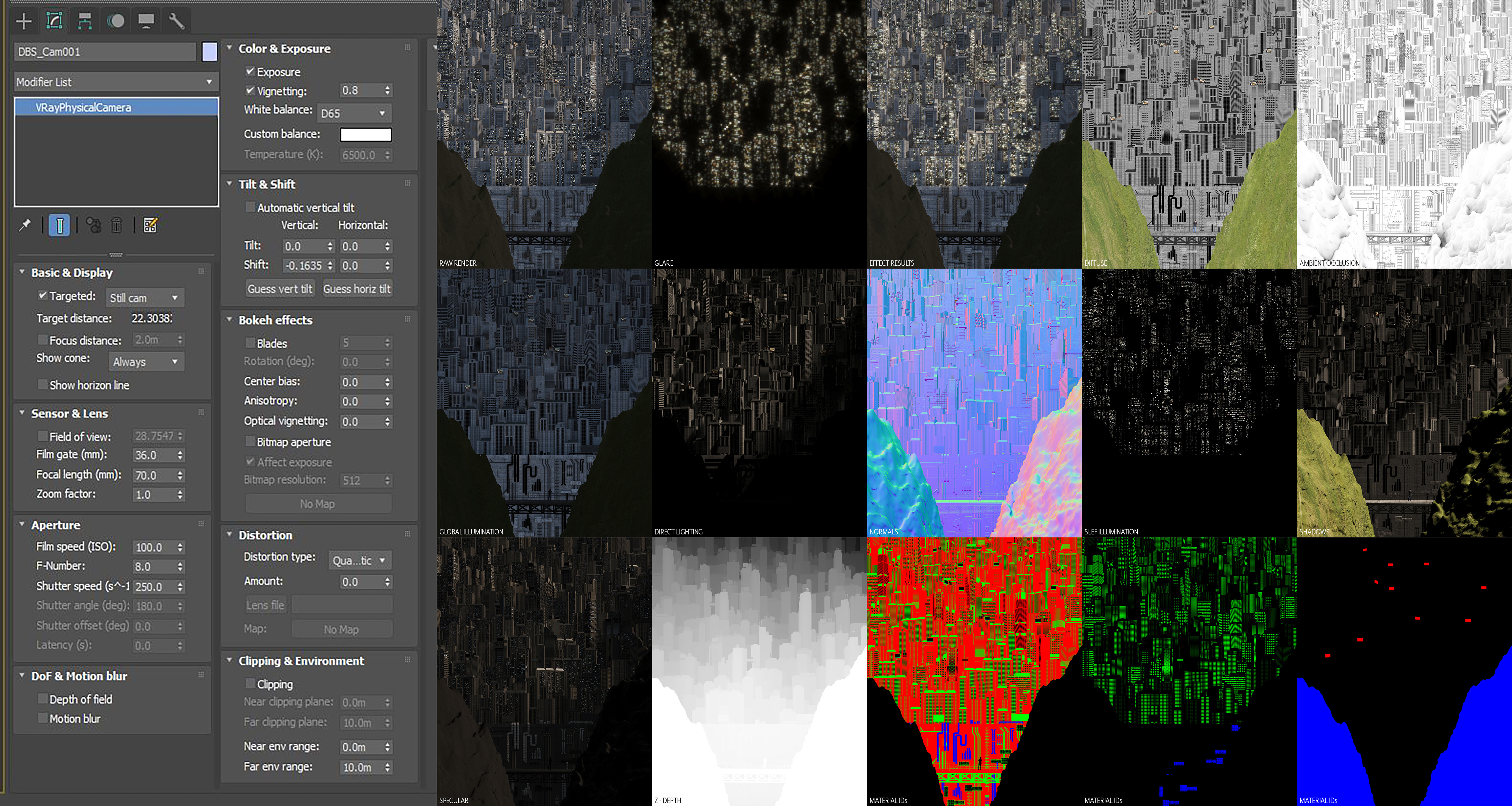
Rendering process was made using mostly default V-Ray Settings. Noise threshold and light cache were the only values changed in order to keep the noise lowest as possible and avoid the Vray Denoiser for not losing definition for details. Many Render Elements were largely used to help the next step.
Rendering process was made using mostly default V-Ray Settings. Noise threshold and light cache were the only values changed in order to keep the noise lowest as possible and avoid the Vray Denoiser for not losing definition for details. Many Render Elements were largely used to help the next step.
POST-PRODUCTION
Post-production probably was the most interesting step of the whole path mostly because this process was completely improvised layer after layer but bearing in mind what could be the final effect. The natural slopes in the foreground coming out from the render were not up to the quality though, so this part has been replaced using a real landscape picture. Thanks to several Render Elements, the contrast effect between highlight and shadow areas was carefully enhanced. The following video is the entire post-production process live recorded, hope you will enjoy it!
Post-production probably was the most interesting step of the whole path mostly because this process was completely improvised layer after layer but bearing in mind what could be the final effect. The natural slopes in the foreground coming out from the render were not up to the quality though, so this part has been replaced using a real landscape picture. Thanks to several Render Elements, the contrast effect between highlight and shadow areas was carefully enhanced. The following video is the entire post-production process live recorded, hope you will enjoy it!
FINAL COMMENTS
The outcome was surprising not just for the image, but also because it’s amazing how the ideas keep flowing after a first submission and for a project developed in a few days. Curiosity can become something incredibly triggering for people that can push your boundaries above any imagination. There was absolutely no expectation for contest results and having the image shortlisted in the top 25 was something more than just surprising, hoping the ideas will keep flowing in the future. One big THANK YOU goes to all the readers, Ronen for giving this little spot within his website, Fabio, Jason, Mengyi, and Mike (even if he kicked the image out from the final round-down during the judging show :D)
The outcome was surprising not just for the image, but also because it’s amazing how the ideas keep flowing after a first submission and for a project developed in a few days. Curiosity can become something incredibly triggering for people that can push your boundaries above any imagination. There was absolutely no expectation for contest results and having the image shortlisted in the top 25 was something more than just surprising, hoping the ideas will keep flowing in the future. One big THANK YOU goes to all the readers, Ronen for giving this little spot within his website, Fabio, Jason, Mengyi, and Mike (even if he kicked the image out from the final round-down during the judging show :D)
You must be logged in to post a comment. Login here.
About this article
Making of Urban Contrast project submitted for D2 CHALLENGE 2020
visibility1.57 k
favorite_border3
mode_comment0