Living + Dining
You must be logged in to post a comment. Login here.

Sherwin Boston
Report Abuse
Wow, thanks for the reference photo Mam Fran...ditto you got it right. I will look for fancy throw that blends well.
Sherwin Boston
Report Abuse
:o
I had the feeling to show what will be if there's a photographer in there...err but it doesn't comes out well. Thanks for the comments Jonathan.
By the way, I attached the original image.

Frances Gainer Davey
Report Abuse
This is nice. The dining chairs do look large, but that could be because they are in a small space. If it were me, I'd change the little throw that is on the ottoman. Here is a reference photo of a throw blanket on an ottoman: [IMG]http://www.westelm.com/weimgs/ab/images/wcm/products/201031/0001/img8l.jpg[/IMG]

Jonathan Sanchez
Report Abuse
Interesting that you try to show the photographer reflecting off the tv and tv console...even though it's a cool idea, I think it's just distracting Sherwin, plus I think the photographer is a little bit off from where actual photo was taken. Otherwise great images!
Sherwin Boston
Report Abuse
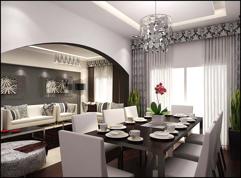
Just now I realized that, you are right about the scale I will look into that when I will do the revision. I forgot to add that this Villa is existing, the work covers only a make-over. The arch that divides the living and the dining are structurally built in there. The client even me wanted this to be straight but it's not possible. We cannot cut the arch or cover up the below part that makes it lower.
For the curtain box with the wallpaper, I tried to organice that all the curtain boxes within the living area and dining are the same but I think you are right...it is too much looking on that angle.
Thanks for so informative suggestions, I wish to be hired...lol! ;)
Sherwin Boston
Report Abuse
Putting background is my weakness that's why I leave it white. Thanks teh.
r
ralf kirsch
Report Abuse
I like your color management, saw the rest of your works and you are very good in it . Compliments. There is something strange about the scale. Or the chairs are big or the window door is too low. Try to open it up as like the arc of the room division and the other windows. It would give more space and light. IMO. For me the newbaroque wallpaper in the second image close to the TV module is too much.I know you want to bring back the theme of the dining section but doing so you hack the modern atmosphere of that part . I(n)M(y)O(pinion). Very nice interior feeling, for me you are hired. RK

Jackie Teh
Report Abuse
nice render, background will help make it look more nice.