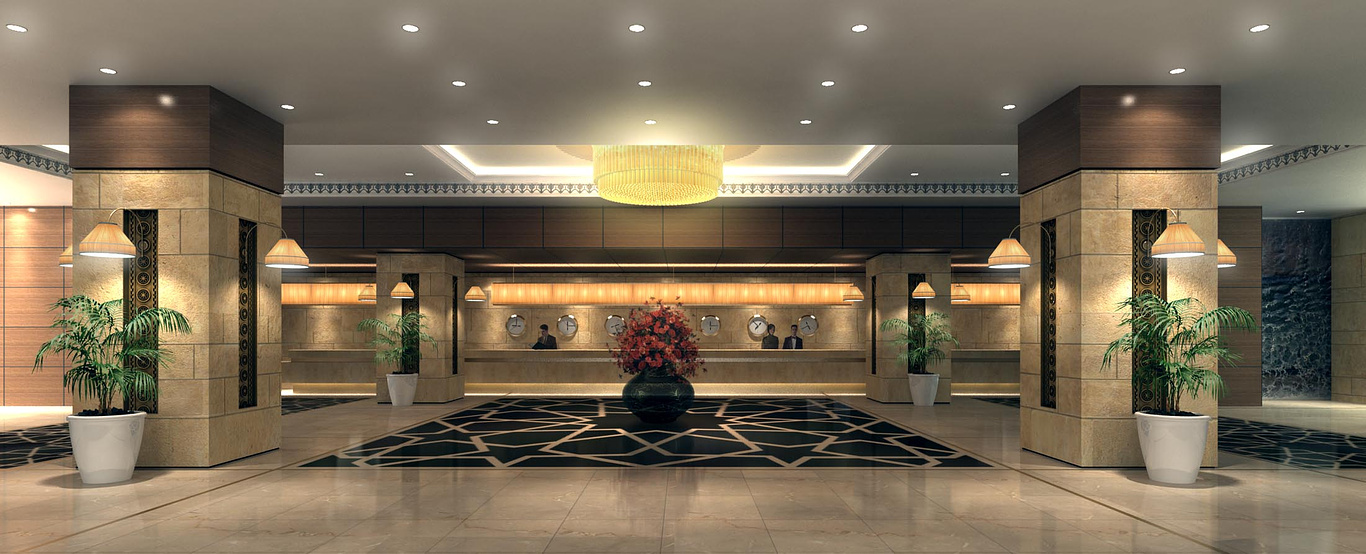
Reception
You must be logged in to post a comment. Login here.
T
Tempest1295
Report Abuse
Great render all overall, I agree with the thin line that Coolie mentioned. Love the lighting though.
John
C
CoolieJC
Report Abuse
Overall it's a nice image... your mapping looks off on the stone work in the columns. For one, you're losing the grout lines in the middle. Also, it doesn't seem like there would be a very thin line of stone at the top. It all depends on whether your client notices it!
E
Elisabeth Lisa Tanuwijaya
Report Abuse
The color tone is great... Nice design... ^^

