Redevelopment of pub site, feedback appreciated
You must be logged in to post a comment. Login here.

Mike Johnson
Report Abuse
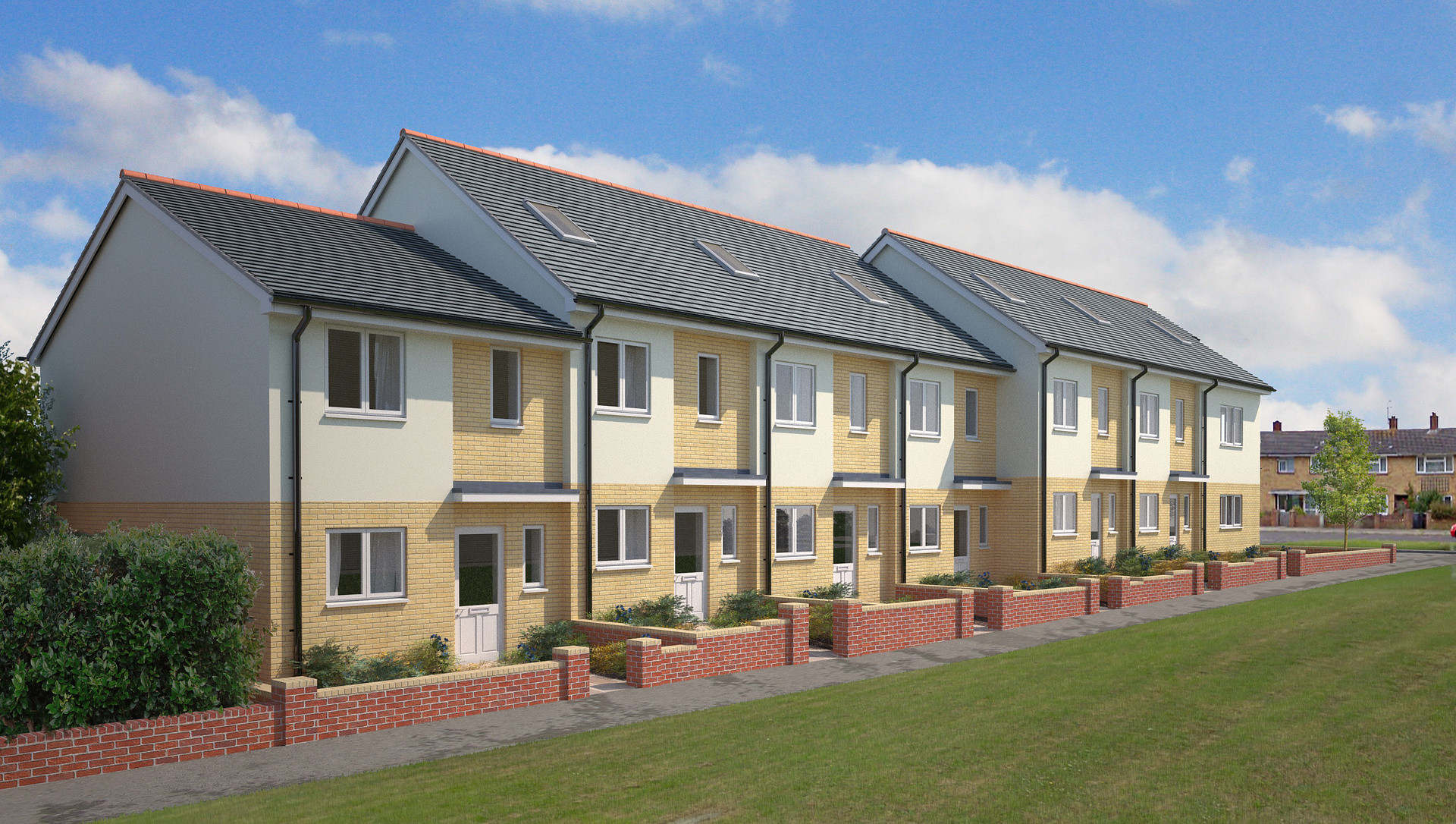
Thanks Nigel. Shadows in the foreground is a trick I use often! Unfortunately there were no trees in this council estate, and I don't like to use the artistic license too much.
Think people would be good in this view. I occasionally add them, and in this instance I don't know why I didn't, not you point it out it seems obvious.
It's a new build, for a sales brochure, so my hands are always a bit tied - it has to look clean and new, not weathered. I couldn't fill it with sky dishes for instance, even though that's what will obviously happen in real life.

Nigel Stutt
Report Abuse
I enjoy helping people with comments based on my limited experience so here you go:
1. concetrate on the details - aerials, people, lamposts, cars, cig packet on the street, birds, leaves blowing around etc can all help with realism.
2. A well known illustrator I know always places a tree shadows in the foreground and somemtimes leaves as well to aid in the composition, framing the view - it can work well
3. Textures are everything and you need to develop ways to create complex textures using dirt masks on top of repeating textures also things like Ambient Occlusion can help.
4. Post render colour balancing,a dding fog/haze, maybe glints and other photo artifacts etc can all help
5. You need a focus - some people, maybe an interesting viewpoint etc to make the image stand out from the crowd.
6. Finally try to get a style, the image I think looks a bit flat could possibly do with more contrast, but art filters can also help by giving the image some added photographic 'grain' etc.
Hope these help somewhat I am no way an expert mind but its all about learninga new art form, although a lot of old school illustration principles still apply such as composition and focus.