Ext - Apartment complex
You must be logged in to post a comment. Login here.

Aubrey Millard
Report Abuse
Yea, sometimes you need another set of eyes. At least you got it to a good point.
Have fun with the bathroom :)
J
Jason Johnson
Report Abuse
[IMG]http://www.jasonarts.com/Images/Work%20Images/CRica-Composite.jpg[/IMG]
Good call! Ya know your at the end when you didn't even see such a crappy section. Wow no clue how I didn't notice. Some reason the shadow didn't effect that area. It's the parking garage. I selected the area in my Mat Id and just knocked the brightness way down. tadaaaaaa..... well.... I dont wanna look at this thing anymore. Such a pain. I was too close to it I think I couldn't figure a way to step out of the box so to speak :)
Now just got to get going on that bathroom i posted and get another piece up!
Aubrey Millard
Report Abuse
A big improvement.
What is with the lower windows? Are those reflections?
If you fix that then I think you will have a solid image.

Jason Johnson
Report Abuse
[ATTACH=CONFIG]45590[/ATTACH]
Alrighty here's an update of this pain in the #$%$%. Spent like an hour or so on lots of cleaning and detail work. Fixed the palm trunks up, the building colors and reflections in the windows. Just a lot of maintenance and cleaning really. I'd like to think it's coming to a close..... unless there some thing new that stands out to you all :) Those 3d trees make a BIG difference! I miss having Speedtree. I was able to use it at my previous job but....welp....yea....
J
Jason Johnson
Report Abuse
no.... I really wasnt doing much to the image. I was just doing the vegetation. Figured since I didnt have to deal with the vegetation I could start actually dealing with other parts. Like adding more white reflection to the windows. Fixing the clouds and sky and I did an exposure control on the grass. It was all ways too bright.
I always knew the problems with this composition just couldnt get around it for some reason. Too close to it now I guess? Thats why I asked for some help and I thank you all. Now I have to get a game plan to finish this beast! I am about 80% done with my other bathroom piece. Few more textures and I can get to rendering. Ill get that one up here soon. Maybe later today Ill get a render from a week ago :)
Anyways thanks guys! keep the ideas and critiques coming, I can take 'em!
J
Justin Traylor
Report Abuse
Nice job, lookin much better. Your grass looks better now too, like there is more variation in the material for it. Did you change that too?
Aubrey Millard
Report Abuse
That is a big improvement already. You still need to tweak the tree textures (like the trunk) but you are definitely going in the right direction now. :)
Jason Johnson
Report Abuse
[ATTACH=CONFIG]45484[/ATTACH]
OK! I got them trees put in more or less like I been doing with my cut outs. Here's where I am at.
J
Justin Traylor
Report Abuse
I would agree that elements aren't blending together, it's starting to look very photomontage. I think the reasons for that is that the elements seem to be at different resolutions and have different lighting. For instance the palm trees are sharper and are lit differently than the buildings themselves. Also, if you are blurring the background to achieve a depth of field effect, it doesn't really make sense. Because at that scale in real life with an actual camera, having the buildings in focus would also cause the background to be sharp. Having the BG blurred either makes it look intentionally photoshopped, or makes the scene seem way out of scale (too small).
Aubrey Millard
Report Abuse
I liked the other POV better than this one.
The problem as far as I can see is the integration of the 3 main elements. The 3d buildings, the trees and the background.
I can see the 3 elements when I look at the image, they stand out individually. They don't blend together.
Jason Johnson
Report Abuse
Hey I got a new Updated image. I haven't had the chance to load it onto here but did it a few days ago. Working on 2 different pieces at once :)
[ATTACH]45478[/ATTACH]
Got some trees from Vyonyx and moved the came way in and tilted it upwards some so there is less open space! Better? Still got some fine tuning to do at least I know...
Aubrey Millard
Report Abuse
Yea the trees are hurting the image as they look like PS'd trees.
If you have no 3d vegetation you could try these.
http://seek.autodesk.com/manufacturer/xfrog+inc+:+greenworks+organic+software?resetft=true&count=20&startIndex=80
Jason Johnson
Report Abuse
Just decided to check the thread out at the right time didn't I? Yes they are. I dont have any type of tree generating software. I was mixed on the upfront trees. That statement was enough for me to get rid of them though! I'm using trees that Vyonyx has on there site. I plan on adding highlights to the palms still. Is that the only thing that bothers you now? If so I'm on the right track! I think my problem is I still know the guidelines they wanted on this property back a few years ago. I'm trying to break out from that. There's a reason it lost funding haha
Aubrey Millard
Report Abuse
Take the trees out from the bottom front. Are all the trees Photoshopped in?
J
Jason Johnson
Report Abuse
no other or new comments? Is that good? bad? I love to learn so I love to get feed back
Jason Johnson
Report Abuse
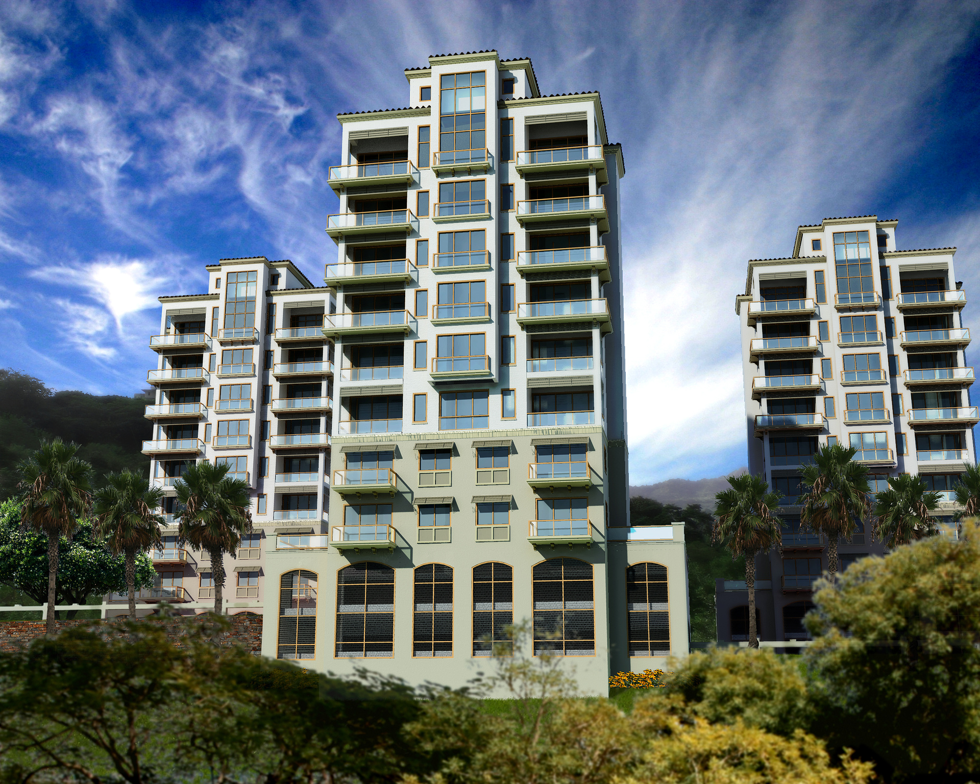
I have updated my image. Only maybe an hour or so of work done to it. I removed the car and road up front. Changed the back ground tree I had to the left. I added some palm trees and shrink down the flowers in the front of the main building. Changed the sky map to match my lighting but I did use the older one for my front reflections. I just really liked the colors in the sky. Also I swapped out my stone wall texture for a newer high rez version.
How are the changes? What you all think needs to be done? Looking nicer then what I had originally posted so I'm back in the right direction! :)
Jason Johnson
Report Abuse
Yes yes I agree you may have commented after I posted that I noticed that just after I created the thread but yes the sky needs to go away because it doesnt match. Good stuff I'll take what you said and any one else that wants to give there 0.02 and get a new post up this weekend some time
Aubrey Millard
Report Abuse
Ok, since you asked :)
Lose the background, it doesn't match at all. The sun is setting behind the buildings but the light is coming from the front left of the buildings.
The flowers on each side of the building are way over scaled.
I'm not a big fan of the stone wall texture.
I would lose the car and the dude on the balcony.
The tree looks like it was PS'd in and doesn't look right.
You already mentioned the glass so no need to comment on that :)
I like the buildings though.
My $0.02