Church in the village
You must be logged in to post a comment. Login here.
A
Alexandros Milioridis
Report Abuse
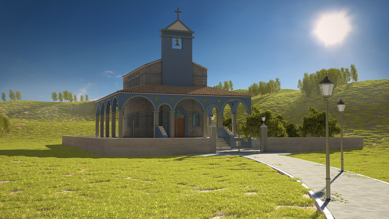
Thanks for the comments
Indeed, I agree, the illumination should be darker in the arches.
Definitely the backlighting has its difficulties, but is more
dramatic. I agree that there should be a better contrast.
The rule of third will actually give you a better result.
See you
AlexMil
O
Oana Vinatoru
Report Abuse
Hi Alexandros!
This image reminds me of traveling and holidays :)
Your light setting is a difficult one, trying to capture light from behind. Because of this, the visible sides of the building are too dark. In reality, our eye will perceive more light and detail even if all is in shadow, from reflected light, and there should be a difference in light on the different sides, now the front and left side are equaly lit so you can't make out the edges and the volume of the building. Also the part under the portico should be darker but now it has equal light as the upper part. The composition could be improved by placing the main vertical with the rule of thirds and the grass seems a bit short.
Hope this is helpful and thanks for sharing your image!