Kitchen - Tio Chair
You must be logged in to post a comment. Login here.

Dave Buckley
Report Abuse
Haha . . . i don't know?
Basically make the three items pop. As travis said, perhaps make them bright red - so they stand out?
Or maybe you're trying to say, keep them within the same pallette but make them darker?
Who knows ;)
Sleep time I think. Will revisit tomorrow.

AdriaaN van Jaarsveld
Report Abuse
oops, sorry, different tone, same hue
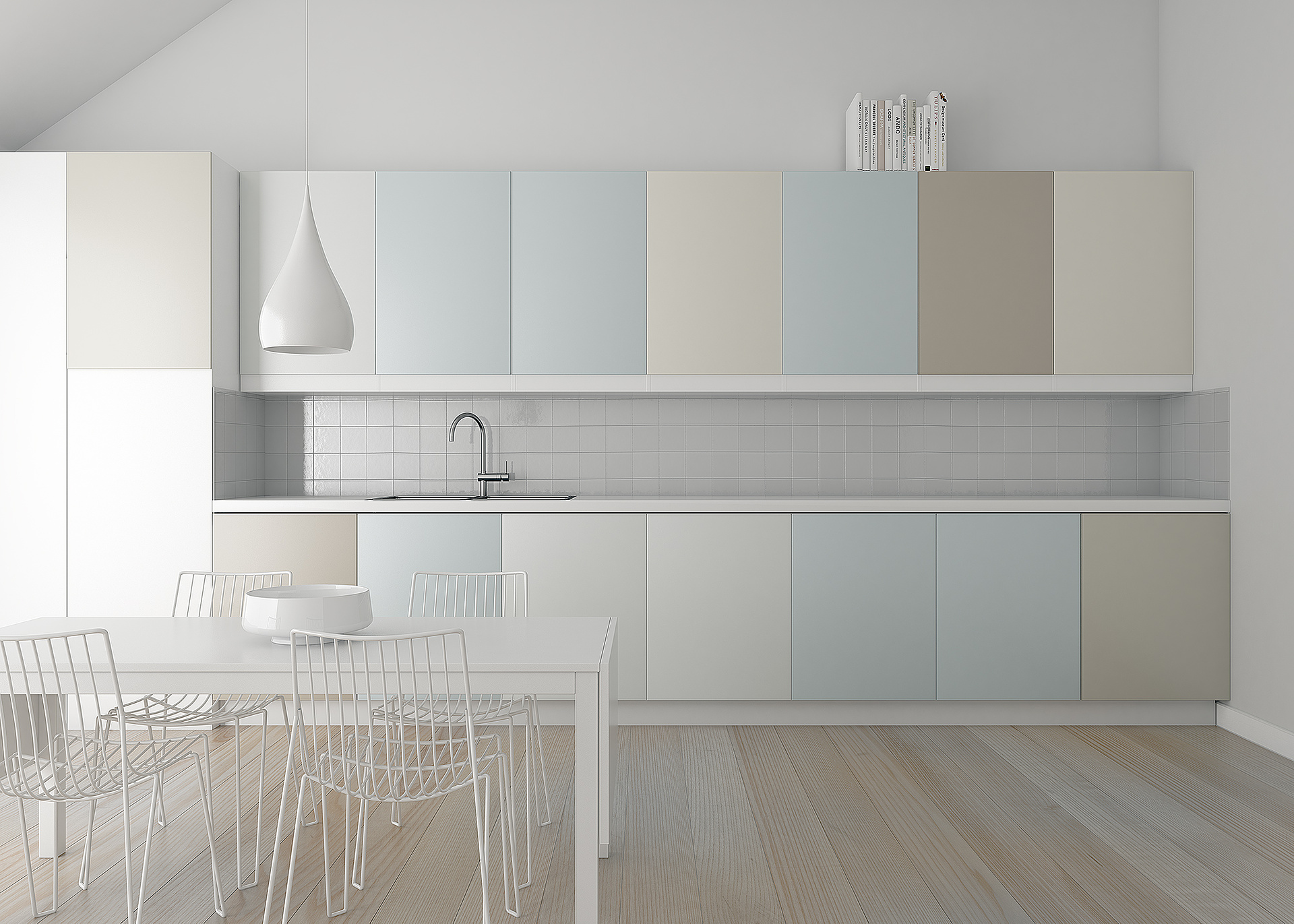
All the colours in the render has the same light tone, soft colour. Thus if you're going to tell a story, with say 3 objects
,pop their colour tones a bit(brighter or darker) and keep their hue the same range.
wait..... am I now confused?? did that make sense? Think its late!
Dave Buckley
Report Abuse
Koper
My 'colour terminology' isn't too great, when you say same tone, different hue - are you now telling me to keep the colours as they are?
AdriaaN van Jaarsveld
Report Abuse
+1 Travis
same color tone, just different hue. There is allot of space for a story[ATTACH=CONFIG]41333[/ATTACH]
Dave Buckley
Report Abuse
I was going to make the cupboard doors darker to bring a bit more colour into the image. But will consider all comments. Red light shade? Red bowl? The bowl originally had apples in but I took them out.
I'll give correct render times when I re-render as I didn't really take note the first time round. But the first one was rendered with the longest edge at 3500px (I lowered the res for the upload) and took between 2 - 3 hours (I think).
Nothing special, just a single rectangular photometric and FG lighting this one.

Travis Schmiesing
Report Abuse
If you keep the very light, low contrast image, then I think it needs something to make it pop. Something that will catch my eye, and tell a story.
I am thinking a sultry red handbag on the counter, or something like that. You could use fruit, but that would be expected. Whatever it is, I like the idea of the color of red in the attachment contrasted against the stark whiteness of the scene.
http://www.fashion-shoppe.com/images/3450220red.jpg
And yes, a very clean and crisp image compared to the majority of mr work that I have seen.
Can you share render times and resolution for that render time?
Dave Buckley
Report Abuse
Excellent news - although I wasn't trying to emulate him in anyway.
Going to give it a rework anyway - adjust the tiles, and will do some levels adjustment to boost the contrast ;)
Hopefully will be able to swap out the image at the top.
Gimme me a couple of hours to render the fresh one out and create a 50 slot multi-sub material to stop them tiling (which I hadn't actually noticed) - i wish the multi-texture was compatible with MR that comes with floor-gen
AdriaaN van Jaarsveld
Report Abuse
Well, you're on you're way to a Gus Capote quality image.
http://guca.cgsociety.org/gallery/470887/
Dave Buckley
Report Abuse
Ok will give it a rework (not sure if these images can be changed once uploaded)
If I'm honest I'm not a massive fan of mega-contrasty scenes, but I agree it probably needs more.
Floorboards are based on true sizes from Dinesen website, take a look at some of their marketing shots (there huge)
I'm still working on it anyway but wanted to get it up to start getting feedback.
Cheers for your comments
AdriaaN van Jaarsveld
Report Abuse
Floor boards are way to big and tiling imo
i'm impressed by you're MR quality.
Having a second look at the image, i realized it needed alooooot of contrast, hope you don't mind, did a quicky!
Dave Buckley
Report Abuse
Gotta be honest, I noticed the tiles were looking dodgy when I switched back to PS after uploading the image. Some mapping issues I think.
Can you expand on the floor comment.
Yep it's Mental Ray. Had to start using it again now I've no longer got access to VRay. But I honestly don't have a preference.
AdriaaN van Jaarsveld
Report Abuse
NICE Dave!! Mental ray you say!!
I like the colour pallet allot. The only thing that breaks the realism now is the wooden floors and the kitchen tile wall