Retail Interior
You must be logged in to post a comment. Login here.

Matt McDonald
Report Abuse
It sounds like you had a pretty quick turn-around on this one so I'll save the nit picky stuff. For such a quick project, I think that overall the renderings look good. The space is well lit and has a nice warm feel to it both in terms of the textures and the lighting.
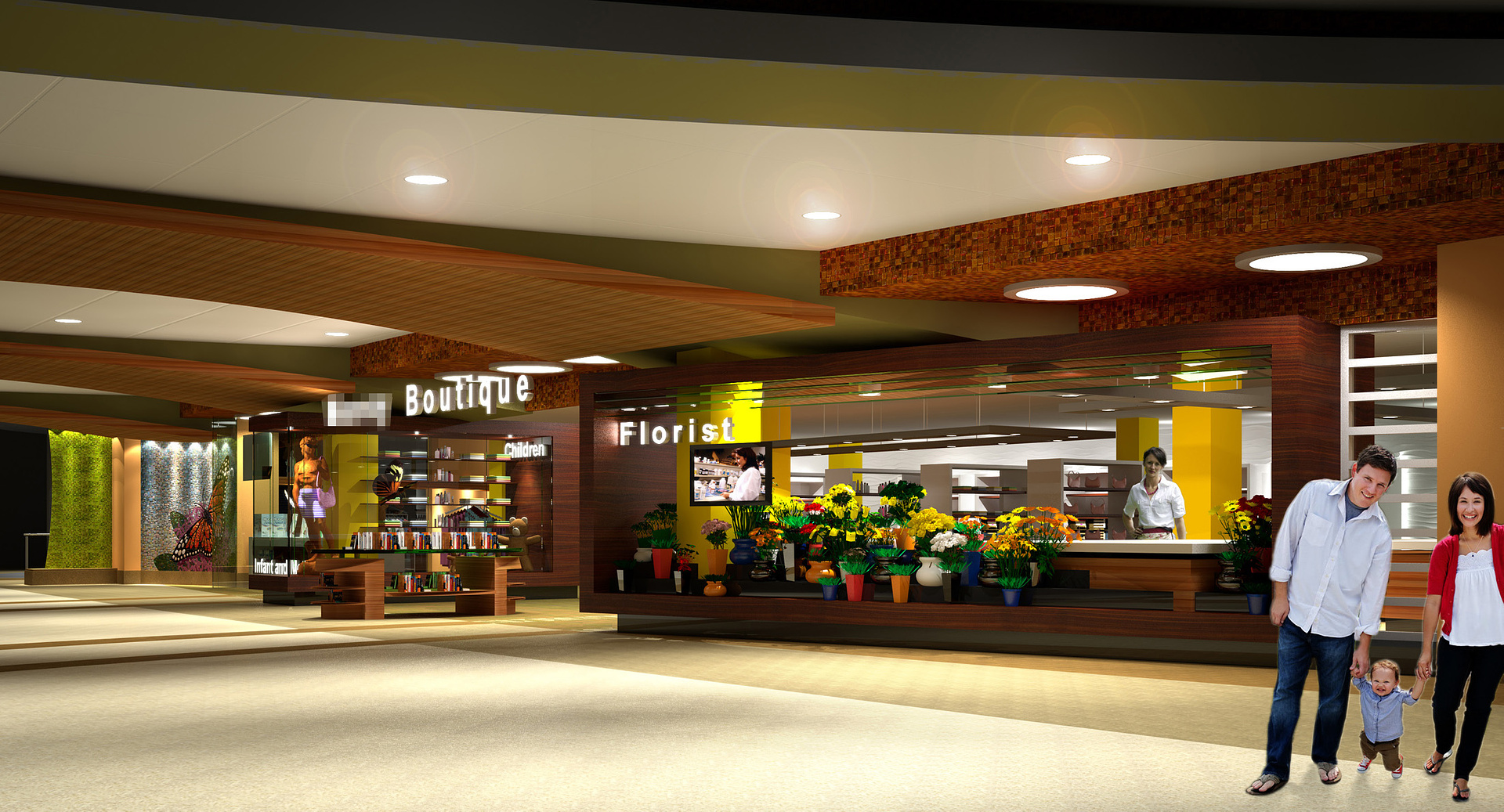
The one thing I notice is that I can't figure out a rhyme or reason to the placement of the product tables and racks...it feels really random. I suspect that your client also received some sort of fixture plan which made the placement reasoning more evident but I wonder if there is a way to communicate that a bit more in the views. Maybe raising the camera angle, maybe shooting down some "isles". I don't know but that's what jumps out at me.
Overall I think its nice work.
A
Aaron Rumple
Report Abuse
The public cooridor area? Yes, I agree. We've proposed to the client to do some furniture groupings in the corridor (and existnig space). Right now it is much more open than it needs to be and could use some activity. They wanted it along the wall, which wouldn't help the product visibility.
We still have product to put on display, more people of course and furnishing.

Francisco Penaloza
Report Abuse
Over all looks good, but there is something in the camera angle or colors that make the image loose in depth, maybe is the angle of the people right at the front or maybe you should apply a gradient to make the foreground bright and the background a little dark?? or less saturated in colors??
A
Aaron Rumple
Report Abuse
...development of concepts for retail branding. Client approved - proceding to final rendering stages.
[ATTACH=CONFIG]45675[/ATTACH][ATTACH=CONFIG]45677[/ATTACH][ATTACH=CONFIG]45676[/ATTACH]