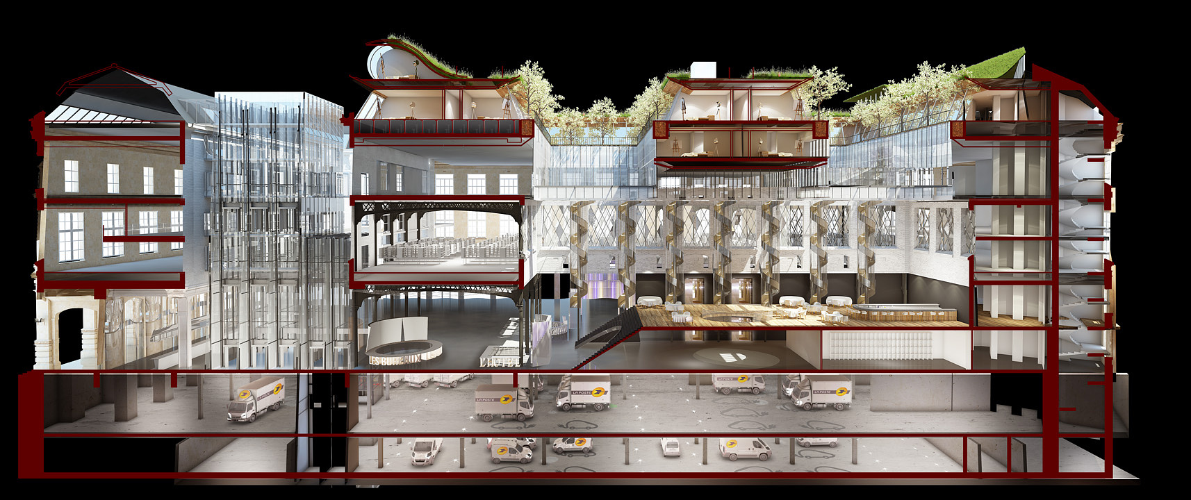
Perspective section
You must be logged in to post a comment. Login here.

Marcos Garcia
Report Abuse
very nice render. I agree, im not digging the red section cut. also, needs a strong base, the section looks like its floating and needs to be grounded.

Adam Zollinger
Report Abuse
This image is nice, but could be way more interesting with a little adjustment. I think it needs a little bit of enhancing in post, and I would definitely change the red to a dark gray or something. Also, I think a white background might look better than the black. The modeling is really nice. Overall, good work.