Exterior Home - Crits Please
You must be logged in to post a comment. Login here.
l
luc van amerongen
Report Abuse
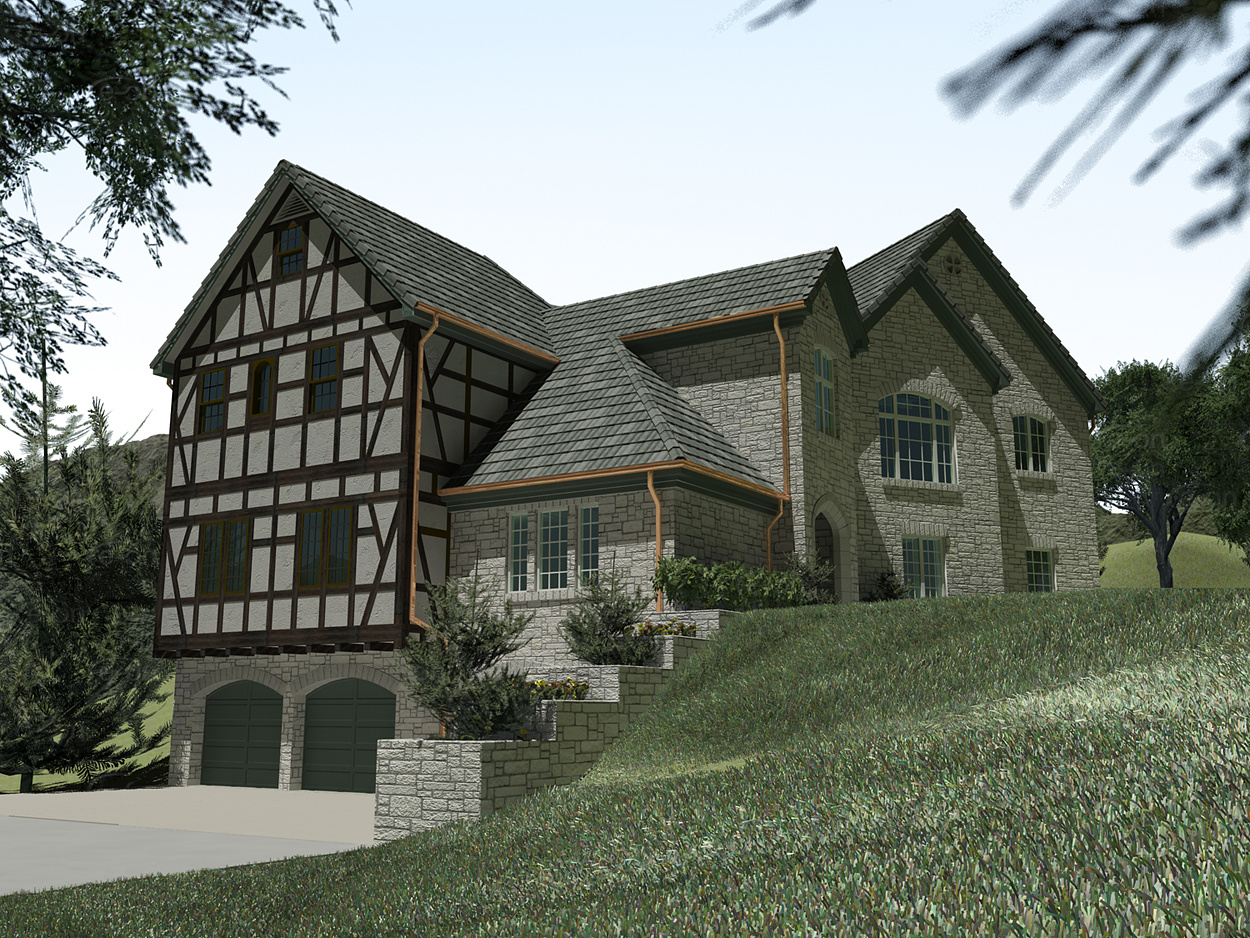
The grass looks a bit plastic. And the greens need more saturation.
The whole picture needs more colour and light.
The parts facing the sun should be more yellow, the parts in the shade more blue.
Good Luck.
w
wannes vanspranghe
Report Abuse
Perhaps you can use the Hair and fur modifier it the grass o matic really doesn't work. There's even a preset for grass inside the modifier.
J
Javier Oropeza
Report Abuse
you mentioned you used vue, just curious what bit you did in vue or if you used vue xstream in max or did you import the max scene into vue? are you using mrsky or vue atmospheres?
M
Mark Van Laren
Report Abuse
- I get the feel of a dull day but there is blue in the sky. Perhpas make things a little brighter and use a different map for your sky.
- Typically copper is not used for homes of this style. If you have seen this, perhaps you could add more of a patina to the copper.
- I Agree that the tudor is looking flat. More depth is needed.
The model as a whole looks great.

Antoine Desjardins
Report Abuse
I'm using 3ds max design 2011 x 64 w/ grass-o-matic.. might just have to download the new version.

paul rodham
Report Abuse
glass needs some reflection too, i think.
post it again when you make the changes.
M
Marcellus Ludovicus Servus
Report Abuse
Thank you both very much. I'll look into the AO and lighting. The grass o' matic plugin seems to be incompatible with newer versions of Max, maybe scatter will work.
Antoine Desjardins
Report Abuse
Good crit.
To overcome some of these challanges I would:
1 - use mental ray physical sun/sky and have the sun at a 45-60 deg. angle off to the left of the model (in the current view) so you can see some light/shadow variation
2 - use grass-o-matic or some other grass blade generator. They are much more realistic if your machine can handle the increased poly count.. otherwise make the displacement grass more green and lush.
3 - Try a stronger dirt map (AO pass) for this image. It should add depth and realism to a model as faceted as this
4 - increase contrast in post
great start though
paul rodham
Report Abuse
not a bad start, but there are a few things that are troubling me.
1.) i'm not getting the sun angle / lighting - it looks like it might be hitting the front facade almost straight on, which is not adding much to the overall composition (flat). a little more contrast / darkness to the shadows would help as well.
2.) the timber frame elements need a little more depth - it looks flat.
3.) the grass looks a bit lush and thick - don't know what to suggest there. the roof shingles look a little big as well.
4.) if the rendering was for a gutter manufacturer, then it was a success !