Feedback Please
You must be logged in to post a comment. Login here.
Antoine Desjardins
Report Abuse
Sweet.. looking much better. The walls of the building would be much darker than they are in your images since there are no exterior lights. I would add some ambient lighting to liven up the forms.
J
Justin Traylor
Report Abuse
I added a camera modifier, and after seeing the difference I agree with you. The extreme perspective made the image seem a little too distorted. I attached the newest here, and also posted it on the gallery page.
Justin
Antoine Desjardins
Report Abuse
[FONT=Tahoma]It's looking much better, but I would still correct the perspective to a true vertical with a camera modifier. A bit of vertical perspective is alright, but this is a bit too extreme for me. [/FONT]
J
Justin Traylor
Report Abuse
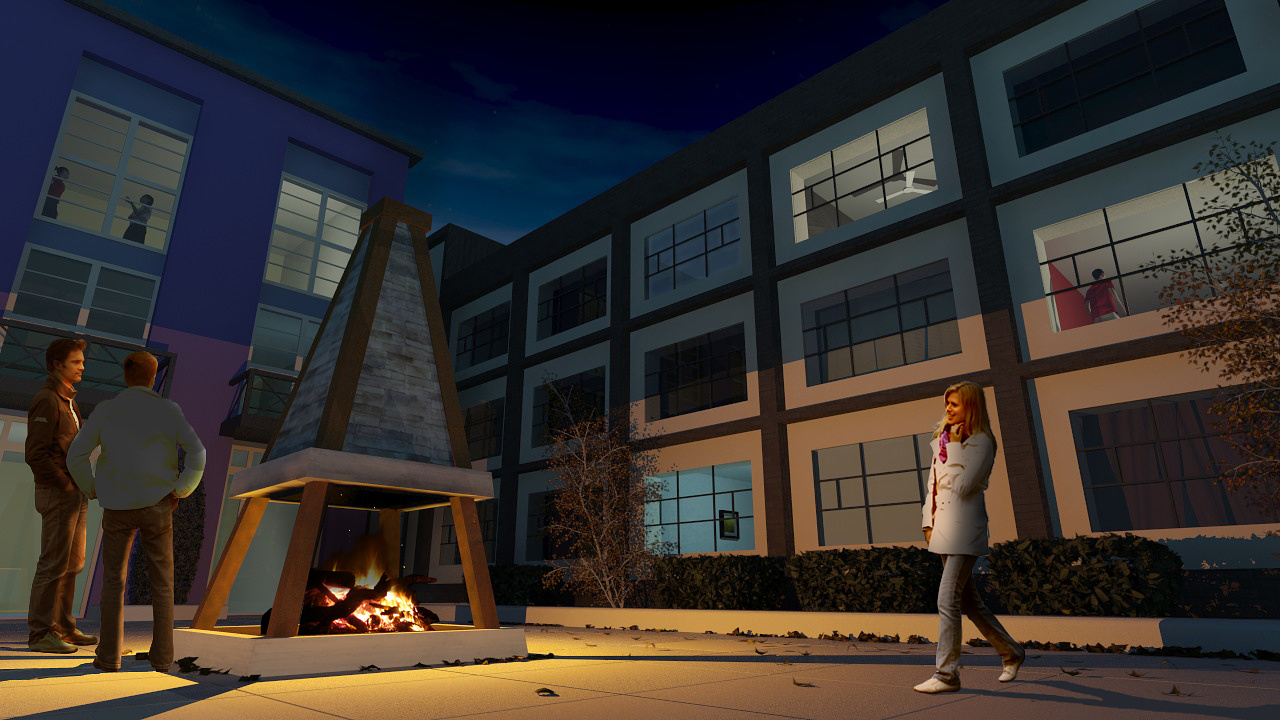
For this revision I adjusted the alignment of the people to match the perspective and the exposure settings/firelight. I think the lighting looks better, but not sure about the figures.
Justin
Antoine Desjardins
Report Abuse
No problemo. Post up some fresh ones when you get a chance. Lets see how it turned out.
J
Justin Traylor
Report Abuse
Thanks for the feedback, I really appreciate it.
-.- .-.
Report Abuse
:)
Antoine Desjardins
Report Abuse
Correct the perspective first of all (this is what's making the people look out of place since they are aligned to a true vertical). The light emitting from the fire should have a warmer color temp (between 2000-3000k). Also, soften the shadows by increasing the diameter of the light. The scene's got potential.. I like the trees and hedges - they are rendered and modeled well. You could even take the intensity of the "fire light" down and make the camera's exposure settings more sensitive because right now it looks like the fire's light is reaching the far walls (which probably is not possible).