house-interior rendering
You must be logged in to post a comment. Login here.
P
Park Lee
Report Abuse
thank you,buddy :-) good comment!
P
Park Lee
Report Abuse
thanks :-)

Ryan Watson
Report Abuse
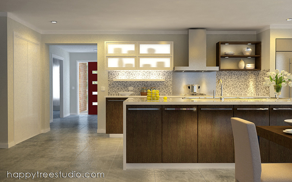
Hi Park - some comments:
1. A lot of graininess to the image - especially on the closet doors and back wall.
2. The composition is severely weighted to the right side of the image. Your eye tends to be dragged over, and then just leaks of the page through the hallway opening. I would keep the focus in the kitchen area and try not to do so much with the image.
3. Seems like the backsplash tile should have more detail - can't readily see the grout lines although, at this distance, we should be able to. Also, not sure why there is a gap between your range hood and the ceiling. This would be flush up and sealed in r/l.
4. Lastly, the table texture seems blurry. Consider a more detailed map?
Otherwise, I think this image is coming together nicely!
E
Elisabeth Lisa Tanuwijaya
Report Abuse
Nice tone... Love it...