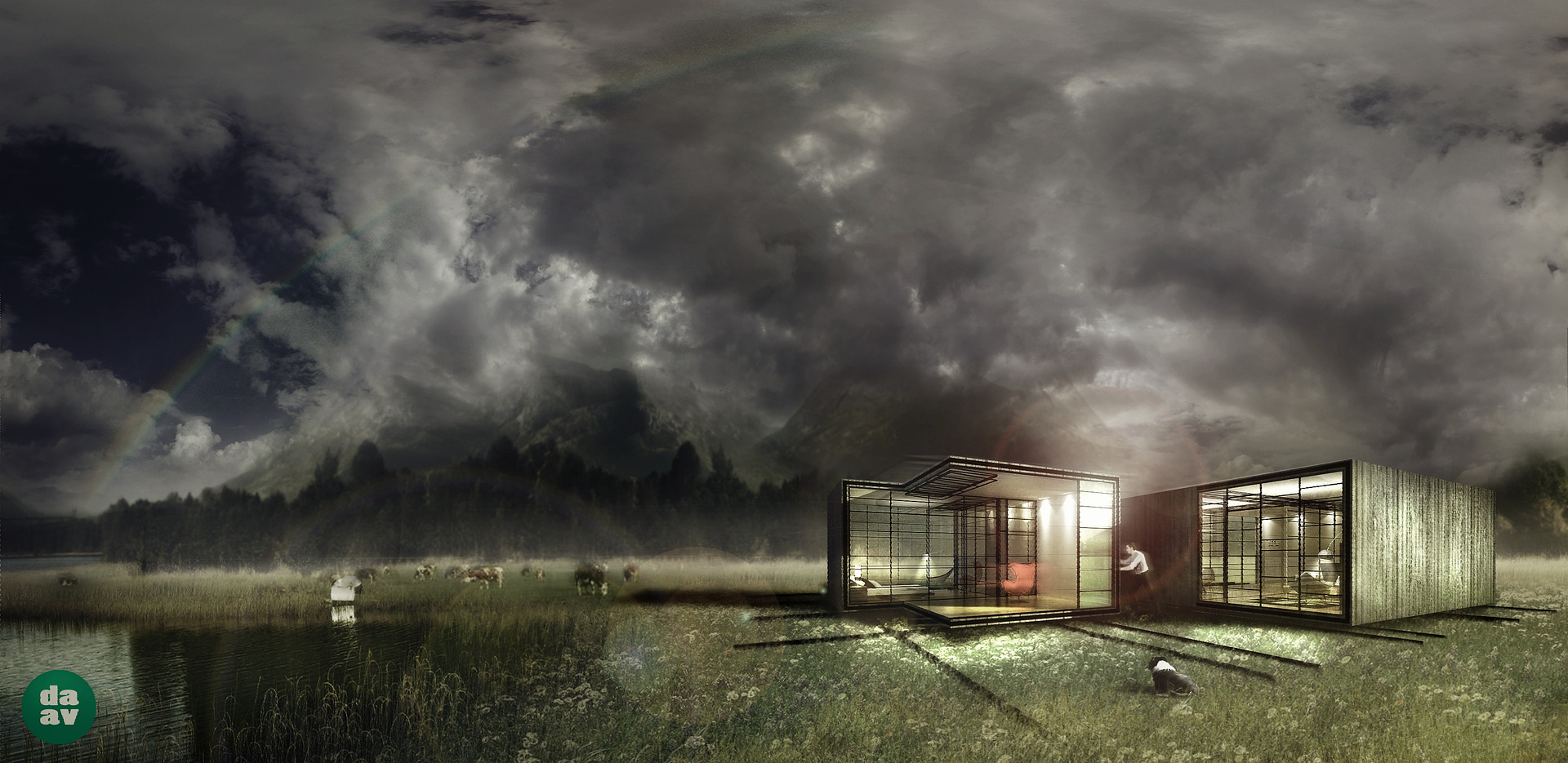
/ / Myriad House / /
You must be logged in to post a comment. Login here.
Paulo Borlido
Report Abuse
thank you Jonathan!
I realize now what you said about the rainbow and I agree with you. I was always afraid that the rainbow would draw to much attention on the image distracting the viewer. next time i will try to make it better!
thank you for your recomendations.
Paulo Borlido
Report Abuse
yes, it is in fact part of a idea competition entry. that's the reason for working on a dreamy mood like this.

Jonathan Sanchez
Report Abuse
Nice work Paulo.. I like it a lot.. think rainbow would work better if that part of the sky were a bit brighter/bluer, but love the feel of the image.

Jeff Mottle
Report Abuse
There are plenty of visualizations that are done for competition work or very preliminary design studies that done in a similar photo composite style.

Abdullah
Report Abuse
I still wonder who are the clients for these work. I have never met anyone who want these.
Or is it something that you saw in your dream?