Center for Architecture
You must be logged in to post a comment. Login here.
T
Tom Svilans
Report Abuse
Thanks for the comments!
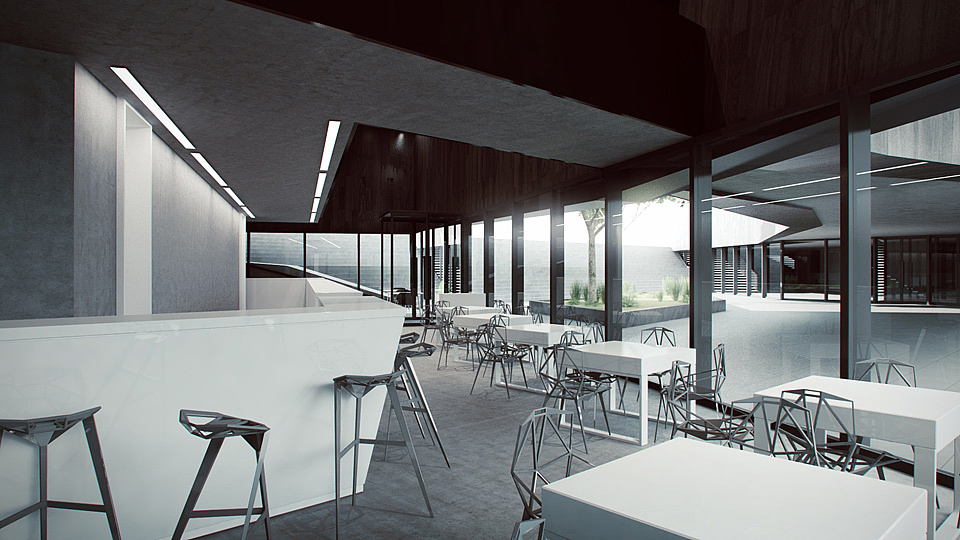
Tron: The shot with the stairs is definitely the least successful of the set. If I had more time I'd tweak it, I swear! But overall I hate the composition of it too, though it was necessary to show the entrance, stairs to the gallery below, lecture space and bridge to the right all in one shot. I think the minimalism of the project is mostly due to it being designed and modeled in only a couple of days :P It's the first design scheme in a much larger project (and it's only the first real review).
kankan: I really appreciate the detailed response and the critique of the architecture itself! I think in general that is somewhat missing from a lot of arch. viz discussion: how the visualizations and the actual architecture fit together. It's possible to do anything with arch. viz but the architecture is the real raison d'etre so it can't be overlooked!
In terms of concept, I think, for now at least, that it was primarily a programmatic response with some nice architectural ideas (the open circulation, interpenetrating functions, outdoor assembly space, etc.) however it may not be completely well articulated yet. It's not my favorite way of doing things (and I personally prefer a much more textured environment) but I think it's enough for this stage of the project.
Thanks for all your comments!

Antoine Desjardins
Report Abuse
I like it, but I'm partial to austere minimal architecture. The forms and finishes you employed definately lend themselves to large volumes. The only real eyesore is that dark set of stairs.. and maybe a bit strong on the glare. Nice job overall.

Athanasios Karampitsakos
Report Abuse
I agree totally with Mirza.

Kamran Mirza
Report Abuse
Can I crit on a design level? The furniture in the images seems to carry the images, especially in the second image. I think that's mainly your work. The Architecture itself needs a stronger concept. The lighting is also very monotone and gives a gloomy impression. I would have thought architecture centers would have an exhibition space as the focal point? How did your friend's submission go? What were the jurors' response?
On a rendering level, I think they probably saved your friend's honour! Very accomplished, though the lack of materiality is not your fault, the design doesn't seem to have been thought through to the detailing. I do like the furniture and the geometries. Well done in so little time!

