Corten House
You must be logged in to post a comment. Login here.

Manuel Fuentes
Report Abuse
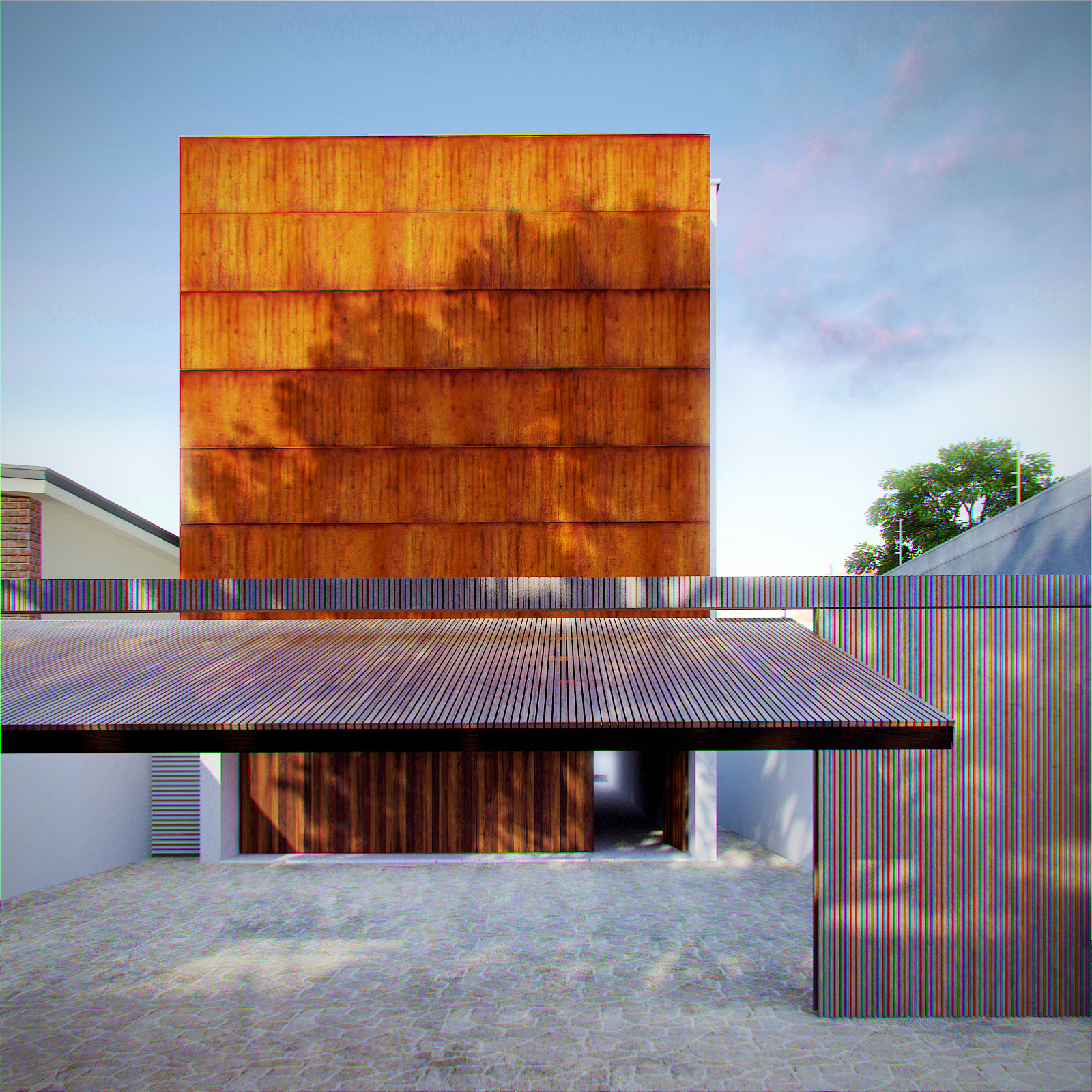
Its not orange wood, its weathered steel (Corten) I tried to match the color from the photographic references.
I'm startin to regret using the Cromatic aberration lol .
thanks a lot for the comment :)

MikeDugenio
Report Abuse
I think the, as stated before, the CA is overused. And the saturation of the "orange" top wood is too strong. Perhaps you should desaturate the orange colors in your image.
Beside that, it's very nice.
Manuel Fuentes
Report Abuse
yeah it was the last thing I did to the image and did it really quick, it does look a little weird. After a few more comments Ill try to improve it. Thank you for the comment :)
Manuel Fuentes
Report Abuse
I see what you mean, the floor is made with a displacement but the map is not big enough, maybe I shoud model the rocks and scatter them so it looks more real. Gracias por el comment :)

Erich zumBrunnen
Report Abuse
The visual composition is great. Good balence and porportions.

Athanasios Karampitsakos
Report Abuse
Nice ans simple.

Michael Jones
Report Abuse
Nice image, I am liking the textures used... My only problem is with the chromatic aberration used, I like it around the outside of the building and the tree I'm just not sure about having it on the wooden panels at the front? Makes it look funny colours?

Jerónimo Cabezas
Report Abuse
nice lighting... the ground needs more work, the tiling is visible... perhaps add some leaves on the floor? just an idea.