Concept image
You must be logged in to post a comment. Login here.
C
Chris MacDonald
Report Abuse
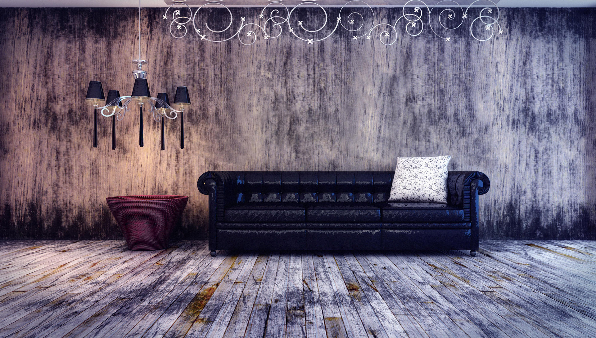
As an image and concept I like it, though I do agree with the other comments here - that wall when viewed at full resolution looks like it has motion blur on it, which is very confusing to the eye - perhaps the texture was taken on a handheld camera?
Lighting is also a bit confusing, as it's difficult to place where the light is actually coming from. It's all a little bit too uniform.
The sofa material really needs sorting out, the reflectivity doesn't appear to have any kind of falloff, and it's just too glossy all over.
A few minor tweaks and this scene could be very good indeed.

Athanasios Karampitsakos
Report Abuse
I like the image Thiago, but the wall material is confusing, seems like a 3D material.

Michael J. Brown
Report Abuse
I like the textures, however, I'm a bit unsettled on the light sources. I can tell there is daylight coming from the right of the image, and artificial from the chandelier. But are you lighting this space with anything else? (There seems to be another source towards the middle of the scene)

Jonathan Sanchez
Report Abuse
Nice image colors and styles, but the sofa material is way too glossy.