give some tips to make it more realstic
You must be logged in to post a comment. Login here.

ronit sharma
Report Abuse
Corey BeaulieuCoreyB thnx to advice me to make it realstic.......
C
Corey Beaulieu
Report Abuse
Do you see now what we meant by adding more intrigue with light? Now we don't see the window, but we know it's there and where it is. It gives the room a bigger feel and helps add more realism because we see evidence from life beyond the picture.
Nice job.
C
Corey Beaulieu
Report Abuse
Do you see now what we meant by adding more intrigue with light? Now we don't see the window, but we know it's there and where it is. It gives the room a bigger feel and helps add more realism because we see evidence from life beyond the picture.
Nice job.
ronit sharma
Report Abuse
Thanx orey BeaulieuCoreyB for ur comment..............after correction and adding vray sun this is my final out put :)[ATTACH=CONFIG]46444[/ATTACH]
ronit sharma
Report Abuse
Thanx rey BeaulieuCoreyB :) ur comments alwys welcome.......and thnx too Fran for a great tutorial :)
C
Corey Beaulieu
Report Abuse
Hey,
It is definitely looking better. The light didn't change all that much though. Looking at your second render it had stronger shadows. Maybe a sun?
As to your light settings. I'm impressed your are getting so much light from only 2 Vray planes set up like that. Good job balancing them with the camera. If you want to try a stronger sense of light direction you may want to try making the window an actual openning and placing a sun outside. You can then change the plane at the window into a skylight portal and your shadows will be a bit stronger. Fran mentioned the shadowing by the mullions in the window, this is because your plane is in front of them or in line and has a problem projecting a consistent light with in plane geometry.
Your pillows do look a lot better. Did you check out Fran's website for that pillow tutorial? I saw it last week and learned a lot. It's a great way to get extreme realism in the more organic options. I found that adding an animation into the actual place the pillow will sit helps make it even more natural in its position. (thanks Fran, great tutorial).
Your carpet looks great by the way, as do your materials in general.
keep playing with it. Eventually you may want to apply a more random mix of book colors and thicknesses, but what you have is just fine while you develop a mood for the shot itself. It may help to ultimately decide on a camera angle and just model and tweak like crazy until you feel like you know the person living in that room.
ronit sharma
Report Abuse
[ATTACH=CONFIG]46442[/ATTACH]
changed pillow n light direction :)
ronit sharma
Report Abuse
[ATTACH=CONFIG]46441[/ATTACH]
Hi, Frances Gainer Davey
this is my light setting for this render is tihis correct?? or i need more light??

Frances Gainer Davey
Report Abuse
Hi Ronit,
I rather like the oversized hardware. I would claim it as a design element and defend it to the last! :D
Just a few things:
[LIST]
[*]As mentioned already, the pillows need help. I have a brief tutorial on making a throw pillow on my blog if you want to take a look.
[*]The fabric for the bedding has a tiling issue where the source image is not lighted evenly. CGTextures.com is a great place to find free textures that tile seamlessly.
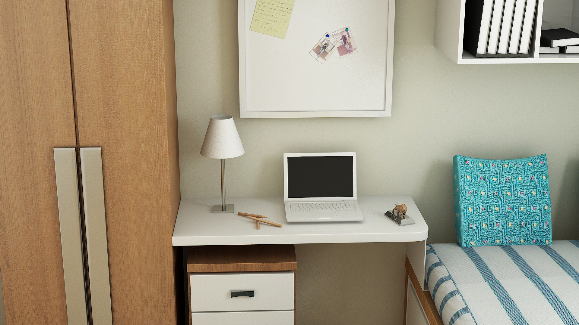
[*]I'm not sure if the object on the wall is supposed to be a window or a picture, but the shadow lines look a little odd. And the climbing dude looks like a peeping-tom. :D
[*]The laptop computer on the desk appears to be floating.
[*]I'm not sure if the wood-grain orientation on the bed frame is intentional, but it is usually oriented parallel to the long dimension of the framing members.
[/LIST]
ronit sharma
Report Abuse
Ismael Orozco & Jan Walter Schliep..........thnx 4 the comment & ur advice :)

Jan Walter Schliep
Report Abuse
Imho most parts of your render are realistic, the only thing really jumping the eye is the pillow. But as was mentioned before, the lighting is very flat. So even with a picture beeing 100% realistic, this does not mean that it looks interesting. Look at photographs, you will find many photographs "that look realistic", but they are still uninteresting.
I think playing with the light will get you further!
I
Ismael 1-1
Report Abuse
Agree with Corey and for a tip, just trust yourself.
When I look at your request, 'give some tips to make it more realstic', it tells me that you were not pleased with the work as not real enough. Trust your eyes and try to recreate and render as many things as possible from images, observations, imagination.
You have improved your lighting a lot, keep it up.
ronit sharma
Report Abuse
thanx Corey BeaulieuCoreyB 4 comment........:)
C
Corey Beaulieu
Report Abuse
Hello,
I'm no official on these things but the couple of things that jump out at me are.... I think the scale is little off like in the cabinet for example. Maybe make the handles smaller or make the whole thing bigger. The mattress looks great, but the pillow on it looks very cg. Maybe reapply whatever technique made your mattress onto the pillow. Lastly, the light is very flat. Usually this is good because it gives you the most options in post and the most flexible image to work with, but I feel that this one is too flat. There is no obvious direction to the light. I'm guessing that isn't a window on the right (it looks like a decorative poster) so what is the light source? I think a few adjustments to these things could take this ground work really far. Also, your computer is flying and the pin board looks detached from the wall some.
I don't mean to sound critical of your work, but you asked and these are the things that I think about when Im working on an image. You've got a great base though, usually lighting is a problem because of not enough and that's a hard place to come from. Yours just needs a little more story.