NPR-ish, Kodachrome-esque

You must be logged in to post a comment. Login here.
t
tristan basco
Report Abuse
The image could actually use entourage to give it life.

patrick anderson
Report Abuse
You can only polish a turd so far.....and you're pretty much at the limit there mate.
g
george sandoval
Report Abuse
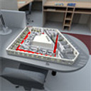
Now it seems too right side heavy. I think the tower needs to be moved to the middle.
(just kidding.................................)
Tom Suess
Report Abuse
[ATTACH=CONFIG]41664[/ATTACH]
Well that was an easy fix.
Tom Suess
Report Abuse
Yes, I probably did misrepresent the terms NPR and Kodachrome. That's why i put the -ish and the -esque. I've always associated Kodachrome with super saturated and I used a couple artistic filters in pshop.
Andrew Lynn
Report Abuse
I disagree. There's nothing inherently wrong with a symmetrical composition, the rule of thirds was made to be broken, and that's way too strong a criticism on the composition. And entourage is way overrated.
Honestly I think this is a fine render as it is. If it were a more glamorous or high end project I'd say more pop, more bling, more stuff, more views, more Photoshop, but it's not like the client is trying to sell expensive retail space in the parking garage or make people want to spend their vacations in the parking garage or something. It's a straight up architect-wants-to-show-what-the-building-looks-like situation.
g
george sandoval
Report Abuse
I totally disagree about the view point. 1st of all, it's part of our mission to educate clients. If the purpose of the rendering is to show the building to the bank or the community or the zoning board you DON'T want a view that is boring, stagnant, and that shows the design in it's least flattering view. And this may very well hang in the owner's office.
And this is not at a critique point if you don't have the entourage in yet - cars, people walking, people sitting on the benches, plants in the planters, maybe a foregroung tree branch coming in from the upper right corner to break the symmetry.
I think a 2nd view is an excellent idea along with comments about the pros of going with a less static view. I'll bet they change their mind.
Andrew Lynn
Report Abuse
Heh, I know that feeling - architects ask for shots photographers would never take. You make do with what you've got - a parking garage and an architect who thinks the parking garage can only be done justice by a shot that shows every finely crafted inch of its stately yet playful facade - but really, with parking garages you're mostly trying to tell everybody that it's not going to be as ugly as they think it will. Given those constraints, I actually like what you've done with composition and can't fault that. The only things I can fault are the use of the terms NPR and Kodachrome in the title - it's really neither, being pretty photoreal and not having a Kodachrome-ish palette.
Tom Suess
Report Abuse
I guess I could pick a secondary viewpoint and say "now here's what you should have asked for."
Tom Suess
Report Abuse
The point of perspective was dictated by the client as was the request that the extent of the building be shown. I am well aware that this will not be hanging in anyone's living room after all it's a PARKING GARAGE!! Is there anything I can do within these constraints.
g
george sandoval
Report Abuse
TOOOOOO SYMMETRICAL. This would get you an "F" for composition in art school and a rap on your knuckles with a ruler.