Trying to get more realism
You must be logged in to post a comment. Login here.
S
Sami Mansour
Report Abuse
Hi Paulo,
Thanks, I've kept the samples low to keep the rendering times down, and will turn it up again once I am satisfied with everything.
That floor is becoming the bane of my existance, I just can't seem to get a nice sharp crisp looking floor, or I end up with the colors getting out of contorl due to the bounces. In the end i've resorted to using an override material to avoid the colour bleed. Oh well, I will keep trying.
Thanks again for the comments.
ps. the scale is quite accurate in terms of numbers, but I still think it looks a bit off.. Try and imagine a human standing in that scene, does it look right?? My imagenation says no for some reason. But then again he's a picky bastard.:p
P
Paulo Nogueira
Report Abuse
I just started using Vray so Im not to sure how it and its light work but your samples on either your lights or rendering if quite low and you get a lot of pixelation towards the top of your image, maybe crank that up a bit. It will help your render but of course increse your render time a bit.
I would say your floor needs a bit of specularity, either through a seperate map or in the shader itself. again i dont use Vray so not sure what the best option would be.
I like your modelling nice and in scale ;)
R
Rémi Ciron
Report Abuse
You can try to reduce gi bounce multiplier a little and see what it does
S
Sami Mansour
Report Abuse
Yes, still getting the green tint. I can minimize it a little by playing with the white balance, but haven't managed to get rid of it all.
I've not used render elements before, I need to take a better look at it and compositing in general.
R
Rémi Ciron
Report Abuse
Do you still have the green tint on the pic you showed ? On the lower left ? on the bottom of the wall ? you can try to lower a little the values of the 1st or 2nd GI bounce. Or you can use vray render elements, vrayglobalillumination or vrayrawglobalillumination, never used them but I think you can substract the annoying GI with that.
Your floor seems a bit down scaled to me or it is the real size ?
S
Sami Mansour
Report Abuse
Well I changed the floor again which threw my white balance and brightness off meaning more post work to get it right, I'll have to play with the balance to get rid of the green tint.
Guess vertical has helped a bit getting the verticals straight.
[ATTACH]39979[/ATTACH]
R
Rémi Ciron
Report Abuse
Ok about the furnitures on the other room ! I like the view through the door on the right, I don't think you should hide that.
I have no problem with scale and perspective, that's not obvious to me. I just wrote about that because I noticed the vertical on the left was tilted, nothing more.
S
Sami Mansour
Report Abuse
Thanks Fouinard,
You are right about the occlusion, I only noticed it after I posted the image. Thats easy enough to fix in post.
I do struggle with perspective a lot. I agree, getting the camera angle and lens right would imporve the image a lot. Right now it feels wrong, although the model is to a correct metric scale, it just feels like everything is small and its difficult to imagine a human being in this image.
I had the furniture in the other room turned off to try and keep the rendering time down. Maybe I will try and tweak the angle a bit to hide the other room.
Thanks again for the comments and ideas.
S
Sami Mansour
Report Abuse
Thanks Ambrozoom, maybe i'll try adding a vray sun or a direct spot to give it a sunny look, but I'm not ready to start playing with the interntal IES lights yet. I want to do that separately.
The floor is a problem, i've tried multiple textures and they all seem to come out flat, regardless of the bump, relfection, or even if i add a displacement to it. Guess i'll keep trying.
R
Rémi Ciron
Report Abuse
Hi,
IMO you have too much occlusion on those spots
[IMG]http://img602.imageshack.us/img602/2789/captureq.jpg[/IMG]
if you're adding the ao pass in post, maybe you could soften these parts a little.
Also we can see straight through the rooms on the right, maybe you should add something to break that. Like a chair, corner of a coffee table...
Also your camera target isn't at the same height as the camera so the vertical perspectives are a little distorded, you can click on "guess vertical" in the cam settings. It's not adding more realism but just an option. We're using it a lot on outside views, don't know if it's used in inside views ?? Maybe someone could enlight me about that ?
Great rendering anyway !
edit : I just saw this, it's a good thing you lowered the light on the far right, it's preventing the eye to escape from the principal subject...

Rendering.no
Report Abuse
Hi Sam,
I would turn on the lihts, you definetly need some more shadows in there.
I would also change the floor texture .
Hope it hepls.
Regards

Antoine Desjardins
Report Abuse
Glad to help. I'm a mr user myself, but I'm sure similar tutorials on vray shaders exist. Good luck m8.
S
Sami Mansour
Report Abuse
Thanks Tron,
It is odd that the countertop isn't producing refelections, the material applied to it is quite refelctive as it is.
Exposure control is very tricky, especially when there is so much white. Its very easy to over do it and end up with overblown white areas. Post production is the easiest way to do it, but I'd love to be able to get as much of it done in the initial render. Compositing and multiple passes are probably the way to go.
Gotta read up more on glare shaders!!
Antoine Desjardins
Report Abuse
You might be able to acchieve more realism by increasing the contrast in your image. You can do this a few ways: 1) your exposure control, 2) light settings (ie higher intensity lighting) and 3) Post prodcution.
The attached image has only been color corrected and the curves were messed with to enhance the general contrast. [ATTACH=CONFIG]39966[/ATTACH]
You might also want to play with you materials more. Aside from the mentioned floor problem, it seems like the reflectivity of some of you materials is too low. For example: the countertop is almost at a glancing angle to the viewer.. but there are no reflections showing. Hope this helps.
oh and glare.. gotta love the glare shaders. Keep in mind: they only look photoreal if the brightness of the scene is high enough.
S
Sami Mansour
Report Abuse
Here's the first image with the AO pass applied.
[ATTACH]39963[/ATTACH]
It does look better and gives it more depth, but still needs work work..
Thanks for the suggestion.
S
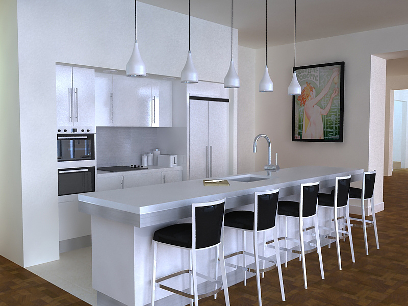
Sami Mansour
Report Abuse
Thanks Antaiwan,
I will give it a AO pass and see how it affect the outcome.
About the floor, I've been going through a bunch of different materials testing it and trying to get a good result, but despite pushing up the bump, trying displacements, and different glossiness settings, it always comes out looking flat.. I don't really know why that is and its really annoying.
In fact I feel the whole image is flat.....
[ATTACH]39962[/ATTACH]
This is an other part of the scene and as you can see its also very flat.
The noise and grain is because the settings are quite low to keep rendering time down (still takes about an hour and a half though)
thanks again
A
Antaiwan Wilson
Report Abuse
You might want to run an occlusion map across it.
As for your floor, why did you choose a parquet pattern? Client?
Its really flat looking(unless you want that)
Its looks a little grainy.
I don't have any experience with v-ray so I'm not sure how you could fix these issues.
Hope this helps
Antaiwan