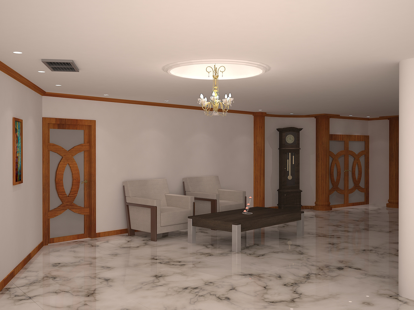
reception room
You must be logged in to post a comment. Login here.

Mohamad Karout
Report Abuse
thank you peter, I really appreciate your advice and I will take it into consideration.

Peter Drew
Report Abuse
Hi Mohamad, good start, some critiques. The floor looks like one huge slap of marble, I think you should emphasize the gaps between the slabs. The curves on a lot of you model look faceted, for instance the wooden door, and the cove around the chandelier. The lighting it too even. Play up the lighting from the chandelier,, turn down the environment light, get some contrast into the image, this will add some drama to the image. Also the column on the RHS, either remove it from the model, or push the camera forward past it, it does not add anything to the composition of the image. Keep going, more practice!!

