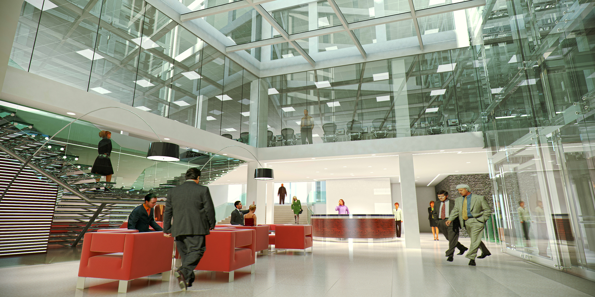
Office refurbishment
You must be logged in to post a comment. Login here.
M
Maciej Wypych
Report Abuse
Thank you all for comments.
neil poppleton
Report Abuse
The proportions of the people look odd. They have a squashed feel to them.
Antoine Desjardins
Report Abuse
maybe perspective correction?? or change the view.. I'm having a hard time finding a clear focal point in this image. Maybe sneak the camera a bit closer to that red chair so it can be a foreground element. Also, I'd get rid of the people. White 2d outlines of people might work better.

marius erasmus
Report Abuse
As mentioned, the geometry is good and the rendering, but the people is a problem. It seems everyone is doing the moonwalk. And the two guys on the right is doing some cowboy dance or linewalk.
M
Maciej Wypych
Report Abuse
Thanks Tobi,
I hate 3d people but I don't have any 2d people that are sitting down and actually look presentable.
As for other comments on the brightness on the rear wall - I've had a client logo there before but he's asked me to remove it so maybe I'll try to play with it a bit as you suggested.
T
Tobi Muller
Report Abuse
I think the gemometry is just fine, some things that bother me are the people..... the 3D people look awful (I know, I use them as well in my pictures but to be honest they mostly dont look too good) and the RPC people seem to be a little stretched horizontally.... other than that, the counter area seems to be a little too bright, maybe reduce the light sources there a little or just swap some of the materials colors in the background, for example some ornaments on the white wall behind the counter could help to avoid the walll looking burnt out....