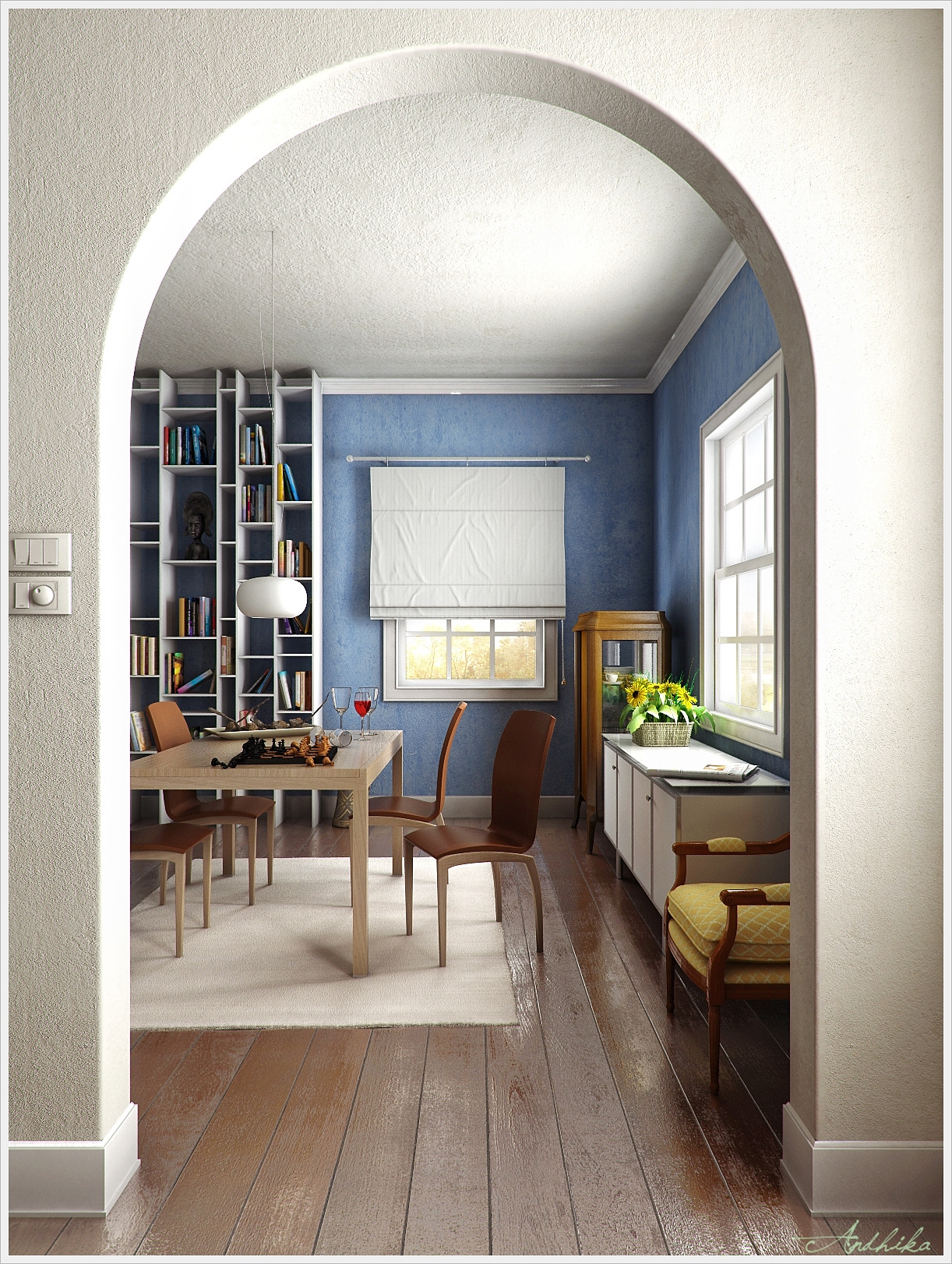
Dining
You must be logged in to post a comment. Login here.

Rahat Amin Chowdhury
Report Abuse
Excellent work.......clear textures and a calm and well executed lighting in the entire scene. I also agree that the lamp should be fixed in a real way....by using a cap or junction.
Again - superb work!

andhika nugraha
Report Abuse
thanks for input brian..i'll try to fix it
regards
thanks girish..yess..yellow chair, i know..it looks too classic..
thanks again..
andhika nugraha
Report Abuse
thanks for the input,,i think the same too..the bookcase looks little bit strange..it should not intersect the crown molding..thanks mate..
yess,,actually i want to make a chic interior style for this practice..with some modern furniture...but i think the result is not too good..maybe i'll fix it on next project..thanks..
thanks for comments johaim
for the rug..I purposely did not put it centered .. because I don't want to make it too neat and too rigid..i agree about the rug color..maybe it needs darker colors..
thanks again
thanks mate,,you are better than me,,why dou you want to be like me??:D
dont call me sir because i'm 23 years old..hehehe..
wood floor is so simple..just use the diffuse map,specular, and bump..so put them in its slots..i cant post the maps because of internet bad connection..sorry,,i'll post it later
thanks again,regards
G
Girish D Joshi
Report Abuse
Nice work. Good to see something different from the very architectural renderings.
Good texturing on the floor. Personally, I would remove the yellow fabric chair, looks a bit out of place.
andhika nugraha
Report Abuse
yes you're right..
i think it should have a cap..
thanks for the input :)
yaph,,thanks for input,,maybe i'll be fix it on my next project..thanks mate :)
thanks mate :)
yeess..i forgot to turn the shadow off for the other two lights,,
thanks mate

Brian Kitts
Report Abuse
nice one, I really like the attention to detail.
Only thing that bothers me is the texture on both the walls and the ceiling, it really makes the two run together a bit too much at the arch. It looks good on the walls, so perhaps try a different scale or treatment on the ceiling.
Fred Baldez
Report Abuse
I really like the image, the textures are visible , the mood of light is clean. Congratulations, Sir. When I grow up I want be like you . lol
If is possible, could you explain how did you make your wood floor? Because I am trying to get something close this and I will appreciate your help, thks.
g
george sandoval
Report Abuse
One other thing and it really is details like this that matter. The rug is not centered on the dining table and
you probably would not have a white rug under a dining table where spilled drinks or dropped food could stain it.
j
johaim Rakim
Report Abuse
yeah! the bookcase is too thin, but it doesnt really matter. it depend on what material is he going to use in real life. anyway, good image. i like it =-) nice floor.
r
robkius
Report Abuse
Nice render.. Love the floor. Agree with above about too many different style furniture used in this scene. Looks like a home of someone who doesn't really care about interior design.. :) However overall a really nice looking render.
g
george sandoval
Report Abuse
Looks great - great floor. I don't think the bookcase would intersect the crown molding - have it end below or stop the crown molding. Also the bookcase elements look kind of thin and insubstantial.
The decor is a little strange - uneven mixture of modern and traditional - especially the yellow chair up front is emphasizing the clash.
S
Saurabh Kolekar
Report Abuse
if ur using a vray light for each window,then turning off shadows for ne 1 light would add to the realism....

Athanasios Karampitsakos
Report Abuse
I agree with kareemkarawia fot the lamp. Everything else is ok. Nice image.

Kareem Karawia
Report Abuse
Good work .. and i agree with Brian .... and i think the lamp itself need to more glossy and a bit more reflective

Brian Zidovec
Report Abuse
For the suspended lighting fixture, would a wire come straight out of the ceiling like that? Should have a cap that covers a junction box.