CAL Lutheran University
You must be logged in to post a comment. Login here.
R
Ricardo Alarco
Report Abuse
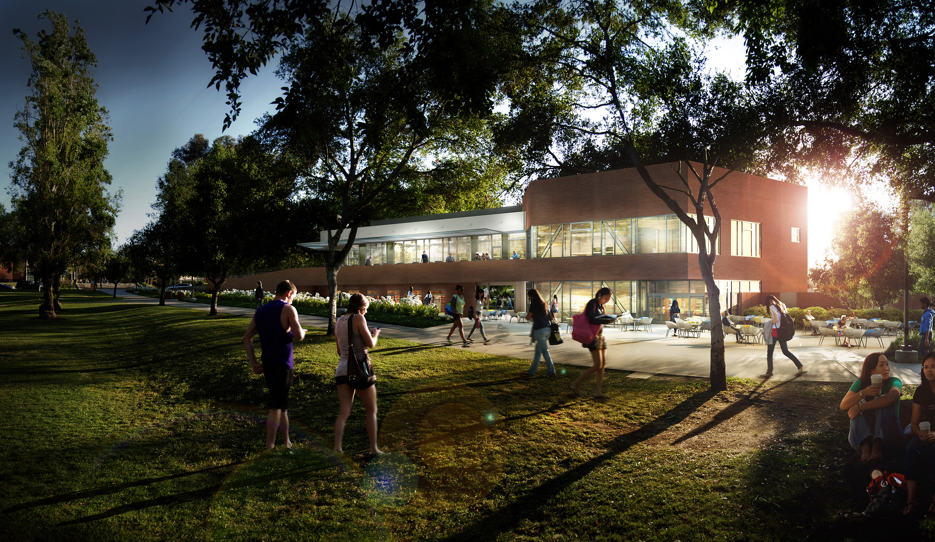
Agree with some of the previous comments. I don't mind the drama of the light. It s quite strong and bold. Very gutsy.
However I'm amazed more and more at architectural companies asking for images of this style for competitions where there's 7% architecture, 93% flares, reflections, shadows and crazy entourage. (not yours directly but in general). Some architects just stopped trying

Nicolas Bischoff (www.burn.co.za)
Report Abuse
Really nice work - I assume this is part of a set because the architecture gets a little lost however I really like the mood you have created. I think the lens flare is a bit strong (or elements of it) but all in all its a beautiful image.
g
george sandoval
Report Abuse
Here's my Simon Cowell critique:
A lot of your images are edgy with large people in the foreground and you manage to to pull it off but this one is not working. The two main figures are very stiff and symmetrical and harshly lit and distracting.
Your late pm raking light is NOT working. It's glaring so unattractive on the foreground grass but gotta give you credit for trying.
Also the building is gray/blotchy and gets lost in the high contrast of everything around it.
Most of your renderings are awesome, sometimes even breathtaking but this on feels like your interns were begging for a chance to do one themselves and you mistakenly gave in.