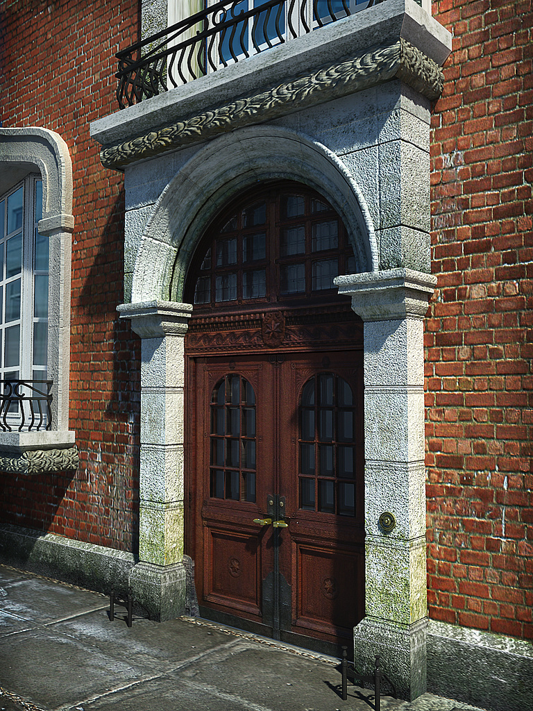
Arched doorway
You must be logged in to post a comment. Login here.

Marcin Jastrzebski
Report Abuse
impressive details! Good work.

Antoine Desjardins
Report Abuse
Shwing! Very well done.
a
andychild
Report Abuse
Thanks, much happier with it now. Just hope my potential client likes it.

Adam McPartland
Report Abuse
excellent mate.. good work on the ol' bricks
a
andychild
Report Abuse
I have changed all the things that have been critiqued above. please let me know what you think.

Adam McPartland
Report Abuse
its nice, the door itself looks great...i think you need to show more attention to the bricks around it tho, they look very 'cg'. I think to get around this you need to maybe paint a bit of grunge on them in photoshop or find a better texture. Also take care with how the bricks meet the stone 'skirting' it would look better IMO if the texture began with a full course of bricks at the bottom.
a
andychild
Report Abuse
Thanks guys for your responses. I'll have a play with the displacements and see what I can come up with.

Antoine Desjardins
Report Abuse
Looks good on my screen as well. The only item for improvement would be the bump/displacement on the ground - Raise that baby up!
N
Nils Homeier
Report Abuse
It comes down to colormanagement and how the monitor and grafics cards are adjusted. Also, if you embed the color profile in the image file, not all browsers display it correctly. I'm no expert on the subject but I'd say, if it looks right on your monitor and print is ok, dont fiddle too much with it. Also my guts tell me to win any competition you have to rework the balcony fresco. It has a very noticable pattern to it and the displacement intersection is also very noticable. I'd suggest you try to work with chamfered or round corners to minimize those intersections.

Athanasios Karampitsakos
Report Abuse
Well done!
a
andychild
Report Abuse
Thanks for the response Tristan . Not sure why its showing up dark and blurred on some monitors and not on others. I've checked on other peoples PC's and my iPhones and the look notrhing like they do on my work machine.
t
tristan basco
Report Abuse
Looks fantastic on my screen.

