Open Space - View 1
You must be logged in to post a comment. Login here.

Joao Pereira
Report Abuse
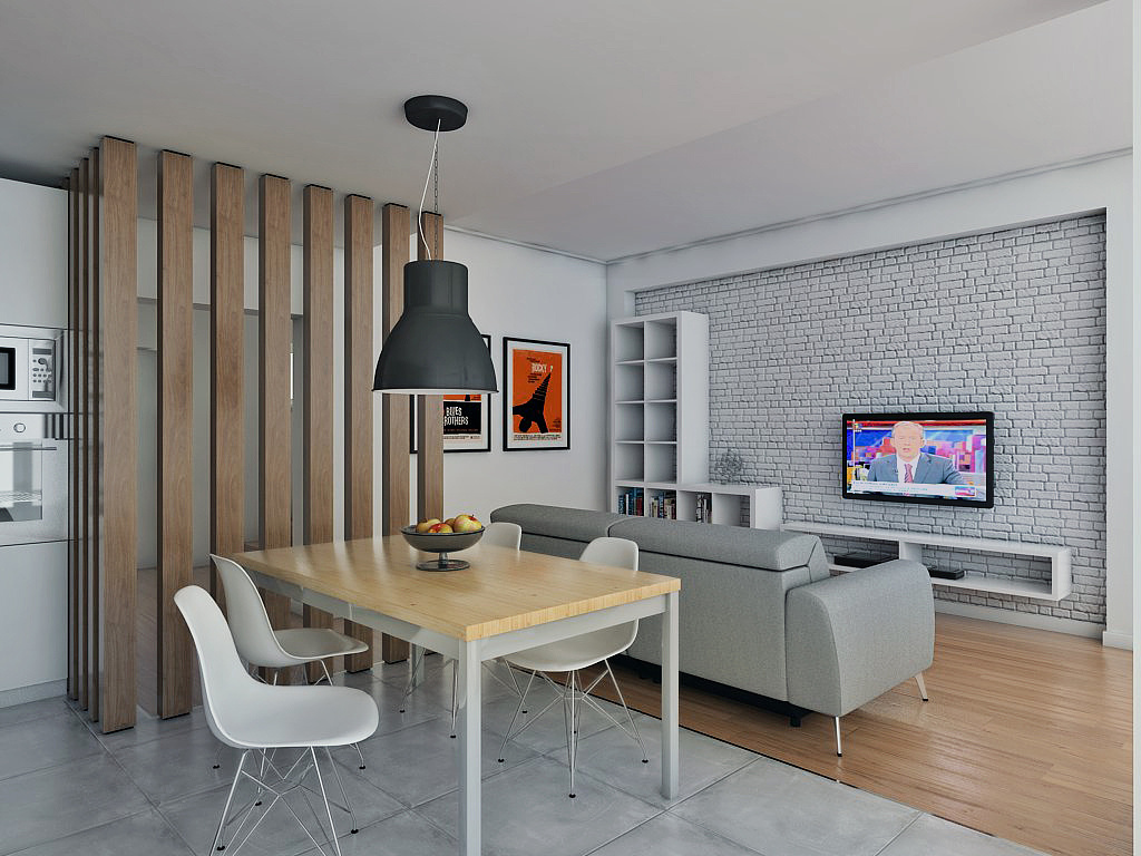
Thanks a lot for your feedback! That ceiling / wall junction actually looked way worse on the rendered image...this is the best result I was able to get from the scene. Perhaps with a few more days I could solve that with the settings.
Other than that, I agree with you: that shadow is a bit strong and yes, the lamp is HUGE, but that's the one the client had, so... The brick is intentionally stronger than "normal" to enhance the brick texture.
g
george sandoval
Report Abuse
Very nice - I think #1 is the weakest. The blotchy ceiling meets wall area. The brick might be a little too strong. Shelf shadow look a little dark.
Wow - that dining table light is enormous - especially over that small table. I think 2 @ 3 have more nice warm light coming in.