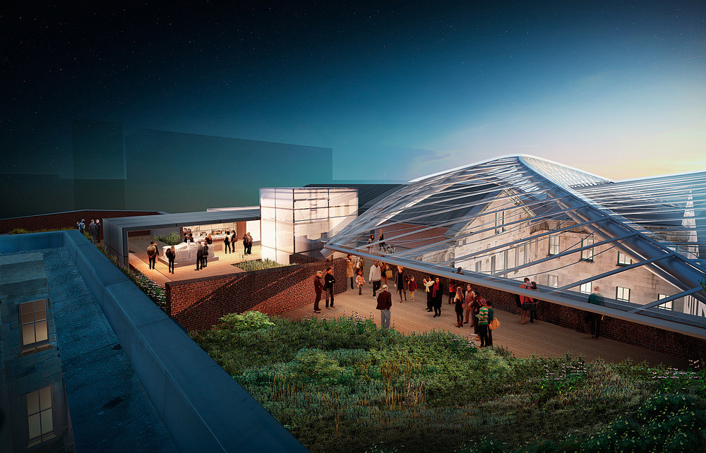
The Mint Proposed Rooftop
You must be logged in to post a comment. Login here.

Mehdi Vahedi
Report Abuse
I like it ...

Chad Warner
Report Abuse
I like the second one. It gives a great sense of what's going on with the space.

Travis Schmiesing
Report Abuse
Here is another image from the same project. This one is inside of the central courtyard.
This one was also created using mismanaged profile, so it may have saturation issues depending on what type of monitor you are suing, and what web browser you are viewing it through.

Travis Schmiesing
Report Abuse
Glad the tip helped. This link is a video that was created while placing people int his view. It uses the overlay post method for scale.
http://phase22.com/misc/cgarchitect/People_Comp.wmv
This image is part of a series that I did earlier in the spring of this year. If I remember correctly the image is mainly lit with a general dome light, with accents in the windows. This image was heavily developed through Photoshop. The attached image is the base rendering coming out of Max before Photoshop work was done. There was a separate pass for the elevator, and a separate pass for the lighting on the canopy. Everything else was built in post.
I typically do a lot of work in post, but this was more than usual for me.
I have a large project that will be gearing up next week. I am planning on using some of the recent workflow adjustments for lighting on it.

Dave Buckley
Report Abuse
Nice little tip Mr Schmiesing. I shall be using that one. Note to self: also do smaller poles when adding children otherwise they're gonna be some big kids :)
Render looking nice too. Is this where your thread about whitepoint and hdri originated from (it appears to be lit with HDRi - so I'm just guessing)

Travis Schmiesing
Report Abuse
I agree that the view does not inform the project in way that gives complete understanding and it does not make you feel like you are part of the scene. We had several high level key players on both the client and design side working to achieve a view that was able to show the modern intervention to the historic structure, but at the same time make sure it was not invasive to the historic structure, and was not decisive as to what the final design would be. In other words, somewhat vague.
The process of selecting the view became a difficult procedure to work through, and in the end made me revisit some of the working methods I have used in the past. Now when we work with a designer that is fluent in 3d we have them set the cameras to what needs to be shown in the project. They typically have been working with the project for several months, and know the design thoroughly inside and out. We often set cameras based on a discussion, and what strikes us as being intriguing. Our end results are not always directly related to what the discussion is about the design, or potential future political discussions.
The heavy saturation is due to my lack of properly using ICC profiles when working between multiple computer, one with a high gamut monitor, and the other with a cheaper entry level monitor. I would like to believe that this problem won't happen on my future work.
The front guy does look large. Typically I scatter 6ft poles around the wire frame scene, and then screen capture it, and lay it on top of the rendering. I then scale my people based on that overlay. So most of the people should be close, but it is very possible that one slipped through the cracks.
Thanks for the compliments.

Justin Hunt
Report Abuse
I agree with Adam, for some reason my eye is drawn to the blue edge on the left rather than the roof garden, possibly its the super saturation.
Also I keep on wondering , what are these people doing on the terrace, why are they there?
Other than that Great detail and a good blend of conceptual and realism. love the texture detailing
jhv

Adam McPartland
Report Abuse
A technically impressive image, love your modelling details on the roof and the mix of photoreal with the stylised backdrop. If I had to suggest improvements it would be your POV which I wish focused more on the roof and less on the huge bush in the foreground. I'd like to be able to feel like i'm on that terrace and see the junction between the old and new. Also i think the scale of the people nearest the camera looking over the wall is a little large... it looks like they could hit their head on that edge beam. Only minor things tho IMO and great use of colour!

Rahat Amin Chowdhury
Report Abuse
Really a great work done......i like the softness and the ambient light effects of the scene........bravo!

Nicolas Bischoff (www.burn.co.za)
Report Abuse
I like it. The image has a very soft feeling to it. I think it strikes a nice balance between realism and conceptual.
C
Chris MacDonald
Report Abuse
I love it!

