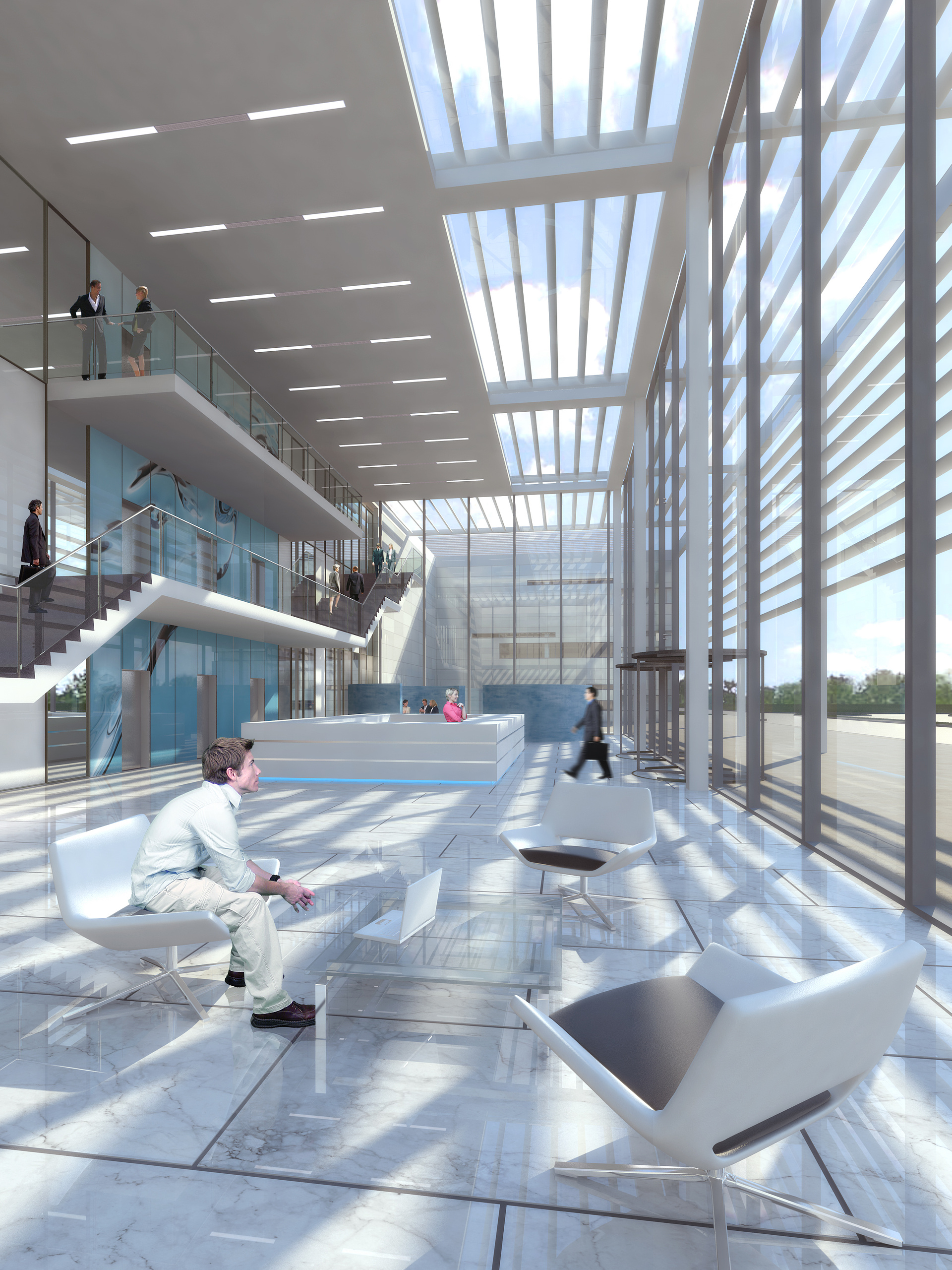
HQ Reception
You must be logged in to post a comment. Login here.
MS JE
Report Abuse
yup..I agree with Henry too, keep it up stephen...cheerssss...

Stephen Thomas
Report Abuse
Yeah, I'd agree with most of that. This was a quick turnaround at an early stage of the proposal. Nothing was really designed yet, so I was making most of it up! The people were done rather hurriedly as a result, so probably could have used more work. Thanks for your crits, guys.

Miguel Flores
Report Abuse
I agree with Henry on everything specially the grout an the guy on stairs, maybe adding some motion blur and contact shadows will make the human scales look better also rotate the chair to make a best match with the sitting guy
Try to desaturate the girls pink shirt
H
Henry Cross
Report Abuse
It's a good image, thinks it needs a few minor changes and it would look great.
I think the image could do we some adjustments, colour balance adding red and yellows in the midtone (warmth) and adding cyan and blue in the highlights (cold) I'd then add some curves and a vignette on colour burn. Also have you used an AO pass?
There a few issues with the image. The guy in the foreground, Should we be able to see the end of the shoe? I'd remove the guy on the stairs as the refection of the balustrade makes him appear like he is floating. For me the grout is too large? Also the base of the chairs get lost I'd render out a Vray wirecolour and adjust the levels.
Hope this helps
Henry